Designed by Studio h | Country: United Kingdom
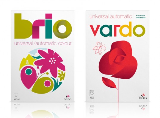
“Branding and packaging design by Studio h for Brio and Vardo, two new brands for the first detergent products to be manufactured in Georgia. Aimed initially at the Georgian market and their neighbouring countries, it was important that Brio and Vardo appealed as local brands reflecting their Georgian provenance and at the same time competed on shelf with the large global competitors. Standing aside from the industry norms Studio h concentrated on using symbolic imagery to create an emotional link to the culture. The branding for Vardo uses a rose, Georgia’s national flower. Brio’s circular illustration reflects the mountains and trees of Georgia’s landscape and the colour palette references the natural hues of the Southern Black Sea region.”