Designed by Spring Design Partners, Inc. | Country: United States
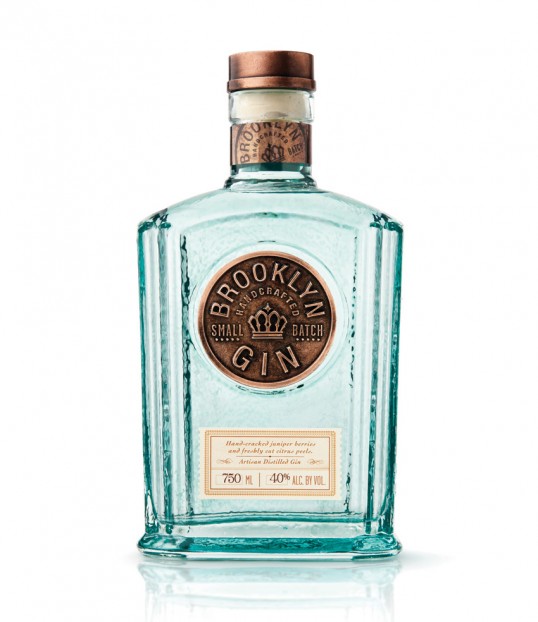
“Spring Design Partners was selected to create the Brand Identity and Package Design for a new super premium Gin that reflects the essence of its birthplace and engages Mixologists with its hand-crafted, micro-distilled pedigree. Inspired by the ingenuity of Brooklyn, a sometimes gritty, but always soulful borough, we crafted a visual identity for Brooklyn Gin that blends old-world craftsmanship with today’s artistic, vibrant culture. The bottle structure pays homage to the apothecary origins of gin, reinforcing its place in the new speakeasy, while the medallion label – stamped in metal – celebrates the authentic spirit at the core of the brand. For the modern Mixologist, Brooklyn Gin captures the magic and magnetism of a time and a place where the cocktail is king The package has generated tremendous attention resulting in national media coverage by The New York Times and The Huffington Post along with hundreds of blog posts. Brooklyn Gin is now sold in over 55 on-premise accounts and dozens of off-premise locations throughout the 5 boroughs. With over 300 cases sold in 1Q 2011, the brand is on its way to exceeding its sales target for 2011.”