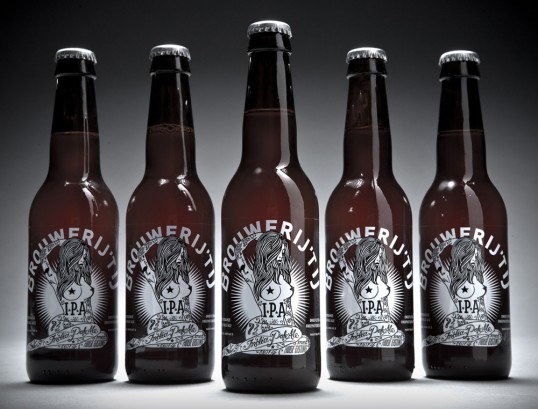
Designed by Redthumb | Country: The Netherlands
“Inspired by a tour of US microbreweries, Amsterdam’s Brouwerij het IJ decided to create their own US-punk-style IPA. Branding studio Redthumb was given it’s shortest ever brief (simply “Tits, tattoos, and skulls”) and created a design with enough punch to match the full flavoured brew. The design picks up on the the brewery’s rebellious nature and is a homage to east coast streetart and artists such as Rebel 8. Hand drawn in-house at Redthumb, the label reflects Brouwerij het IJ’s reputation for producing beers full of character and tongue-in-cheek attitude.”