Designed by: PepsiCo Design & Innovation
Country: United States

Bulb

bulb1

Designed by Igal Hodirker | Country: Israel

“The power of white is sometimes really underrated. As a designer I often hear “make it bigger, add more pictures, there’s too much white space…”

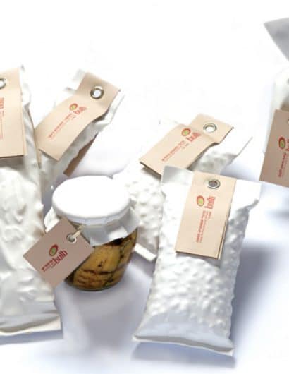
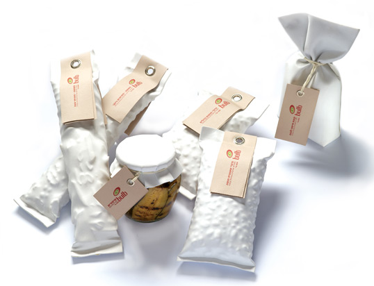
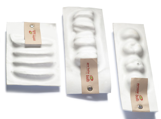
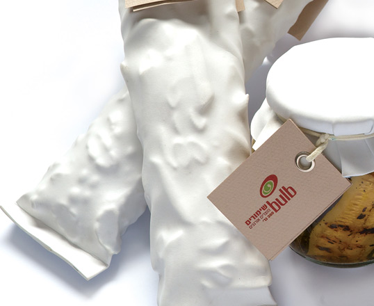
These wonderful packages by Igal Hodirker demonstrates the power of white. The concept behind ‘Bulb’, an organic – GMO free fruit vegetables & food ingredients, is “the inner truth”. Returning to nature, to our basic source, to the seed that grows within.

There are no distractions from this basic “truth”, the product speaks for itself by giving it’s own unique textures to the packages, which were designed with a soft and breathing white material.

Finally, a design so strong with it’s silence, with a boutique charm, I could imagine it on a gallery stand…”
bulb2

bulb3

Get the latest packaging design inspiration in your inbox:

Popular designs

Far Out Bar

Description: Far Out Bar is a cutting-edge packaging design project created for High Life Farms’ macrodose THC chocolate bars. This project involved

Burma Love Rebrand

Love at First BiteAs an extension of the Burma Superstar restaurant in San Francisco, Burma Love Foods gives diners an opportunity to

Over the wave

This Kombucha originates in Lombok, Indonesia, where its paradise beaches attract hundreds of surfers eager to ride the waves. When you surf,

Designed by: PepsiCo Design & Innovation
Country: United States

Bulb

bulb1

bulb1

Designed by Igal Hodirker | Country: Israel

“The power of white is sometimes really underrated. As a designer I often hear “make it bigger, add more pictures, there’s too much white space…”

These wonderful packages by Igal Hodirker demonstrates the power of white. The concept behind ‘Bulb’, an organic – GMO free fruit vegetables & food ingredients, is “the inner truth”. Returning to nature, to our basic source, to the seed that grows within.

There are no distractions from this basic “truth”, the product speaks for itself by giving it’s own unique textures to the packages, which were designed with a soft and breathing white material.

Finally, a design so strong with it’s silence, with a boutique charm, I could imagine it on a gallery stand…”

bulb2

bulb3

Previous slide
Next slide

Explore more great package design

Get the latest on packaging design in your inbox: