Designed by: PepsiCo Design & Innovation
Country: United States

Cabo Chips

lovely-package-cabo-chips-1

Designed by ROOK | Country: United States

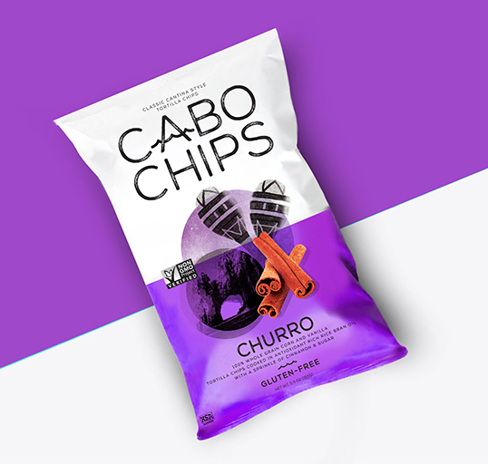
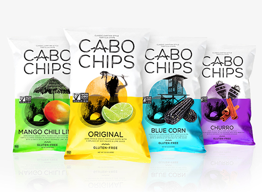
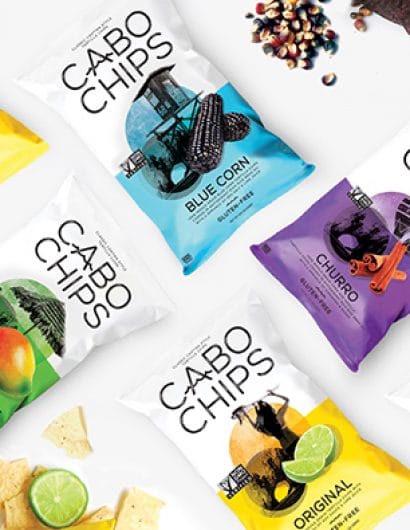
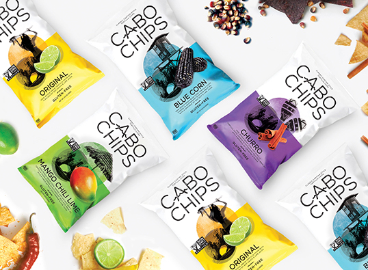
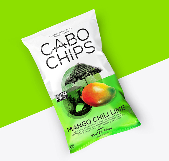
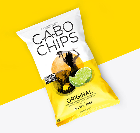
The challenge: Create a new compelling visual identity and packaging design for Cabo Chips to better express the brand’s provenance, personality, spirit and unique taste.

Our perspective: Virtually every tortilla chip attempts to communicate Mexican provenance in one way or another. The opportunity was to find a new way to reflect location; one that’s compelling, contemporary and born out of a genuine story.

“The approach needed to be different: Not stereotypically authentic, not symbolic, but expressive. We wanted to create a sense of place for Cabo Chips that reflects the experience of Baja through lifestyle, emotion and energy. It’s not about simplifying a complex origin into a single symbol, icon or style, but about communicating Baja’s depth, richness and mood in an expressive and layered way.” – Creative Partner and Founder of ROOK, Mark Christou.”
lovely-package-cabo-chips-2 lovely-package-cabo-chips-3 lovely-package-cabo-chips-4 lovely-package-cabo-chips-5 lovely-package-cabo-chips-6 lovely-package-cabo-chips-7

Get the latest packaging design inspiration in your inbox:

Popular designs

Pure Persian Honey

When we look closely at honey packaging, they are almost all in the usual format, and the ultimate in creativity is that

Far Out Bar

Description: Far Out Bar is a cutting-edge packaging design project created for High Life Farms’ macrodose THC chocolate bars. This project involved

Over the wave

This Kombucha originates in Lombok, Indonesia, where its paradise beaches attract hundreds of surfers eager to ride the waves. When you surf,

Designed by: PepsiCo Design & Innovation
Country: United States

Cabo Chips

lovely-package-cabo-chips-1

lovely-package-cabo-chips-1

Designed by ROOK | Country: United States

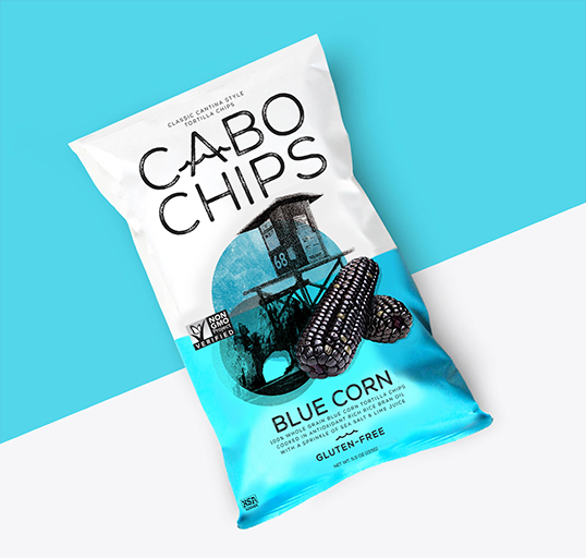
The challenge: Create a new compelling visual identity and packaging design for Cabo Chips to better express the brand’s provenance, personality, spirit and unique taste.

Our perspective: Virtually every tortilla chip attempts to communicate Mexican provenance in one way or another. The opportunity was to find a new way to reflect location; one that’s compelling, contemporary and born out of a genuine story.

“The approach needed to be different: Not stereotypically authentic, not symbolic, but expressive. We wanted to create a sense of place for Cabo Chips that reflects the experience of Baja through lifestyle, emotion and energy. It’s not about simplifying a complex origin into a single symbol, icon or style, but about communicating Baja’s depth, richness and mood in an expressive and layered way.” – Creative Partner and Founder of ROOK, Mark Christou.”
lovely-package-cabo-chips-2 lovely-package-cabo-chips-3 lovely-package-cabo-chips-4 lovely-package-cabo-chips-5 lovely-package-cabo-chips-6 lovely-package-cabo-chips-7

Previous slide
Next slide

Explore more great package design

Get the latest on packaging design in your inbox: