Designed by: PepsiCo Design & Innovation
Country: United States

Caffè del Faro

faro1

Designed by Iceberg | Country: Italy

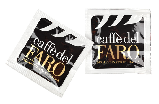
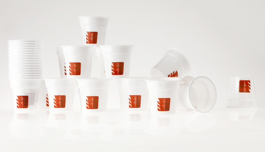
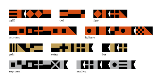
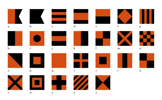
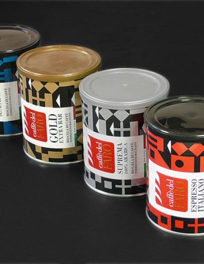
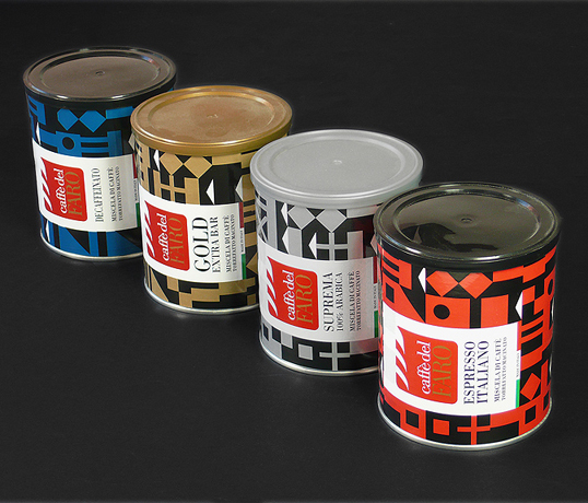
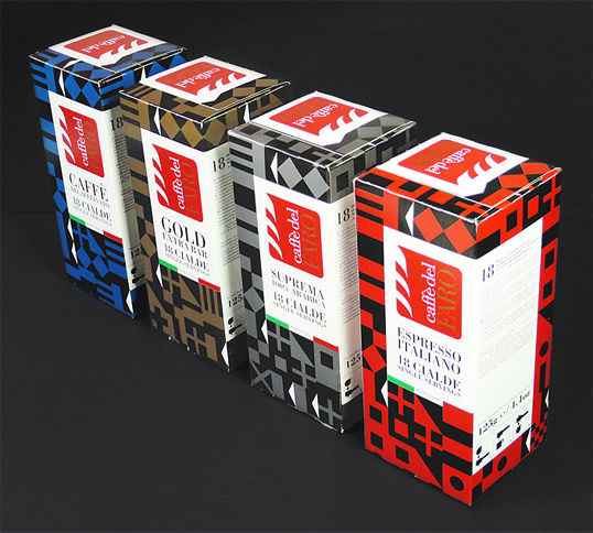
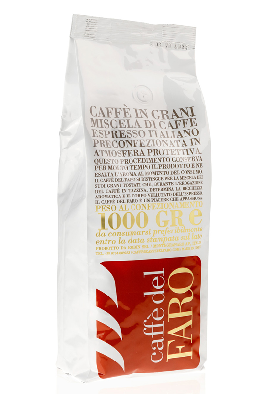
“Iceberg created the corporate identity for “Caffè del faro”. In a successive step, the studio designed two different product lines.  The classic line has a white background where the coffee description becomes the main graphic element.  The top line is based on textures composed by International Marine Signal Flags  (the name “Caffè del faro” means Lighthouse coffee). Using colours and the flags like an alphabet, the studio created the packaging textures, different for every blend.”
faro2

faro3

faro4

faro5

faro6

faro7

faro8

Get the latest packaging design inspiration in your inbox:

Popular designs

Laphroaig’s Wellington Boot-Inspired Gift Packaging Design

Laphroaig leverages story-telling to engage new drinkers, transforming the iconic green wellies into a giftable, reusable packaging for their single malt whisky. The wellie-inspired design disrupts traditional Scotch packaging, adding a playful touch to the brand’s history.

Designed by: PepsiCo Design & Innovation
Country: United States

Caffè del Faro

faro1

faro1

Designed by Iceberg | Country: Italy

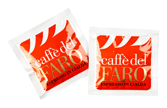
“Iceberg created the corporate identity for “Caffè del faro”. In a successive step, the studio designed two different product lines.  The classic line has a white background where the coffee description becomes the main graphic element.  The top line is based on textures composed by International Marine Signal Flags  (the name “Caffè del faro” means Lighthouse coffee). Using colours and the flags like an alphabet, the studio created the packaging textures, different for every blend.”
faro2

faro3

faro4

faro5

faro6

faro7

faro8

Previous slide
Next slide
Get the latest on packaging design in your inbox: