Designed by: PepsiCo Design & Innovation
Country: United States

Cambrook

Cambrook

Designed by Beeson + Beeson | Country: United Kingdom

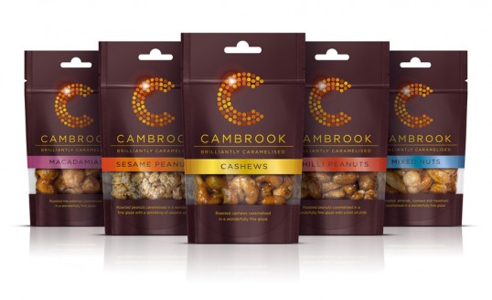
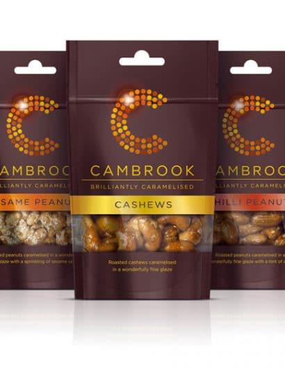
“You could be forgiven for thinking that nuts are nuts. But when we met the team from Cambrook we discovered that nuts can be a work of art. As the original founders of Dormen’s Nuts these guys had learned a thing or two about quality and wanted to launch the ultimate range of caramelised nuts handmade right here in England. 

The thing that struck us immediately about these nuts was their amazing shine. This kind of fine glaze is unlike other caramelised nuts available in the UK and can only be produced using the same gentle panning method that is commonplace on the continent.  

We created the strapline ‘brilliantly caramelised’ to capture the unique shine of the caramel in a very British tone. To bring a little glamour to the otherwise earnest nut aisle our design puts their name in lights, making them famous for their brilliantly caramelised nuts. The dazzling C of Cambrook draws on the ‘brilliance’ of the product to act as an icon for the brand across a range of packaging and other communication.”

Cambrook

Get the latest packaging design inspiration in your inbox:

Popular designs

Designed by: PepsiCo Design & Innovation
Country: United States

Cambrook

lovely-package-cambrook-2

Cambrook

Designed by Beeson + Beeson | Country: United Kingdom

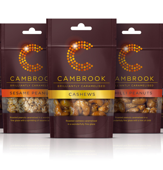
“You could be forgiven for thinking that nuts are nuts. But when we met the team from Cambrook we discovered that nuts can be a work of art. As the original founders of Dormen’s Nuts these guys had learned a thing or two about quality and wanted to launch the ultimate range of caramelised nuts handmade right here in England. 

The thing that struck us immediately about these nuts was their amazing shine. This kind of fine glaze is unlike other caramelised nuts available in the UK and can only be produced using the same gentle panning method that is commonplace on the continent.  

We created the strapline ‘brilliantly caramelised’ to capture the unique shine of the caramel in a very British tone. To bring a little glamour to the otherwise earnest nut aisle our design puts their name in lights, making them famous for their brilliantly caramelised nuts. The dazzling C of Cambrook draws on the ‘brilliance’ of the product to act as an icon for the brand across a range of packaging and other communication.”
Cambrook

Previous slide
Next slide
Get the latest on packaging design in your inbox: