Designed by: PepsiCo Design & Innovation
Country: United States

Camino

Camino

Designed by Karacters Design Group | Country: Canada

“To coincide with a greater availability in stores across Canada, Camino is unveiling a new brand packaging system for its line of premium organic and fair trade products, gradually expanding outside the realm of cocoa and sugar products.

Developed by Karacters Design Group, the brand idea “a joyful food revolution” captures Camino’s belief that through the joy of eating great tasting food made from quality ingredients, people will be encouraged to think differently about their food – where it came from, who made it and what’s in it.

With organic and fair trade products increasingly entering the mainstream, Camino’s refreshed packaging is designed to appeal to the wider demographic who are demanding better food politics.

“Not only has demand increased for organic and fair trade products, but competition has increased dramatically as well,” says Henk van der Molen, chief operating officer, Camino.  “Facing stiff competition from brands owned by large conglomerates, we needed to differentiate ourselves and turned to Karacters to help us express our story.”

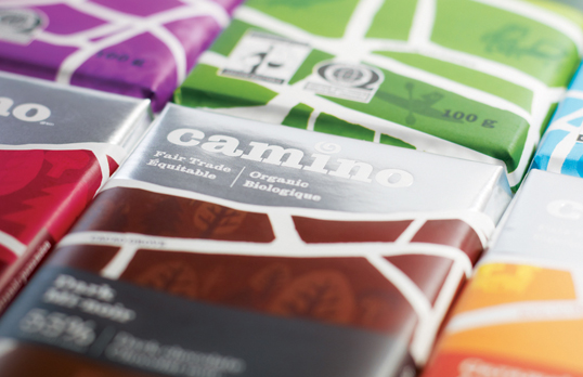
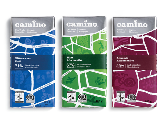
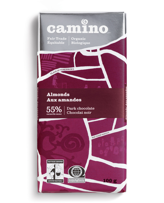
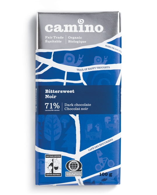
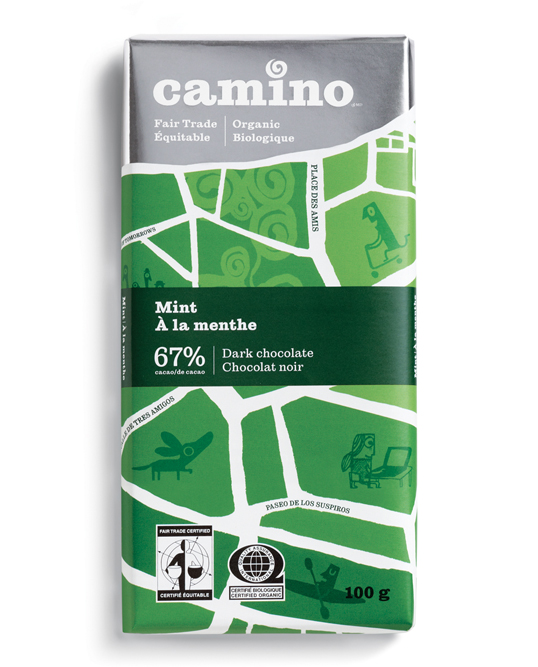
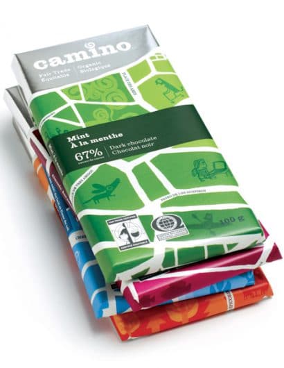
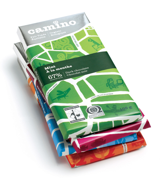
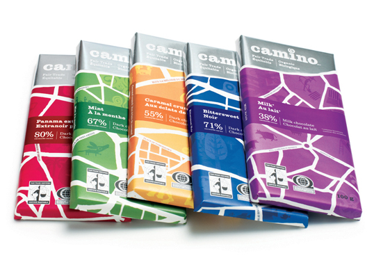
Camino comes from the Spanish word path. Using this as an inspiration, the custom-drawn map used on the bright packaging is filled with quirkily named streets of joy; the illustrations reflect the happy, vibrant and sustainable communities that Camino contributes to through its organic, fair trade, and co-operative partnerships and practices. The creative platform developed by Karacters allows for consistent application across a variety of packaging formats, helping Camino to build strong brand recognition and shelf presence as it expands its product lines to chocolate snack bars, sugars, various baking products and more.

“Camino is a remarkable company that produces great tasting, high quality products that are start-to-finish, top-to-bottom organic fair trade,” says James Bateman, creative director, Karacters Design Group.  “Through a growing range of premium organic, fair trade foods, Camino is doing its part to bring social change to the world.  For their partners, cooperatives of family farmers in Southern countries, they contribute to bringing greater health and prosperity.  For their customers, they bring everyday moments of joy they can feel good about.”

Camino’s new visual identity will be extended to all customer touch points, including a refreshed logo, signage, stationary and website, all timed to coincide with the launch of the new packaging.

The joyful illustrations on Camino’s packaging are by illustrator and fair trade advocate Chris Haughton.”

Camino

Camino

Camino

Camino

Camino

Camino

Get the latest packaging design inspiration in your inbox:

Popular designs

Designed by: PepsiCo Design & Innovation
Country: United States

Camino

camino1

Camino

Designed by Karacters Design Group | Country: Canada

“To coincide with a greater availability in stores across Canada, Camino is unveiling a new brand packaging system for its line of premium organic and fair trade products, gradually expanding outside the realm of cocoa and sugar products.

Developed by Karacters Design Group, the brand idea “a joyful food revolution” captures Camino’s belief that through the joy of eating great tasting food made from quality ingredients, people will be encouraged to think differently about their food – where it came from, who made it and what’s in it.

With organic and fair trade products increasingly entering the mainstream, Camino’s refreshed packaging is designed to appeal to the wider demographic who are demanding better food politics.

“Not only has demand increased for organic and fair trade products, but competition has increased dramatically as well,” says Henk van der Molen, chief operating officer, Camino.  “Facing stiff competition from brands owned by large conglomerates, we needed to differentiate ourselves and turned to Karacters to help us express our story.”

Camino comes from the Spanish word path. Using this as an inspiration, the custom-drawn map used on the bright packaging is filled with quirkily named streets of joy; the illustrations reflect the happy, vibrant and sustainable communities that Camino contributes to through its organic, fair trade, and co-operative partnerships and practices. The creative platform developed by Karacters allows for consistent application across a variety of packaging formats, helping Camino to build strong brand recognition and shelf presence as it expands its product lines to chocolate snack bars, sugars, various baking products and more.

“Camino is a remarkable company that produces great tasting, high quality products that are start-to-finish, top-to-bottom organic fair trade,” says James Bateman, creative director, Karacters Design Group.  “Through a growing range of premium organic, fair trade foods, Camino is doing its part to bring social change to the world.  For their partners, cooperatives of family farmers in Southern countries, they contribute to bringing greater health and prosperity.  For their customers, they bring everyday moments of joy they can feel good about.”

Camino’s new visual identity will be extended to all customer touch points, including a refreshed logo, signage, stationary and website, all timed to coincide with the launch of the new packaging.

The joyful illustrations on Camino’s packaging are by illustrator and fair trade advocate Chris Haughton.”
Camino

Camino

Camino

Camino

Camino

Camino

Previous slide
Next slide
Get the latest on packaging design in your inbox: