Designed by: PepsiCo Design & Innovation
Country: United States

Capriolo

Capriolo

Designed by Family(and friends) | Country: United Kingdom

“Capriolo is a new, luxury brand of authentic Italian first cold pressed extra virgin olive oil.

A limited edition of less than 850 liters, it’s made from a blend of Frantoio, Leccino and Morello olives from the single estate yield of Podere Casone’s grove in the Umbrian countryside.

The Estate owners approached Family (and friends) to help them create a brand identity and packaging design to launch as a product into the UK market. It will be on sale in up-market food halls and delis from  January 2010.

The brief involved finding a name and developing a genuine ‘truth’ for the brand. In an already crowded market of quality oils, impact and ‘storytelling’ needed to be at the forefront of the solution

“We wanted to create a strong story associated with an animal from the region, something that had authenticity and beauty”. Says Alex Durbridge, co founder and creative partner at F&f.

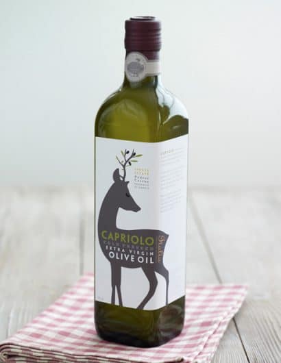
The name Capriolo, Italian for roe deer was chosen with good reason; these elegant creatures roam wild amongst the olive groves, seen fleetingly through the morning mist and acts as a symbol of rarity, freshness and vitality.  We used the deer graphically, but it’s antlers have been magically transformed into living olive branches and its eyes have become glossy olives a to create a something of a mythical beast.”

Get the latest packaging design inspiration in your inbox:

Popular designs

Designed by: PepsiCo Design & Innovation
Country: United States

Capriolo

capriolo

Capriolo

Designed by Family(and friends) | Country: United Kingdom

“Capriolo is a new, luxury brand of authentic Italian first cold pressed extra virgin olive oil.

A limited edition of less than 850 liters, it’s made from a blend of Frantoio, Leccino and Morello olives from the single estate yield of Podere Casone’s grove in the Umbrian countryside.

The Estate owners approached Family (and friends) to help them create a brand identity and packaging design to launch as a product into the UK market. It will be on sale in up-market food halls and delis from  January 2010.

The brief involved finding a name and developing a genuine ‘truth’ for the brand. In an already crowded market of quality oils, impact and ‘storytelling’ needed to be at the forefront of the solution

“We wanted to create a strong story associated with an animal from the region, something that had authenticity and beauty”. Says Alex Durbridge, co founder and creative partner at F&f.

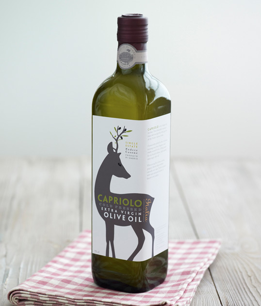
The name Capriolo, Italian for roe deer was chosen with good reason; these elegant creatures roam wild amongst the olive groves, seen fleetingly through the morning mist and acts as a symbol of rarity, freshness and vitality.  We used the deer graphically, but it’s antlers have been magically transformed into living olive branches and its eyes have become glossy olives a to create a something of a mythical beast.”

Explore more great package design

Get the latest on packaging design in your inbox: