Designed by: PepsiCo Design & Innovation
Country: United States

Carpe Diem

lovely-package-carpe-diem-1

Designed by 43’OZ | Country: Moldova

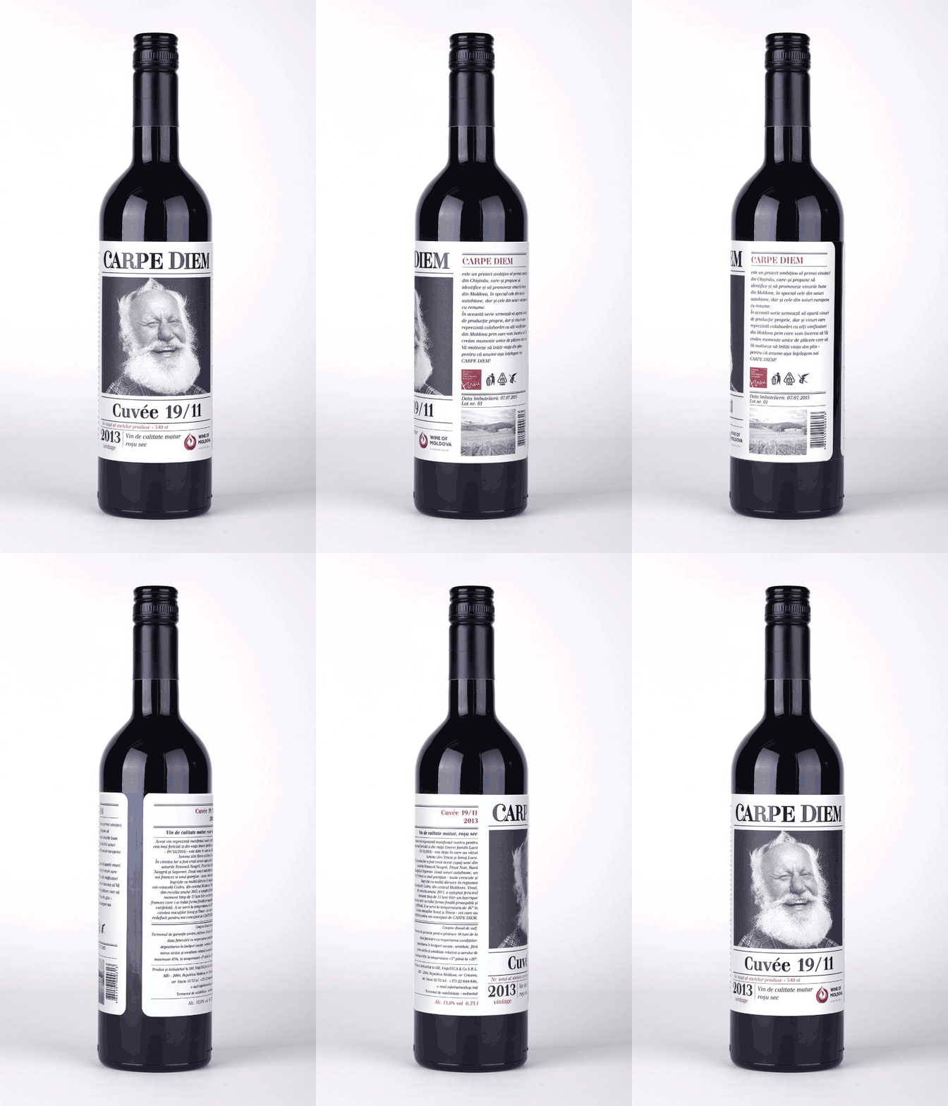
“The target audience of this product became young people who lead an active lifestyle, trend makers, those who live a full life. The customer and the wine author itself were ready for a new, creative approach for a product design, and the client addressed several agencies before settling upon a concept offered by our studio.

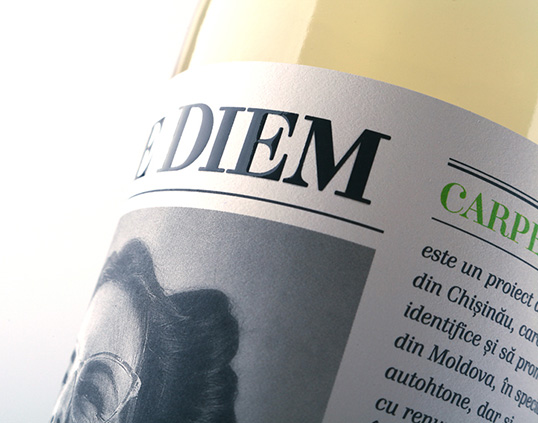
A special thing about the design of Carpe Diem wine is that it’s not created by traditional stereotyped solutions that are usually used for wine labels. At the heart of a design there is expression and emotion which are more important in RTB-factor for the chosen target audience.”
lovely-package-carpe-diem-4 lovely-package-carpe-diem-3 lovely-package-carpe-diem-2

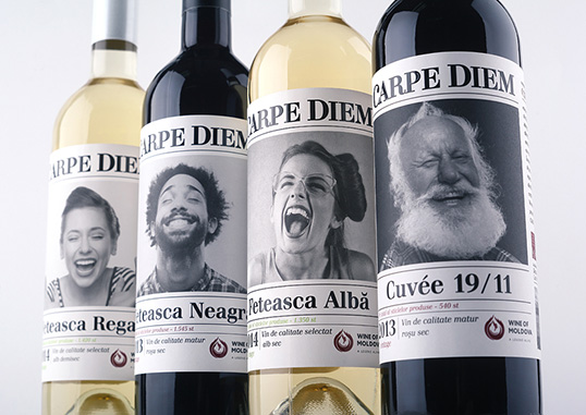
“On the label which surrounds the bottle 360° are people faces like the best emotional indicators. In spite of non-traditional (for market) design stylistics the product looks smoothly on a wine shelf. Label is the base of consumer communication. It is something new on a market and will definitely stand out on a shelf with classic wine.

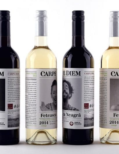
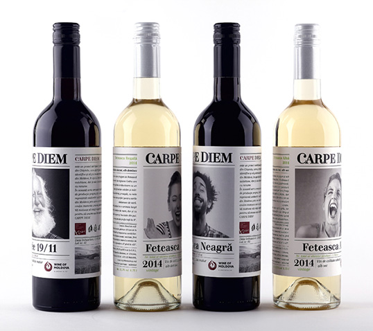
As a result the appearance meets declared requirements – the design conveys disposition and temper that was enclosed in a process of wine creation and the philosophy of its (wine) author. The Carpe Diem wine is presented in 4 SKU’s and can already be found in a same-named wine store. The wine Carpe Diem Feteasca Neagra was awarded a gold medal in a European contest ProWein 2015.”

lovely-package-carpe-diem-7 lovely-package-carpe-diem-5 lovely-package-carpe-diem-6

Get the latest packaging design inspiration in your inbox:

Popular designs

Designed by: PepsiCo Design & Innovation
Country: United States

Carpe Diem

lovely-package-carpe-diem-1

lovely-package-carpe-diem-1

Designed by 43’OZ | Country: Moldova

“The target audience of this product became young people who lead an active lifestyle, trend makers, those who live a full life. The customer and the wine author itself were ready for a new, creative approach for a product design, and the client addressed several agencies before settling upon a concept offered by our studio.

A special thing about the design of Carpe Diem wine is that it’s not created by traditional stereotyped solutions that are usually used for wine labels. At the heart of a design there is expression and emotion which are more important in RTB-factor for the chosen target audience.”
lovely-package-carpe-diem-4 lovely-package-carpe-diem-3 lovely-package-carpe-diem-2

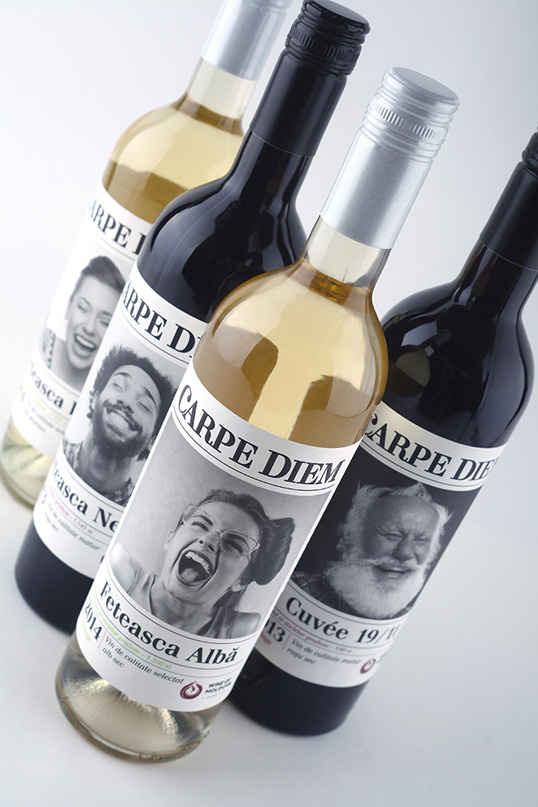
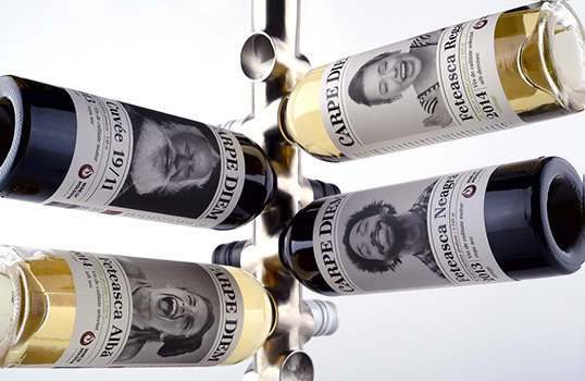
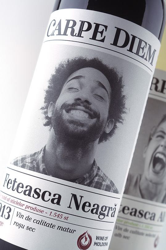
“On the label which surrounds the bottle 360° are people faces like the best emotional indicators. In spite of non-traditional (for market) design stylistics the product looks smoothly on a wine shelf. Label is the base of consumer communication. It is something new on a market and will definitely stand out on a shelf with classic wine.

As a result the appearance meets declared requirements – the design conveys disposition and temper that was enclosed in a process of wine creation and the philosophy of its (wine) author. The Carpe Diem wine is presented in 4 SKU’s and can already be found in a same-named wine store. The wine Carpe Diem Feteasca Neagra was awarded a gold medal in a European contest ProWein 2015.”
lovely-package-carpe-diem-7 lovely-package-carpe-diem-5 lovely-package-carpe-diem-6

Explore more great package design

Get the latest on packaging design in your inbox: