Designed by: PepsiCo Design & Innovation
Country: United States

Catalina Fernandez

Catalina Fernandez

Designed by Anagrama | Country: Mexico

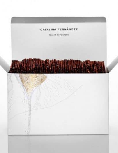
“Catalina Fernandez is your typical home based bakery that started in 1988 and eventually became a successful pastry shop.

Along with the shops growth, came the need to open more branches and to penetrate new generations of potential clients.

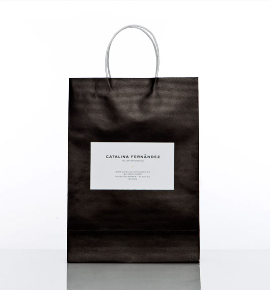
When the client approached us, she told us her desire of upgrading the brand to a much more sophisticated style. Based on these requirement we developed a very elegant identity, with a sans serif typeface to keep the brand neutral and give it a chance to evolve in the long run, with new designs for their packaging and other printed pieces.

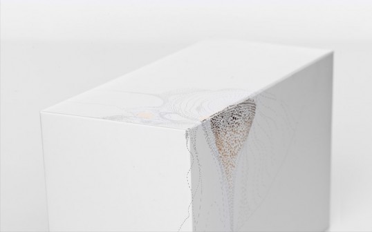
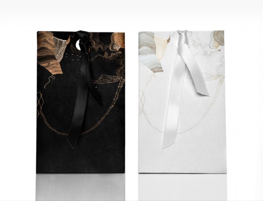
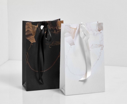
The various boxes and bags were decorated with details in golden foil that, not unlike Catalina’s pastries were, took many hours of attention to detail.”

Catalina Fernandez

Catalina Fernandez

Catalina Fernandez

Catalina Fernandez

Catalina Fernandez

Get the latest packaging design inspiration in your inbox:

Popular designs

Over the wave

This Kombucha originates in Lombok, Indonesia, where its paradise beaches attract hundreds of surfers eager to ride the waves. When you surf,

Far Out Bar

Description: Far Out Bar is a cutting-edge packaging design project created for High Life Farms’ macrodose THC chocolate bars. This project involved

The Port Vodka Lemon Water

Overview: In response to my client’s vision for a Cape Cod themed beverage brand, I embarked on the journey to create The Port

Designed by: PepsiCo Design & Innovation
Country: United States

Catalina Fernandez

lovely-package-catalina-fernandez1

Catalina Fernandez

Designed by Anagrama | Country: Mexico

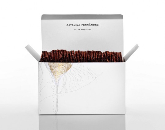
“Catalina Fernandez is your typical home based bakery that started in 1988 and eventually became a successful pastry shop.

Along with the shops growth, came the need to open more branches and to penetrate new generations of potential clients.

When the client approached us, she told us her desire of upgrading the brand to a much more sophisticated style. Based on these requirement we developed a very elegant identity, with a sans serif typeface to keep the brand neutral and give it a chance to evolve in the long run, with new designs for their packaging and other printed pieces.

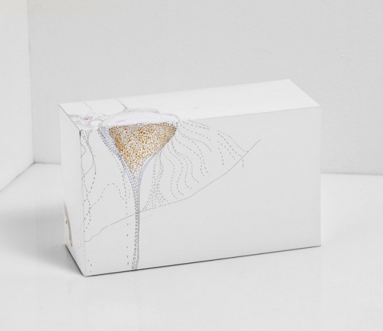
The various boxes and bags were decorated with details in golden foil that, not unlike Catalina’s pastries were, took many hours of attention to detail.”
Catalina Fernandez

Catalina Fernandez

Catalina Fernandez

Catalina Fernandez

Catalina Fernandez

Previous slide
Next slide

Explore more great package design

Get the latest on packaging design in your inbox: