Designed by: PepsiCo Design & Innovation
Country: United States

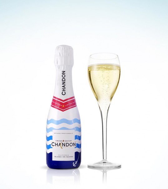
Chandon Summer

Chandon Summer

Designed by ButterlyCannon | Country: United Kingdom

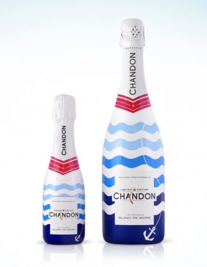
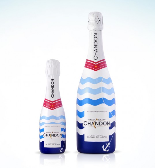
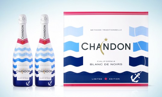
“Building on the success of the past two years, ButterflyCannon, have again been recruited to develop the limited edition packaging for this year’s Chandon Summer program, #ChandonSummer.

The continued success of this annual activity has seen the program successfully rolled out across key global markets, specifically Australia and Asia Pacific. This success has caused the lead (US) brand team to adapt their thinking slightly and aim for the 2014 limited edition to be American Summer inspired with an internationally relevant feel.”

Chandon Summer

“Morgan Robbat, Brand Director of Chandon, says “Our aim with the summer limited edition is to reinforce our position as the refreshing prestige sparkling wine that enhances the fun and casual glamour of summer moments. ButterflyCannon, are our go to agency for packaging design that captures superbly both the essence of the brand and the essence of the occasion, year on year they have produced designs that inspire engaging off pack opportunities during this key selling period.”

Chandon Summer

“We are very proud of the continuing work we are doing with Chandon, the Summer brief is always an exciting and inspiring opportunity; the local yet international bent of this year’s brief added a new layer to the design work and allowed us to think more broadly about how the Chandon consumer experiences summer from a global perspective. The resulting design perfectly balances the unpretentiously chic and vibrant brand personality with an element of summer style and play, the iconography is routed in a summer truth the world over.” Jon Davies, Creative Director and Founder of ButterflyCannon.”

Get the latest packaging design inspiration in your inbox:

Popular designs

Far Out Bar

Description: Far Out Bar is a cutting-edge packaging design project created for High Life Farms’ macrodose THC chocolate bars. This project involved

Tropicana’s Branding & Packaging Redesign by Sunhouse

Tropicana rejuvenates its brand with Sunhouse, blending modern iconicity and heritage. The redesign emphasizes Tropicana’s legacy, highlighting its unique story and craftsmanship, making it stand out as the original, superior orange juice.

Pure Persian Honey

When we look closely at honey packaging, they are almost all in the usual format, and the ultimate in creativity is that

Designed by: PepsiCo Design & Innovation
Country: United States

Chandon Summer

Chandon Summer

Designed by ButterlyCannon | Country: United Kingdom

“Building on the success of the past two years, ButterflyCannon, have again been recruited to develop the limited edition packaging for this year’s Chandon Summer program, #ChandonSummer.

The continued success of this annual activity has seen the program successfully rolled out across key global markets, specifically Australia and Asia Pacific. This success has caused the lead (US) brand team to adapt their thinking slightly and aim for the 2014 limited edition to be American Summer inspired with an internationally relevant feel.”

Chandon Summer

“Morgan Robbat, Brand Director of Chandon, says “Our aim with the summer limited edition is to reinforce our position as the refreshing prestige sparkling wine that enhances the fun and casual glamour of summer moments. ButterflyCannon, are our go to agency for packaging design that captures superbly both the essence of the brand and the essence of the occasion, year on year they have produced designs that inspire engaging off pack opportunities during this key selling period.”

Chandon Summer

“We are very proud of the continuing work we are doing with Chandon, the Summer brief is always an exciting and inspiring opportunity; the local yet international bent of this year’s brief added a new layer to the design work and allowed us to think more broadly about how the Chandon consumer experiences summer from a global perspective. The resulting design perfectly balances the unpretentiously chic and vibrant brand personality with an element of summer style and play, the iconography is routed in a summer truth the world over.” Jon Davies, Creative Director and Founder of ButterflyCannon.”
Previous slide
Next slide
Get the latest on packaging design in your inbox: