Designed by: PepsiCo Design & Innovation
Country: United States

Choxie Signature

choxie

Designed by Target | Country: United States

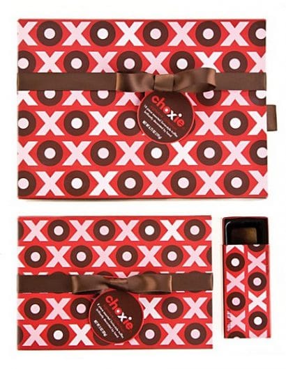
“In order to create a signature packaging system for Target’s private label premium chocolate line, Choxie, we developed a signature line look based on the proprietary ‘OX’ in the existing logotype. The patterning underscores the playful brand look through colors and repeat pattern that was translated to Valentines Day and Winter Holiday signature boxes. Photography emphasizes the richness of the product and unique shape and color of the chocolates.”

Get the latest packaging design inspiration in your inbox:

Popular designs

Rebranding Mayawell: A Blend of Mexican Heritage and Healthy Living

Discover Mayawell, a Mexican-owned beverage company that celebrates its heritage with natural, organic, and prebiotic drinks. The rebranding strikes a balance between traditional elements and contemporary design, offering a unique, healthy alternative to traditional sodas.

Wanderers Vodka: A Blend of Nomadic Heritage and Modern Design

The spirit of freedom and adventure is encapsulated in the design of the Wanderers Vodka. Infused with steppe herbs, the complex flavor and unique aroma transport us straight to the vast plains of the Qazaqstan steppe, where nomad tribes traversed the land for thousands of years, shaping its history.

Art Meets Craftsmanship in BrewBeak Beer Series Packaging Design

“BrewBeak Beer Series Packaging Design artfully fuses craftsmanship and art, reflecting the brand’s philosophy and the beauty of nature. Through minimalist design and bird-themed illustrations, each package uniquely represents different beer varieties, creating a memorable and sophisticated brand identity.”

Designed by: PepsiCo Design & Innovation
Country: United States

Choxie Signature

choxie

choxie

Designed by Target | Country: United States

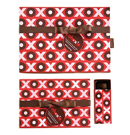
“In order to create a signature packaging system for Target’s private label premium chocolate line, Choxie, we developed a signature line look based on the proprietary ‘OX’ in the existing logotype. The patterning underscores the playful brand look through colors and repeat pattern that was translated to Valentines Day and Winter Holiday signature boxes. Photography emphasizes the richness of the product and unique shape and color of the chocolates.”

Previous slide
Next slide
Get the latest on packaging design in your inbox: