Designed by Cadena+Asoc. Branding | Country: Mexico
CIELITO ® it is a Latin American reinvention of the coffeehouse experience. A place that surprises, comforts and engages all senses through its space, aroma, taste, color, and histories.


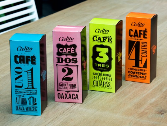
CIELITO ® draws its inspiration from Mexican history: the games, the joyful colors, the language of symbolism, and the illustrated graphics of the late 19th to early 20th century. The Latin American sign maker’s trade, along with the product labels (posters) of the old grocery and general stores, generate a graphic language belonging to a culture that is rich in history, but which is always open to reinvention and to re-positioning itself in the market in a poetic, nostalgic, joyful, dynamic and vastly different way.


With more than 15 locations in Mexico City CIELITO ® rescues the aesthetic value of Latin American folk culture, and reinvents it in a neo-retro style that fuses graphics from colonial times, both Spanish and French, which are evident in its fine use of typography, with modern and 50’s Latin American media like that from the large department stores, whose marketing was also imported from the old continent and the united states, and the contrasting colloquial language of the popular street markets and tiny convenience stores, or “tienditas”.


All of these elements are subtly integrated, creating a very Latin contemporary product with universal appeal.
The concept opens up the possibility of communicating with a broader audience, as it is transformed into a timeless product, which is nurtured by its past but also continually presents itself in new, fresh and attractive ways.”