Designed by Craig Valentino Design | Country: United States
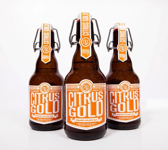
“During the 2014 holiday season, as per tradition, the home brew of Father & Son Brewing Company was created. This year, the name Citrus Gold was given to this orange golden ale, which of course was named after the sweet notes of Belgian orange peel used in the brewing process. The idea was to create a label that was as bright, as bold, and as crisp as the the beer itself, allowing it to accurately represent the brew.
The beer was then bottled using 2 different sizes of swing top bottles and hand-labeled with bright white thick-stock paper. It was then distributed as holiday promotional gifts.”