Designed by: PepsiCo Design & Innovation
Country: United States

Clive’s Organic Dips

Clive's Organic Dips

Designed by Believe In | Country: United Kingdom

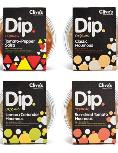
“Our approach was to challenge packaging design in this market, currently saturated with uninspiring health food brands and larger supermarket ‘own label’ varieties who suffer from a lack of personality and brand appeal. Clive’s new range challenges the competition in this area and stands apart from anything else on the market through clear differentiation — in both packaging and product.

“Inspiration came directly from the product itself,” explains Blair Thomson, Creative Director. “The basic hand-drawn elements are abstract expressions of the dips and their ingredients. Bold use of colour and shape differentiates between flavours. The overall result is a striking, distinctive on-shelf presence.”

The actual format of the sleeve was adapted to reveal as much of the content as possible and has been printed onto the reverse of a single sided box board. This gives the outer sleeve a tactile finish which reinforces the organic handmade nature of the product. The pot itself has been sourced from 100% recycled materials and is itself fully recyclable.

“Creating the packaging for this new addition to Clive’s product range has allowed us to further develop the brand — conveying their unique combination of cheeky playfulness and confident sophistication that is otherwise missing from competing brands. The bold graphic identity and punchy colours differentiate beautifully in this niche market.” Blair Thomson.

Clive’s Organic dips have been launched through independent stores, farm shops and other organic food retailers.”

Clive's Organic Dips

Get the latest packaging design inspiration in your inbox:

Popular designs

Designed by: PepsiCo Design & Innovation
Country: United States

Clive’s Organic Dips

dip4

Clive's Organic Dips

Designed by Believe In | Country: United Kingdom

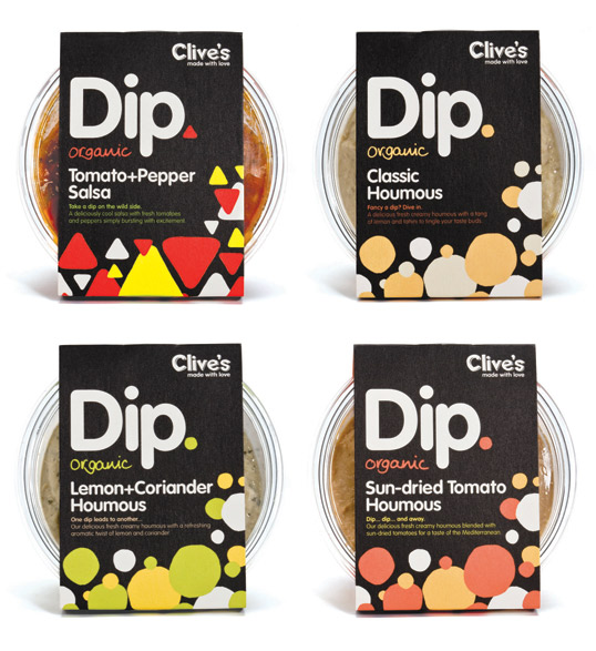
“Our approach was to challenge packaging design in this market, currently saturated with uninspiring health food brands and larger supermarket ‘own label’ varieties who suffer from a lack of personality and brand appeal. Clive’s new range challenges the competition in this area and stands apart from anything else on the market through clear differentiation — in both packaging and product.

“Inspiration came directly from the product itself,” explains Blair Thomson, Creative Director. “The basic hand-drawn elements are abstract expressions of the dips and their ingredients. Bold use of colour and shape differentiates between flavours. The overall result is a striking, distinctive on-shelf presence.”

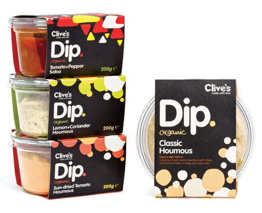
The actual format of the sleeve was adapted to reveal as much of the content as possible and has been printed onto the reverse of a single sided box board. This gives the outer sleeve a tactile finish which reinforces the organic handmade nature of the product. The pot itself has been sourced from 100% recycled materials and is itself fully recyclable.

“Creating the packaging for this new addition to Clive’s product range has allowed us to further develop the brand — conveying their unique combination of cheeky playfulness and confident sophistication that is otherwise missing from competing brands. The bold graphic identity and punchy colours differentiate beautifully in this niche market.” Blair Thomson.

Clive’s Organic dips have been launched through independent stores, farm shops and other organic food retailers.”
Clive's Organic Dips

Previous slide
Next slide
Get the latest on packaging design in your inbox: