Designed by: PepsiCo Design & Innovation
Country: United States

Colourless Coke Can

colourless1

Designed by Ryan Yoon & Harc Lee | Country: United States

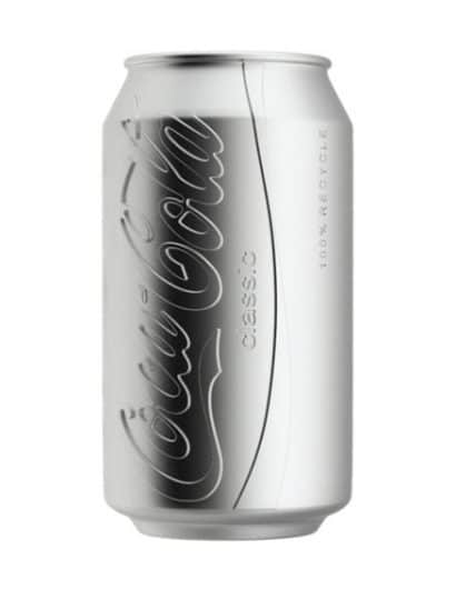
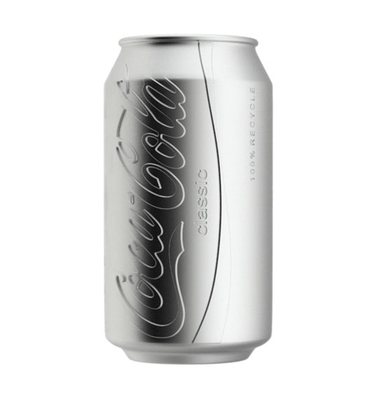
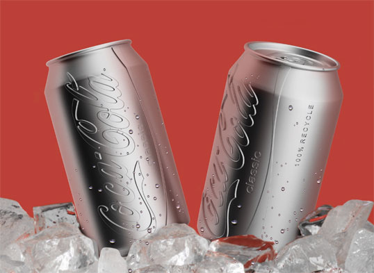
A conceptual package design, which at this time is unaffiliated with Coca Cola, created to drastically reduce the cost of both initial manufacturing and recycling.

“A convex logo substitutes colorfully sprayed can. Naked can help to reduce air and water pollution occurred in its coloring process. It also reduces energy and effort to separate toxic color paint from aluminum in recycling process. Huge amount of energy and paint required to manufacture colored cans will be saved. Instead of toxic paint, manufacturers process aluminum with a pressing machine that indicates brand identity on surface.”
colourless2

Get the latest packaging design inspiration in your inbox:

Popular designs

Over the wave

This Kombucha originates in Lombok, Indonesia, where its paradise beaches attract hundreds of surfers eager to ride the waves. When you surf,

Pure Persian Honey

When we look closely at honey packaging, they are almost all in the usual format, and the ultimate in creativity is that

Far Out Bar

Description: Far Out Bar is a cutting-edge packaging design project created for High Life Farms’ macrodose THC chocolate bars. This project involved

Designed by: PepsiCo Design & Innovation
Country: United States

Colourless Coke Can

colourless1

colourless1

Designed by Ryan Yoon & Harc Lee | Country: United States

A conceptual package design, which at this time is unaffiliated with Coca Cola, created to drastically reduce the cost of both initial manufacturing and recycling.

“A convex logo substitutes colorfully sprayed can. Naked can help to reduce air and water pollution occurred in its coloring process. It also reduces energy and effort to separate toxic color paint from aluminum in recycling process. Huge amount of energy and paint required to manufacture colored cans will be saved. Instead of toxic paint, manufacturers process aluminum with a pressing machine that indicates brand identity on surface.”

colourless2

Previous slide
Next slide

Explore more great package design

Get the latest on packaging design in your inbox: