Designed by: PepsiCo Design & Innovation
Country: United States

Coma

Coma

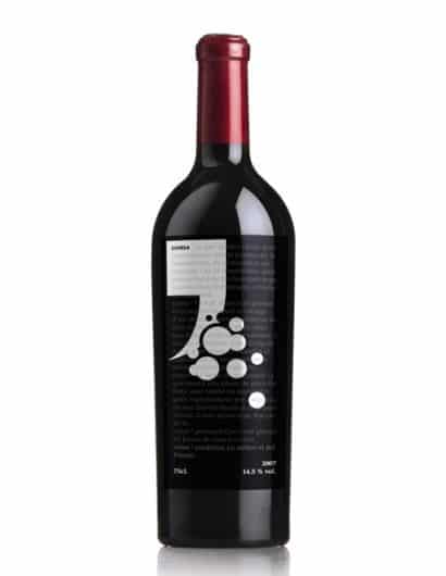
Designed by Andreu Zaragoza | Country: Spain

The simple, bold coma graphic and circular shapes set against the (from what my limited Spanish can tell) screened back dictionary definition of a coma create this unique looking wine label. This is a great example of one colour design done right.

Get the latest packaging design inspiration in your inbox:

Popular designs

The Bra Guru

Most women are wearing the wrong size bra and that is a fact. The Bra Guru® is the first and only professional

The Port Vodka Lemon Water

Overview: In response to my client’s vision for a Cape Cod themed beverage brand, I embarked on the journey to create The Port

Designed by: PepsiCo Design & Innovation
Country: United States

Coma

coma

Coma

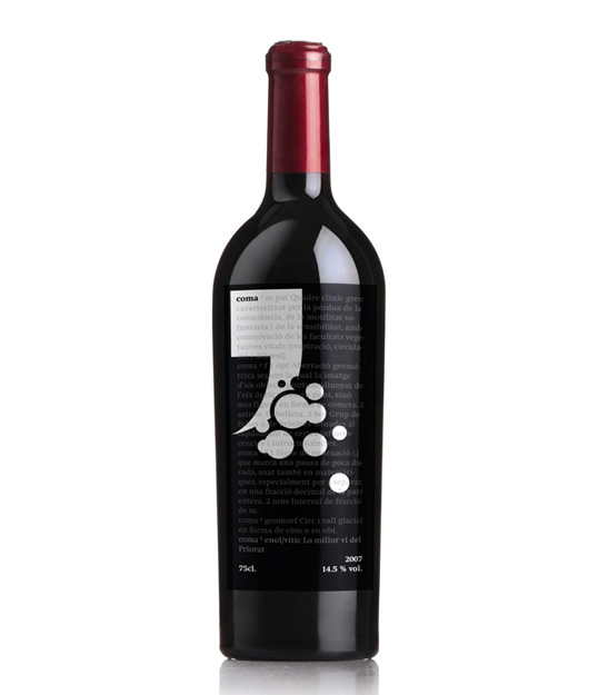
Designed by Andreu Zaragoza | Country: Spain

The simple, bold coma graphic and circular shapes set against the (from what my limited Spanish can tell) screened back dictionary definition of a coma create this unique looking wine label. This is a great example of one colour design done right.

Previous slide
Next slide

Explore more great package design

Get the latest on packaging design in your inbox: