Designed by: PepsiCo Design & Innovation
Country: United States

Commodore’s London Dry Gin Packaging Design

Designed by: C. Carbon Studio | Country: Portugal

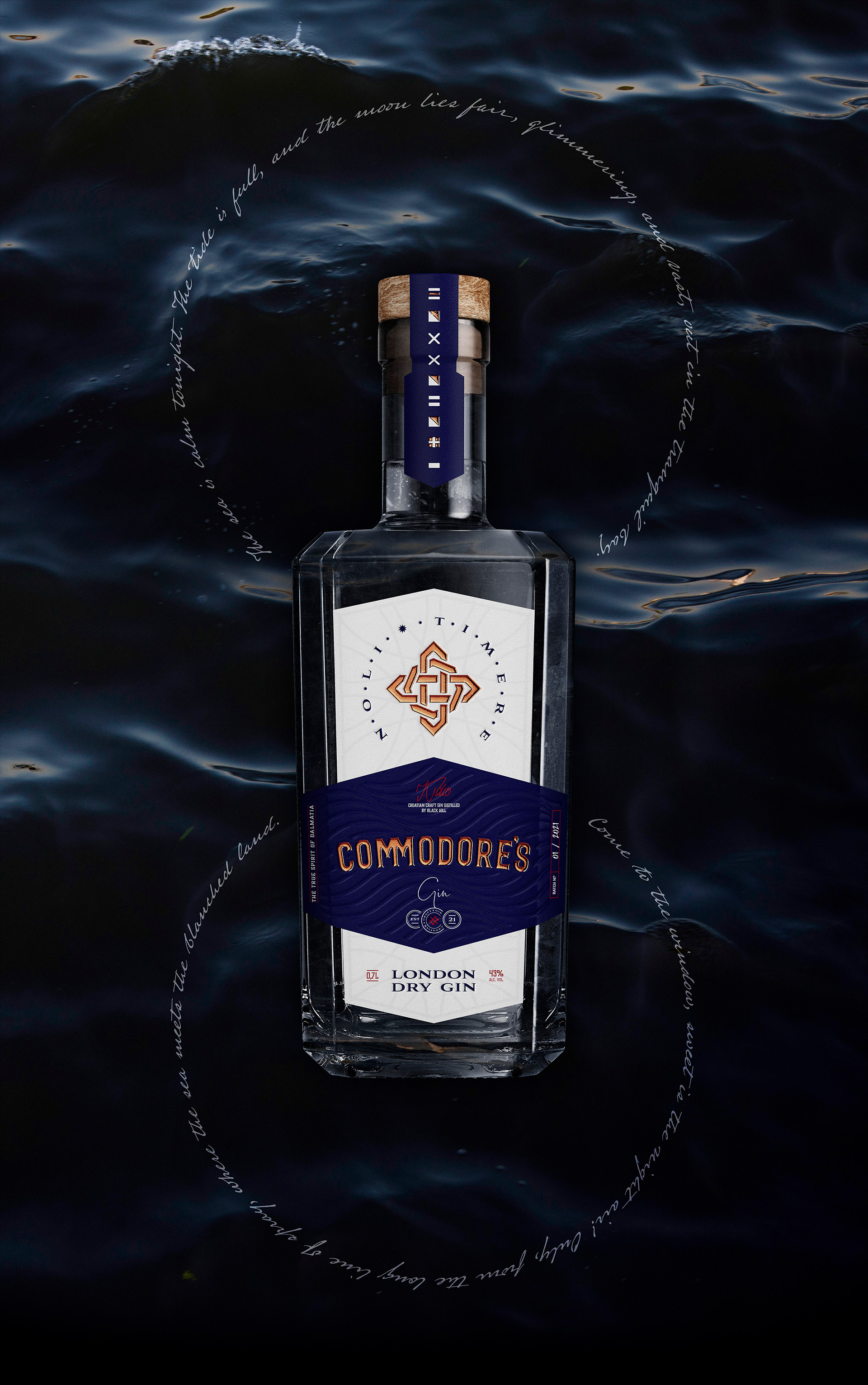
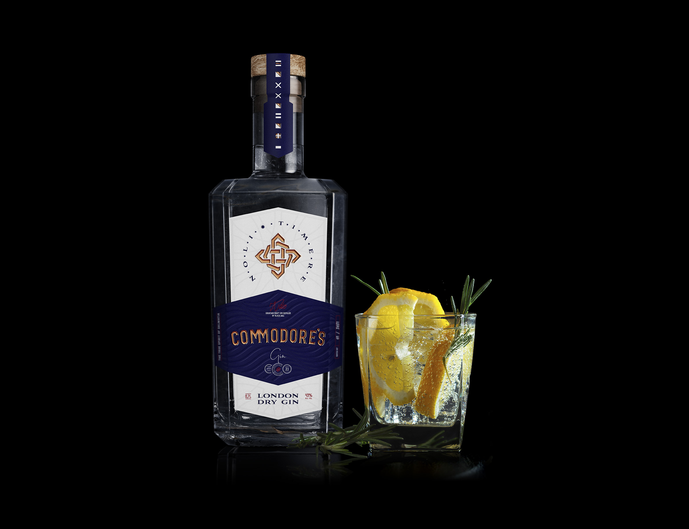
Commodore’s Gin is made in Croatia using a refined formula. The flavors of pine wood forest bursts into the mouth, but once you let it settle, you get a hint of citrus that lingers long after you’ve had the drink.

The prologue to the Gin aptly puts it the following way:

Commodore’s Gin is not fancy or a myth, it’s a true story of bravery and about how strong a man’s heart can be who has the sea for his home, refuge, and fortress.

Commodore’s London Dry Gin Packaging Design

The packaging

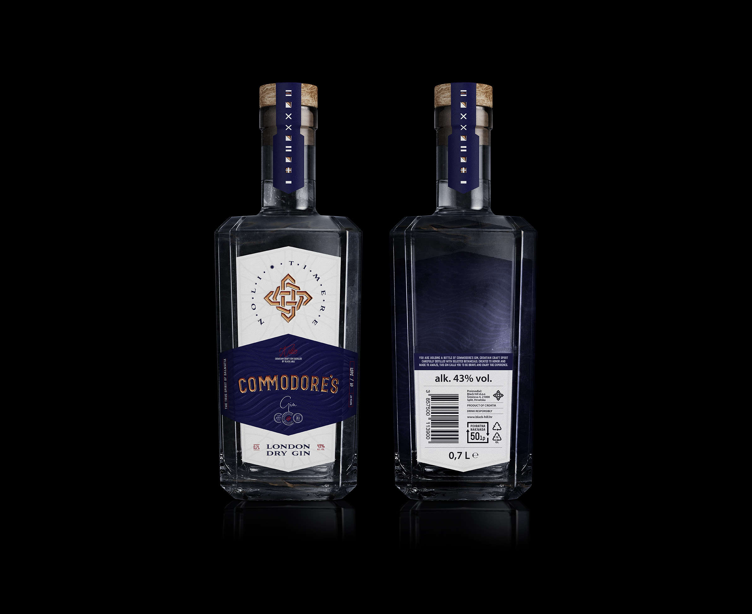
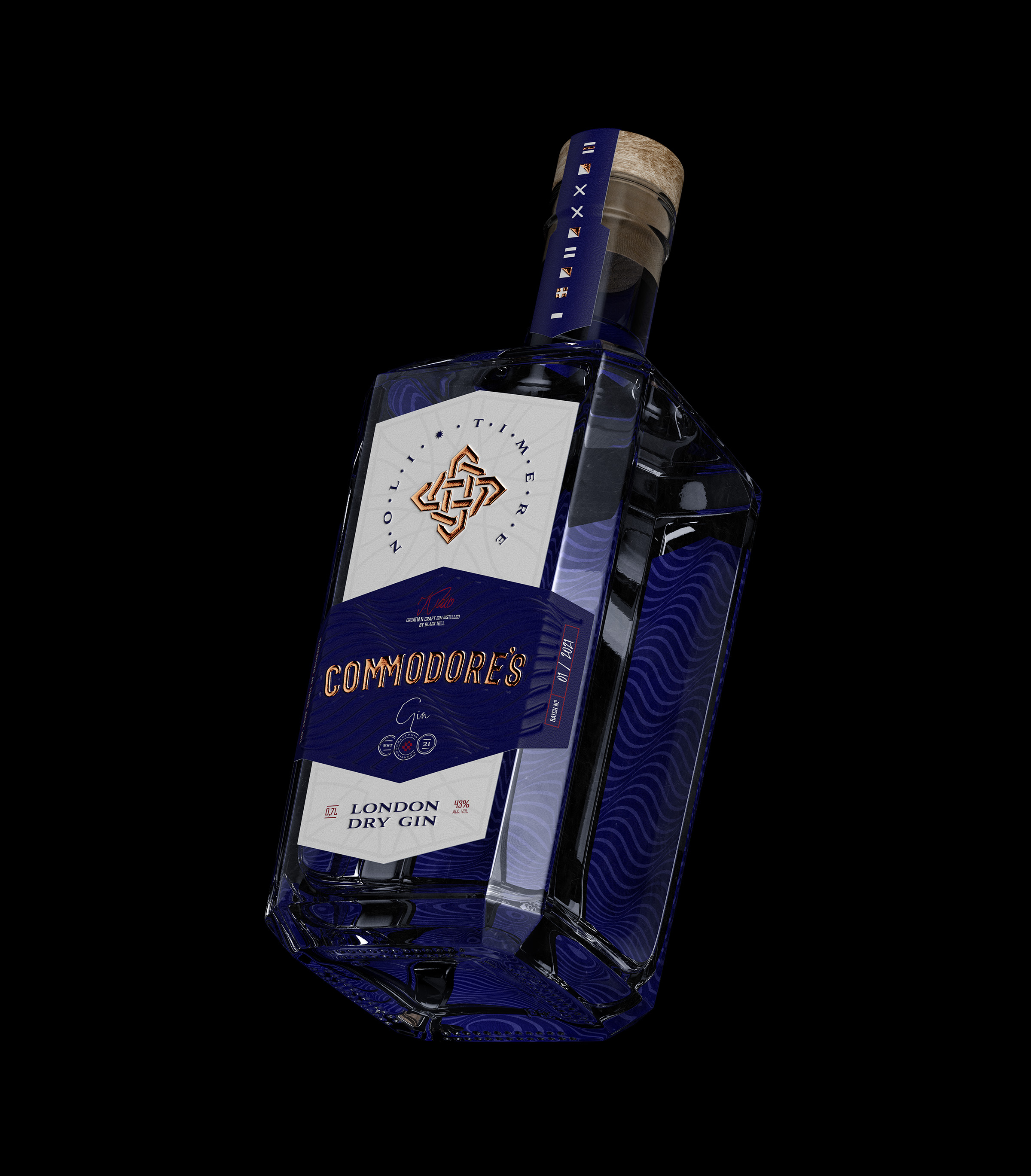
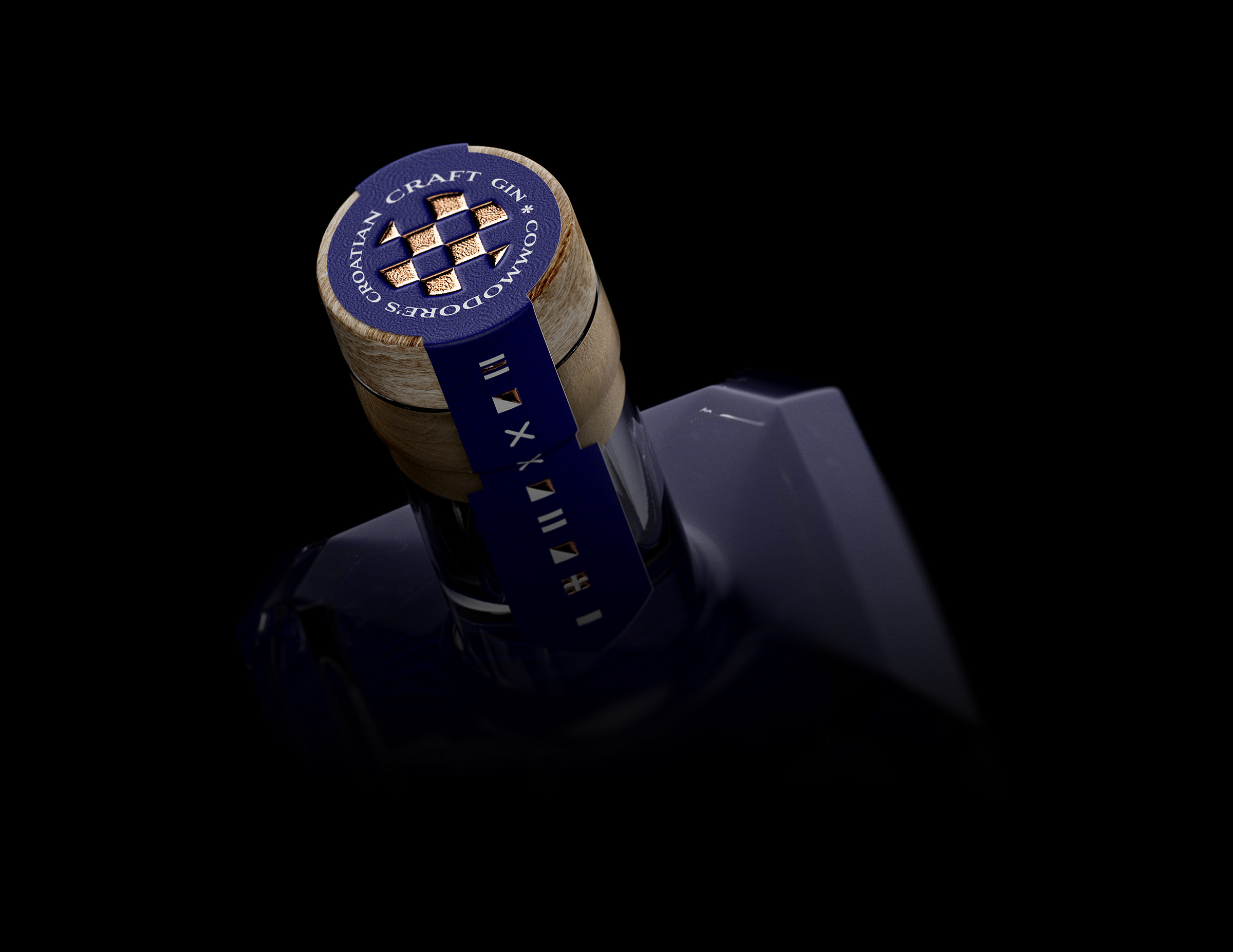
Inspired by the Nautical universe, C. Carbon Studio, a Guimarães-based design agency, used some enigmatic symbols and straight lines which lead the audience to the sea. Nautical flags and Commodore’s rank seal on the packaging transport the audience to the oceans and the beautiful blues skies above.

“Nautical flags aim to provide ways and means of communication in situations related to the safety of navigation and persons, being an international code system used for a boat to signal to shore or for two boats to signal to each other.

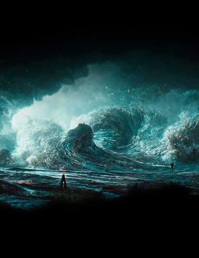
“The sea is calm tonight. The tide is full, the moon lies fair, upon the straits; on the French coast the light. Gleams and is gone; the cliffs stand, glimmering and vast, out in the tranquil bay. Come to the window, sweet is the night air!

Only, from the long line of spray, where the sea meets the moon-blanched land, listen! You hear the grating roar of pebbles which the waves draw back, and fling, at their return, up the high strand. Begin, and cease, and then again begin. With tremulous cadence slow, and bring the eternal note of sadness in.

Sophocles long ago heard it on the Ægean, and it brought into his mind the turbid ebb and flow of human misery; We find also in the sound a thought. Hearing it by this distant northern sea.

The sea of faith, was once, too, at the full, and round earth’s shore lay like the folds of a bright girdle furled. But now I only hear its melancholy, long, withdrawing roar, retreating, to the breath of the night wind, down the vast edges of drear and naked shingles of the world.”

Dover Beach by Matthew Arnold

Get the latest packaging design inspiration in your inbox:

Popular designs

Tropicana’s Branding & Packaging Redesign by Sunhouse

Tropicana rejuvenates its brand with Sunhouse, blending modern iconicity and heritage. The redesign emphasizes Tropicana’s legacy, highlighting its unique story and craftsmanship, making it stand out as the original, superior orange juice.

Designed by: PepsiCo Design & Innovation
Country: United States

Commodore’s London Dry Gin Packaging Design

2-low

Designed by: C. Carbon Studio | Country: Portugal

Commodore’s Gin is made in Croatia using a refined formula. The flavors of pine wood forest bursts into the mouth, but once you let it settle, you get a hint of citrus that lingers long after you’ve had the drink.

The prologue to the Gin aptly puts it the following way:

Commodore’s Gin is not fancy or a myth, it’s a true story of bravery and about how strong a man’s heart can be who has the sea for his home, refuge, and fortress.

Commodore’s London Dry Gin Packaging Design

The packaging

Inspired by the Nautical universe, C. Carbon Studio, a Guimarães-based design agency, used some enigmatic symbols and straight lines which lead the audience to the sea. Nautical flags and Commodore’s rank seal on the packaging transport the audience to the oceans and the beautiful blues skies above.

“Nautical flags aim to provide ways and means of communication in situations related to the safety of navigation and persons, being an international code system used for a boat to signal to shore or for two boats to signal to each other.

“The sea is calm tonight. The tide is full, the moon lies fair, upon the straits; on the French coast the light. Gleams and is gone; the cliffs stand, glimmering and vast, out in the tranquil bay. Come to the window, sweet is the night air!

Only, from the long line of spray, where the sea meets the moon-blanched land, listen! You hear the grating roar of pebbles which the waves draw back, and fling, at their return, up the high strand. Begin, and cease, and then again begin. With tremulous cadence slow, and bring the eternal note of sadness in.

Sophocles long ago heard it on the Ægean, and it brought into his mind the turbid ebb and flow of human misery; We find also in the sound a thought. Hearing it by this distant northern sea.

The sea of faith, was once, too, at the full, and round earth’s shore lay like the folds of a bright girdle furled. But now I only hear its melancholy, long, withdrawing roar, retreating, to the breath of the night wind, down the vast edges of drear and naked shingles of the world.”

Dover Beach by Matthew Arnold

Previous slide
Next slide
Get the latest on packaging design in your inbox: