Designed by: PepsiCo Design & Innovation
Country: United States

Comtech

Comtech

Designed by ONY | Country: Russia

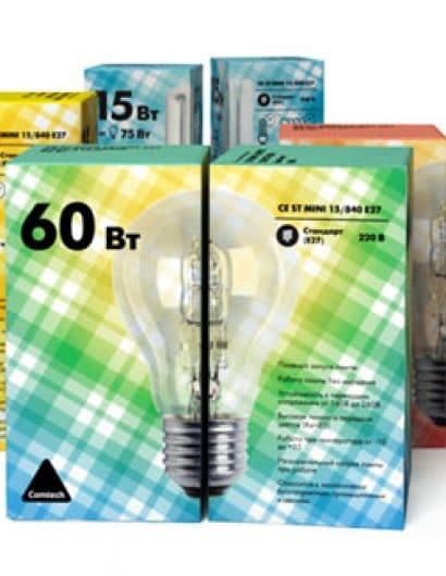
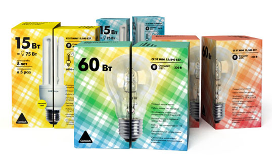
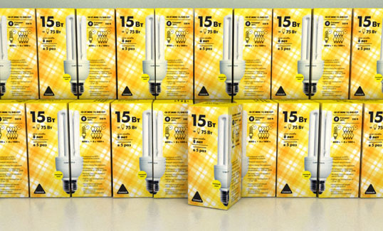
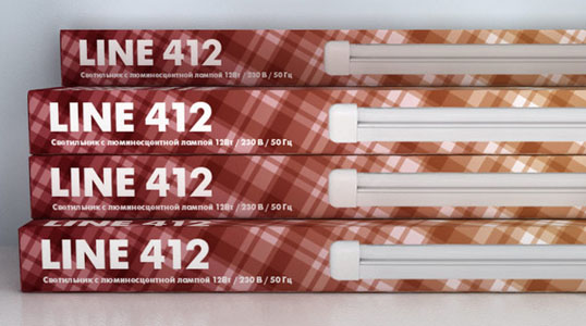
“Main corporate element is checkers design. Repeating pattern draws one’s attention and is quite notable among solid colors on other producer’s packages. It is easy to-replicate on any bearers and formats. Checkers bring emotional note in package design. Usually lamp packages are either aggressive bright or high-tech cold. Textile checkers pattern is more friendly and humane, it has some home comfort sense.

In addition, a lamp image is placed in the corner for some symmetrical lamps. So you can make a whole image placing two neighbor sides of lamp packages. This brings some game aspect into package design making it more interesting and attractive.”
Comtech

Comtech

Get the latest packaging design inspiration in your inbox:

Popular designs

Burma Love Rebrand

Love at First BiteAs an extension of the Burma Superstar restaurant in San Francisco, Burma Love Foods gives diners an opportunity to

Far Out Bar

Description: Far Out Bar is a cutting-edge packaging design project created for High Life Farms’ macrodose THC chocolate bars. This project involved

Over the wave

This Kombucha originates in Lombok, Indonesia, where its paradise beaches attract hundreds of surfers eager to ride the waves. When you surf,

Pure Persian Honey

When we look closely at honey packaging, they are almost all in the usual format, and the ultimate in creativity is that

Designed by: PepsiCo Design & Innovation
Country: United States

Comtech

comtech1

Comtech

Designed by ONY | Country: Russia

“Main corporate element is checkers design. Repeating pattern draws one’s attention and is quite notable among solid colors on other producer’s packages. It is easy to-replicate on any bearers and formats. Checkers bring emotional note in package design. Usually lamp packages are either aggressive bright or high-tech cold. Textile checkers pattern is more friendly and humane, it has some home comfort sense.

In addition, a lamp image is placed in the corner for some symmetrical lamps. So you can make a whole image placing two neighbor sides of lamp packages. This brings some game aspect into package design making it more interesting and attractive.”

Comtech

Comtech

Previous slide
Next slide

Explore more great package design

Get the latest on packaging design in your inbox: