Designed by: PepsiCo Design & Innovation
Country: United States

Conker Spirit

lovely-package-conker-spirit-5

Designed by Interbang | Country: United Kingdom

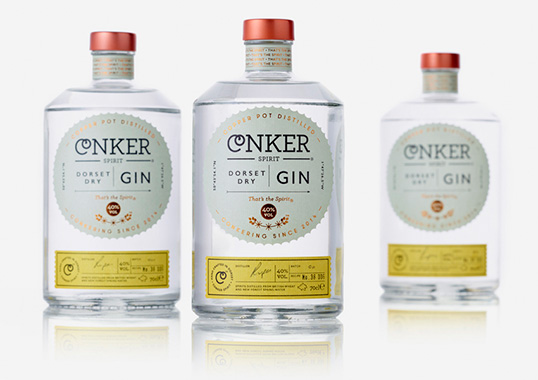
“Interabang have just completed work on the brand and packaging for Dorset’s first gin distillery – Conker Spirit – after being approached by the founder Rupert Holloway.

Free from the constraints of tradition Conker are in pursuit of the new and exciting, with a ruthless focus on quality, and they wanted their bottle to reflect this.

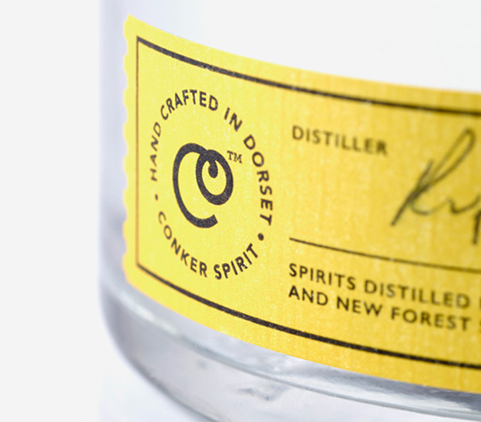
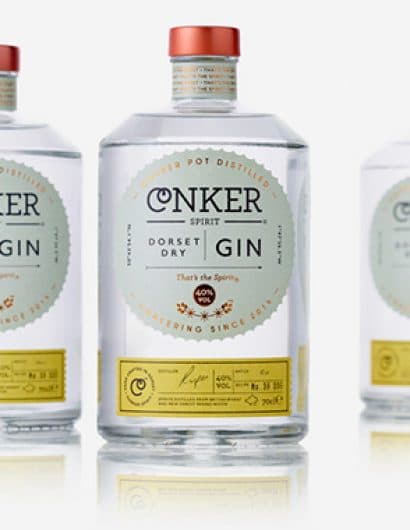
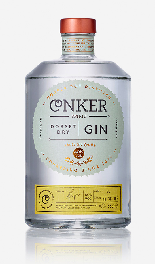
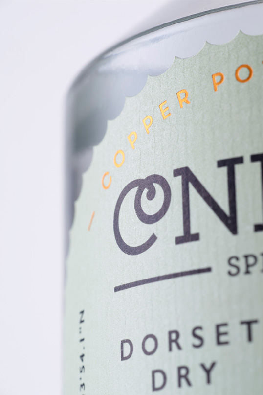
Design cues were taken from the name, which inspired the shell-like shape of the main label. The name also led to the ‘CO’ ligature in the word marque (a graphic conker on a string), which is used as a visual shorthand for the brand.

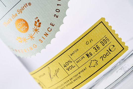
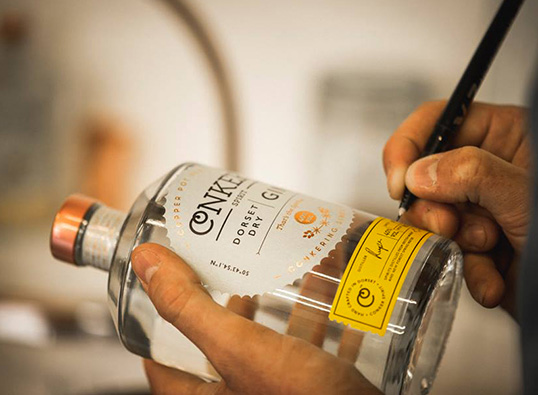
Dorset is key to Conker. As well as the location for the distillery, the gin uses New Forest spring water and botanicals unique to the area such as handpicked gorse flowers (which influenced the distinctive yellow colour of the batch label). Inspired by the coast, we looked to the typography of vintage railway signs, tickets and posters to evoke the nostalgia of trips to the seaside, and the bottle itself was chosen for its nautical feel.

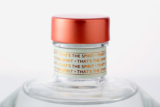
Copper foil blocked accents were used, as well as a copper lid, to reflect the traditional copper pot distilling process.”
lovely-package-conker-spirit-7 lovely-package-conker-spirit-4 lovely-package-conker-spirit-1 lovely-package-conker-spirit-2 lovely-package-conker-spirit-3 lovely-package-conker-spirit-6

Get the latest packaging design inspiration in your inbox:

Popular designs

Designed by: PepsiCo Design & Innovation
Country: United States

Conker Spirit

lovely-package-conker-spirit-5

lovely-package-conker-spirit-5

Designed by Interbang | Country: United Kingdom

“Interabang have just completed work on the brand and packaging for Dorset’s first gin distillery – Conker Spirit – after being approached by the founder Rupert Holloway.

Free from the constraints of tradition Conker are in pursuit of the new and exciting, with a ruthless focus on quality, and they wanted their bottle to reflect this.

Design cues were taken from the name, which inspired the shell-like shape of the main label. The name also led to the ‘CO’ ligature in the word marque (a graphic conker on a string), which is used as a visual shorthand for the brand.

Dorset is key to Conker. As well as the location for the distillery, the gin uses New Forest spring water and botanicals unique to the area such as handpicked gorse flowers (which influenced the distinctive yellow colour of the batch label). Inspired by the coast, we looked to the typography of vintage railway signs, tickets and posters to evoke the nostalgia of trips to the seaside, and the bottle itself was chosen for its nautical feel.

Copper foil blocked accents were used, as well as a copper lid, to reflect the traditional copper pot distilling process.”
lovely-package-conker-spirit-7 lovely-package-conker-spirit-4 lovely-package-conker-spirit-1 lovely-package-conker-spirit-2 lovely-package-conker-spirit-3 lovely-package-conker-spirit-6

Previous slide
Next slide
Get the latest on packaging design in your inbox: