Designed by Bless | Country: United Kingdom
“Bless has just completed the new branding for London based Cool Chile Co. one of the first companies to supply Mexican dried chillies and fresh corn tortillas to the UK.
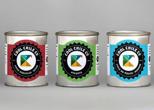
Cool Chile wanted to continue using a snake as their brand icon as they had been using a clipart version for over a decade, so our first task was to create one that would be more ownable and distinctive. The new snake and branding were inspired by geometric Aztec shapes and rich Mexican colours. The four main colours reflect the companies four main store categories, red for chillies, yellow for corn products, green for herbs and blue for spices and store cupboard items. More than 60 items were colour coded, with an individual shade being selected for each product type, this resulted in over ten different reds for the chilli section alone.
Cool Chile now have an identity that is simple, iconic and helps them stand out from their competitors.”