Designed by: PepsiCo Design & Innovation
Country: United States

Courthouse Brewery

Courthouse Brewery

Designed by Timothy Batterham | Country: Australia

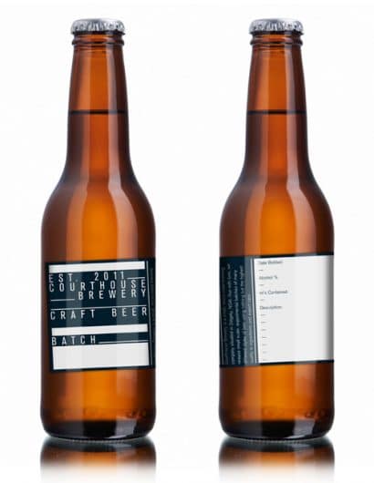
“Courthouse Brewery is an extremely small, family run brewery run out of the old Courthouse situated in Dalgety, NSW. While currently only brewing reasonably small batches for distribution amongst family and friends, the brewery has the capabilities of brewing on a far larger scale for commercial sale. The brewery wanted to create branding that could be used across all of their products as a generic label for the beer they brewed.

My solution was some branding that was, for convenience, printed on packaging tape, and could be cut and fitted to the individual bottles or to boxes of the beer for storage or distribution. I designed a generic label that could be used across all of their different brews and filled in individually or with another label in case they ever felt the need for the extra information for sale or storage purposes.

The branding concept was designed to communicate the same “fill in the blanks” idea that the labels were based on. This idea also communicated the kind of personal attention given to each batch of beer they make and shows the personal love and care this family has for their brewing.”

Get the latest packaging design inspiration in your inbox:

Popular designs

Designed by: PepsiCo Design & Innovation
Country: United States

Courthouse Brewery

courthouse

Courthouse Brewery

Designed by Timothy Batterham | Country: Australia

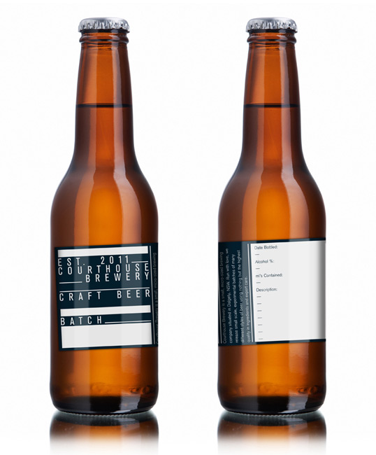
“Courthouse Brewery is an extremely small, family run brewery run out of the old Courthouse situated in Dalgety, NSW. While currently only brewing reasonably small batches for distribution amongst family and friends, the brewery has the capabilities of brewing on a far larger scale for commercial sale. The brewery wanted to create branding that could be used across all of their products as a generic label for the beer they brewed.

My solution was some branding that was, for convenience, printed on packaging tape, and could be cut and fitted to the individual bottles or to boxes of the beer for storage or distribution. I designed a generic label that could be used across all of their different brews and filled in individually or with another label in case they ever felt the need for the extra information for sale or storage purposes.

The branding concept was designed to communicate the same “fill in the blanks” idea that the labels were based on. This idea also communicated the kind of personal attention given to each batch of beer they make and shows the personal love and care this family has for their brewing.”

Explore more great package design

Get the latest on packaging design in your inbox: