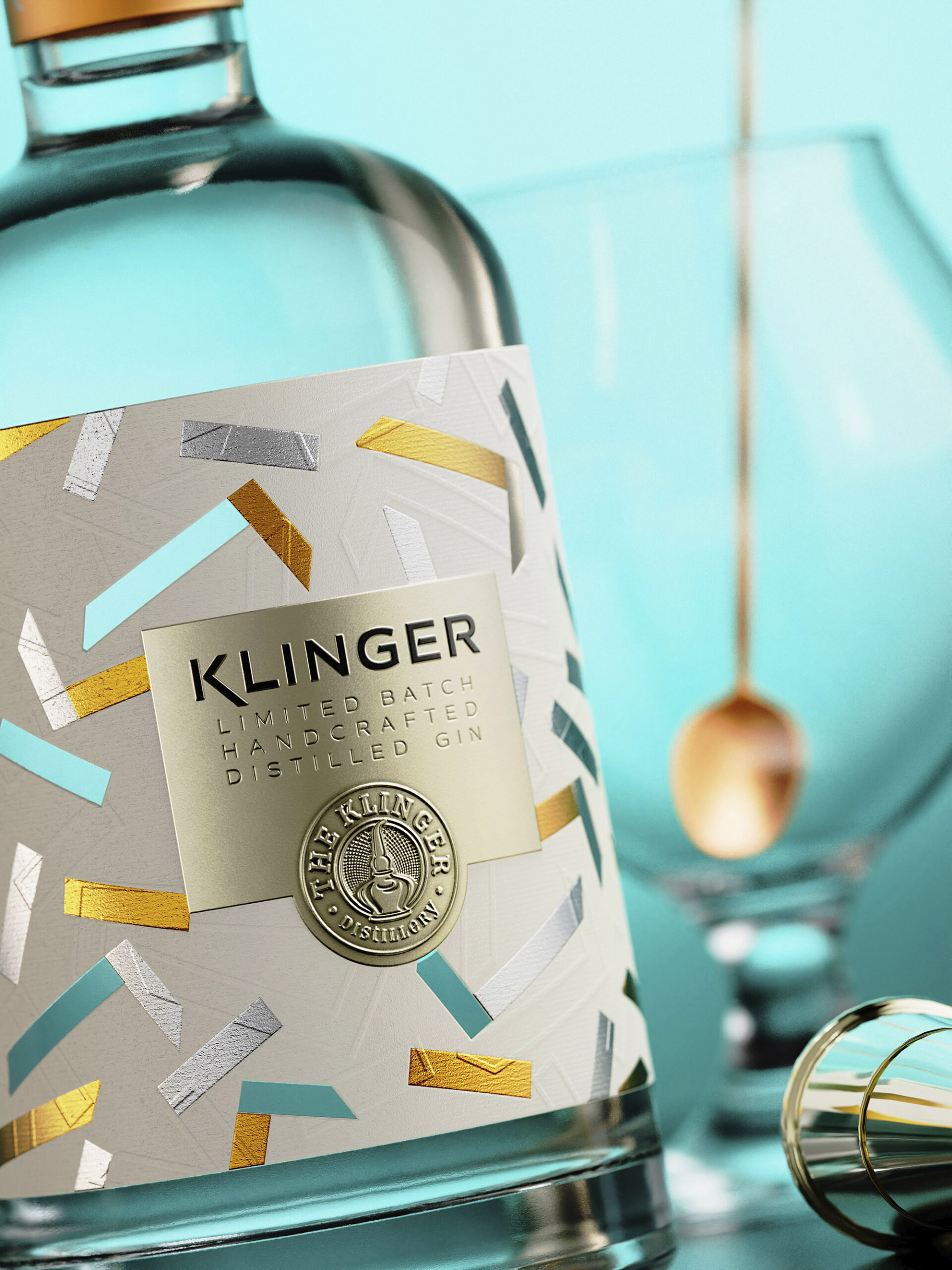
The heart of the recent venture was the creation of a distinctive new logo, inspired by the iconic copper Alembic stills of Klinger Distillery. This simple but potent symbol became the pulse of the label, encapsulating the essence of tradition and craftsmanship.
The gin bottle, a beautiful blend of contemporary style and vintage elegance, became the canvas for this visual narrative. This vessel not only contains the spirit within but also reflects the craftsmanship at every glance.
The label presents an audacious twist with a chic, ultra-modern, see-through design. An artistic pattern, derived from randomly scattered ‘K’ letters representing Klinger, is a delightful twist, allowing glimpses through cuts in the paper, creating an interactive experience with the glass beneath.
Adorning the label’s surface are embossed outlined ‘K’ letters, orchestrating an intricate dance with the foiled elements and the strategically placed cutouts. The richness of silver and gold hot foils adds a luxurious shimmer to the pattern of this gin label design.
The choice of heavy stock paper with an elegant linear texture for the bottom layer, and embossed and debossed solid aluminum foil as the top layer, results in a fusion of materials for the gin label. This harmonious blend creates an attractive, tactile design that is both minimalist and modern.
In the realm of gin label design, this creation encapsulates a minimalist ethos with a fancy, joyful twist. The label is a celebration of simplicity with an intricate pattern, a visual feast for those who appreciate the marriage of subtlety and flair.
This limited edition gin label design is a testament to meticulous craftsmanship, brought to life by Dagaprint.com in a small run, enhancing the exclusivity and uniqueness of each bottle.
The final touch is the metallic copper matte capsule, proudly bearing an embossed logo. This crowning element adds a premium and bold finish, signifying the exceptional quality within.