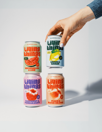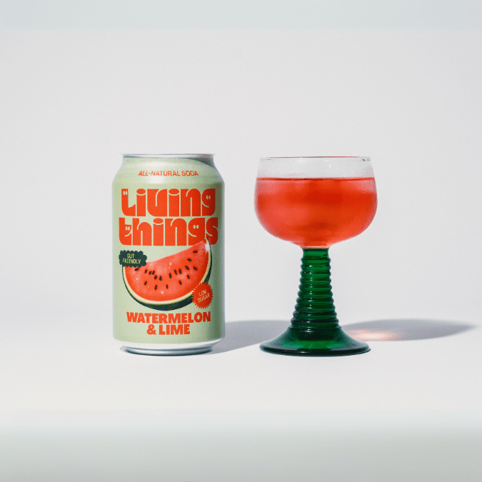
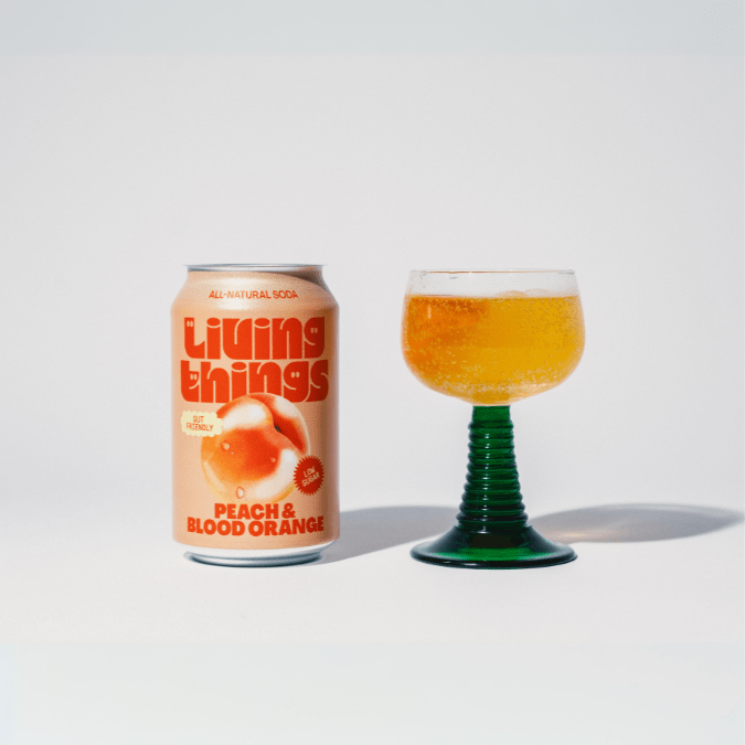
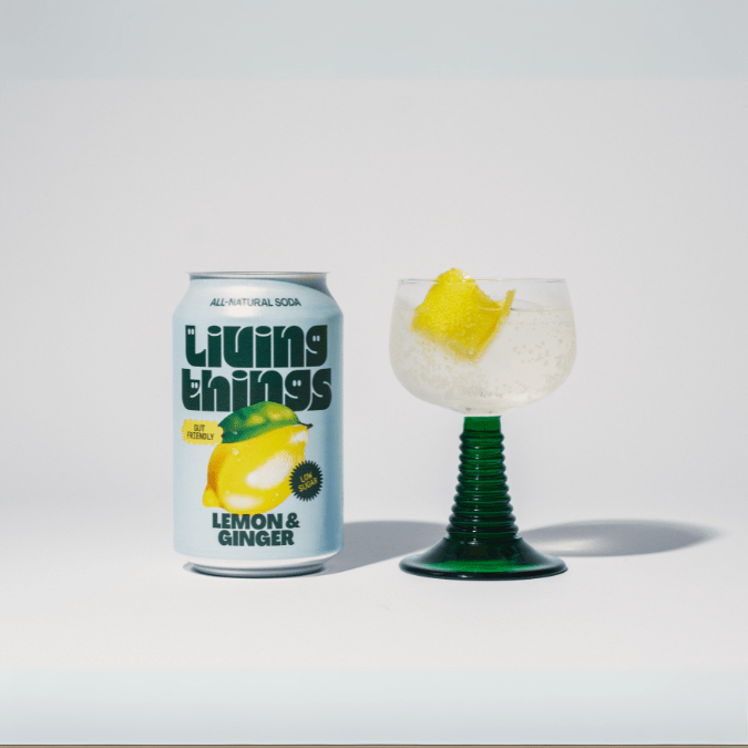
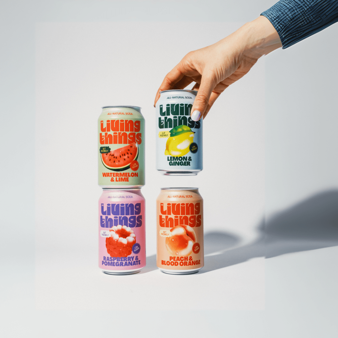
The development of the Living Things packaging was a meticulous process that spanned several months and multiple stages of design, feedback, and fine-tuning. This journey began with conceptualization, moved on to graphic design, then to prototyping, and finally culminated in production.
Living Things, being a new entrant in the market, was faced with the daunting task of establishing a strong and distinct brand identity in a fiercely competitive and saturated marketplace. To combat this challenge, an in-depth market research was conducted to understand customer preferences and perceptions about the brand.
The brand roped in the expertise of seasoned brand strategist Jose Debate and the creative prowess of design agency Studio Nari to create a visual identity that was modern and inventive. The objective was to resonate with the health-conscious, trend-setting Gen Z and millennials. The design also needed to blend seamlessly into the trendy ambiance of chic cafes as well as stand out on supermarket shelves.