Born amidst the lush mountains of Costa Rica and Colombia, Magnagaea is more than just a coffee farm. It’s a home for a tribe that’s passionate about coffee and the environment. This tribe’s dedication to quality is evident in every step of their process, from brewing methods to roasting and sourcing the coffee.
The brand, Magnagaea, aims to provide its customers and local partner coffee shops with the highest quality coffee possible. They offer four types of coffees, selecting the best beans from around the world and roasting them to perfection. The coffee is available in three weight versions (80gr, 250gr, and 500 gr).
The challenge was to develop a brand that is perceived as natural, organic, direct, and memorable, using regional emblems that the public recognises as theirs.
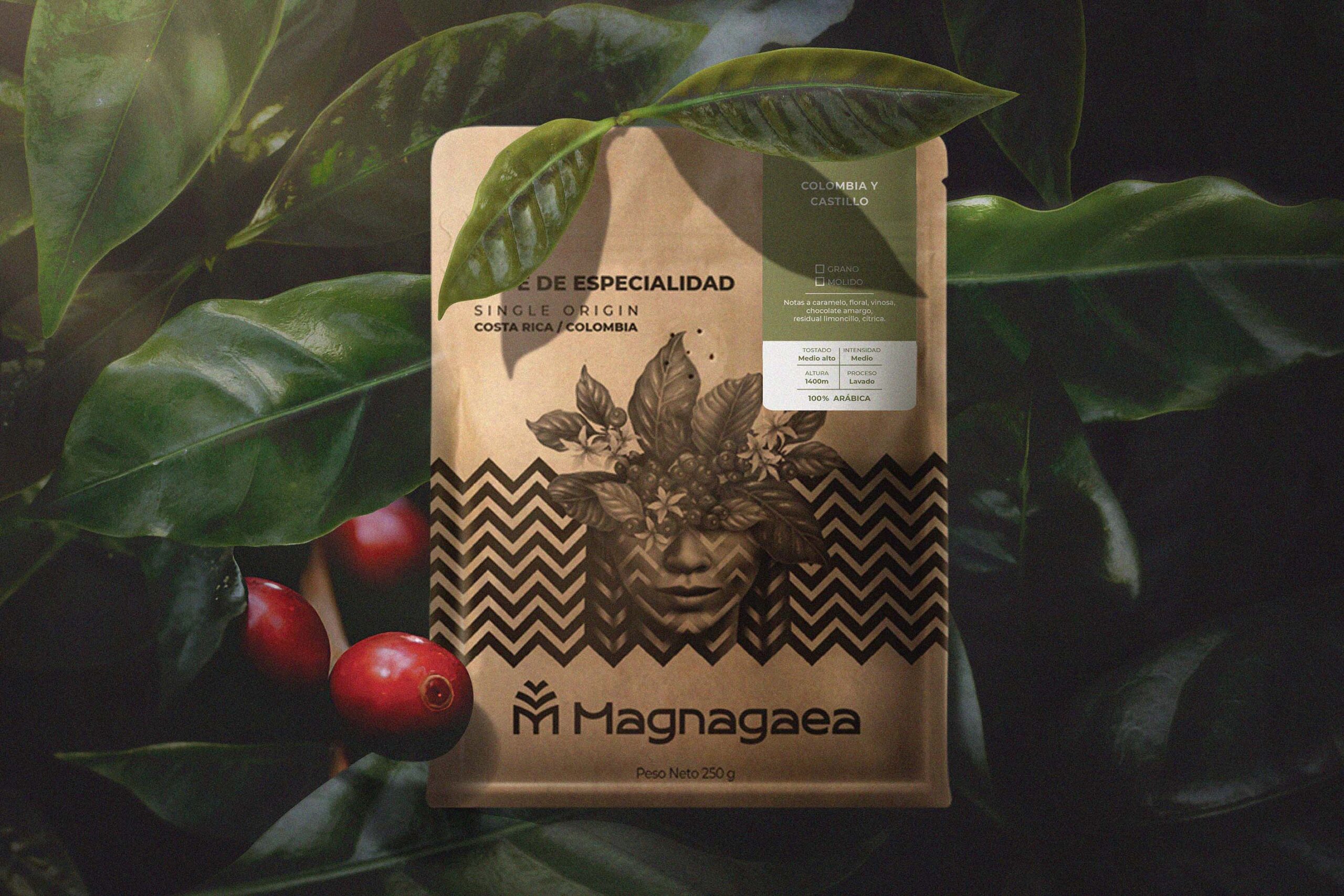
The team designed new packaging and a comprehensive brand identity system as a tribute to Colombian coffee culture and its history. The aim was to communicate the brand’s environmental awareness and pride in their origins through the packaging.
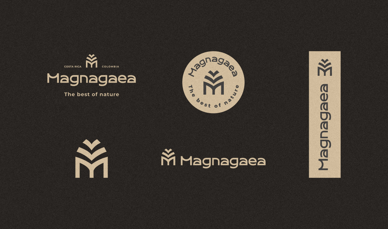
The typography and symbol of the logo incorporated the shapes of leaves, resulting in a fully functional logo capable of adapting to any format and digital platform.
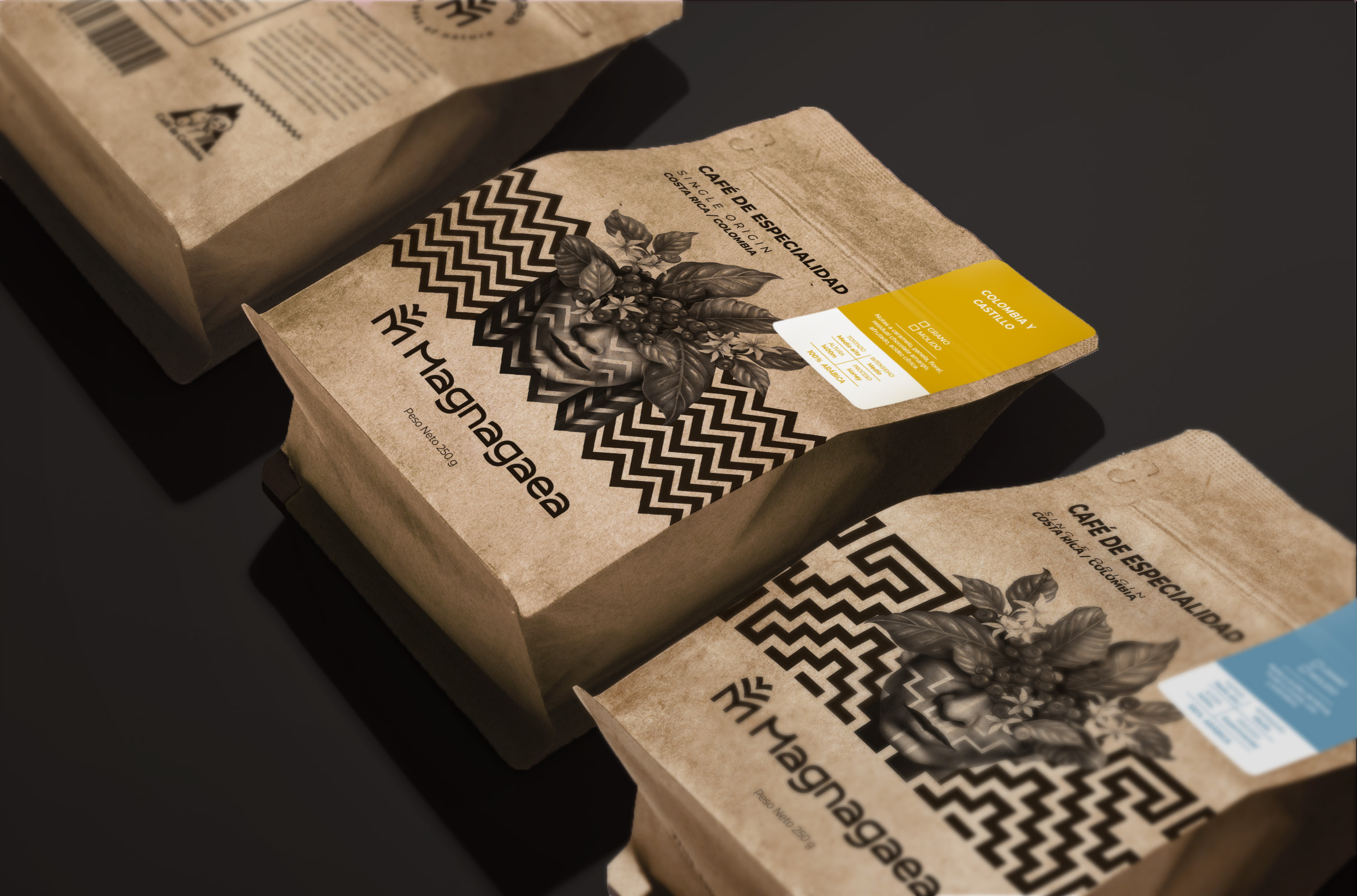
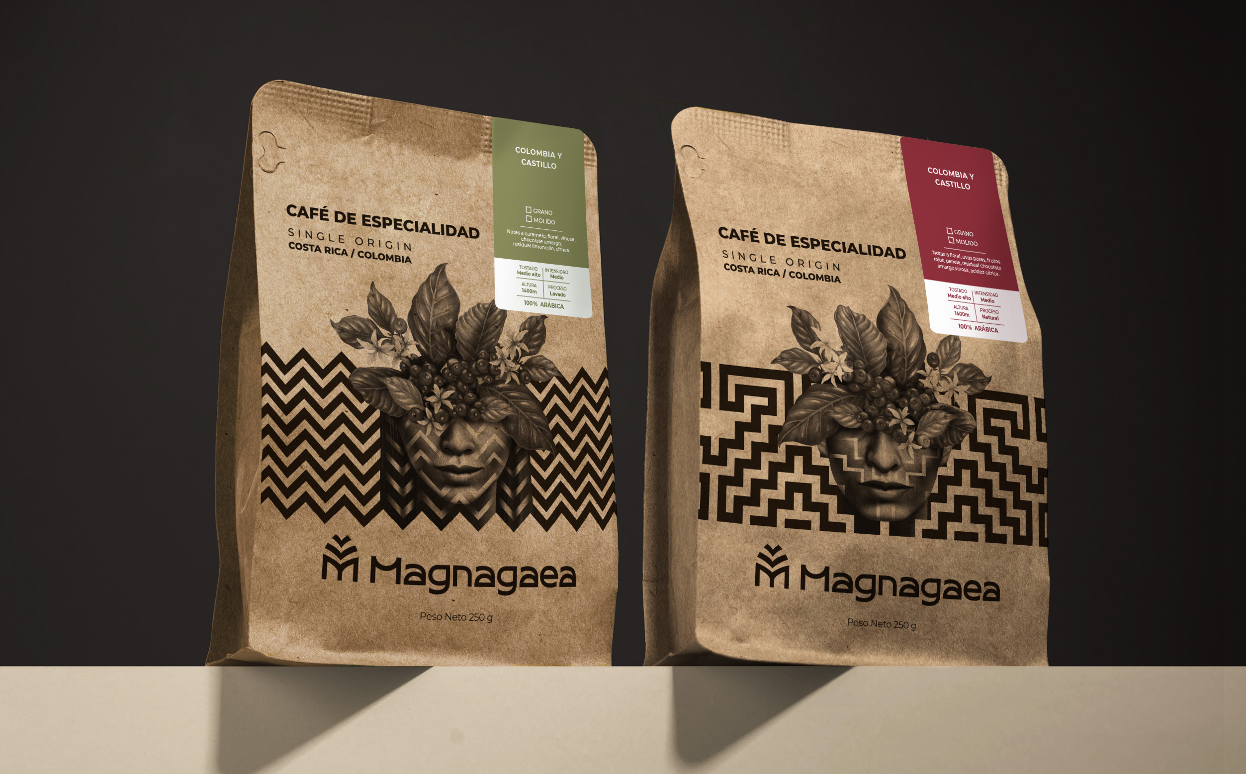
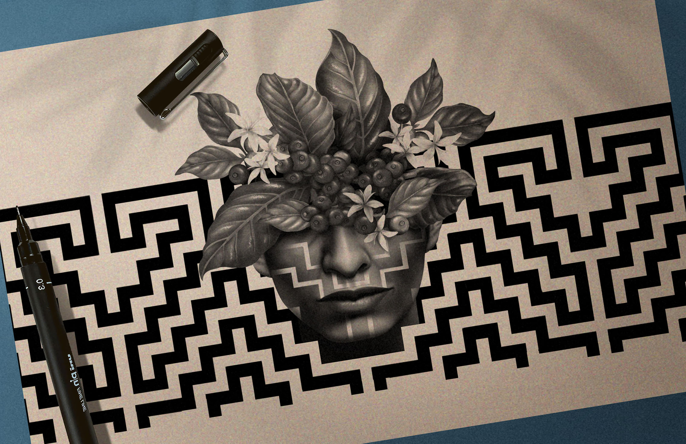
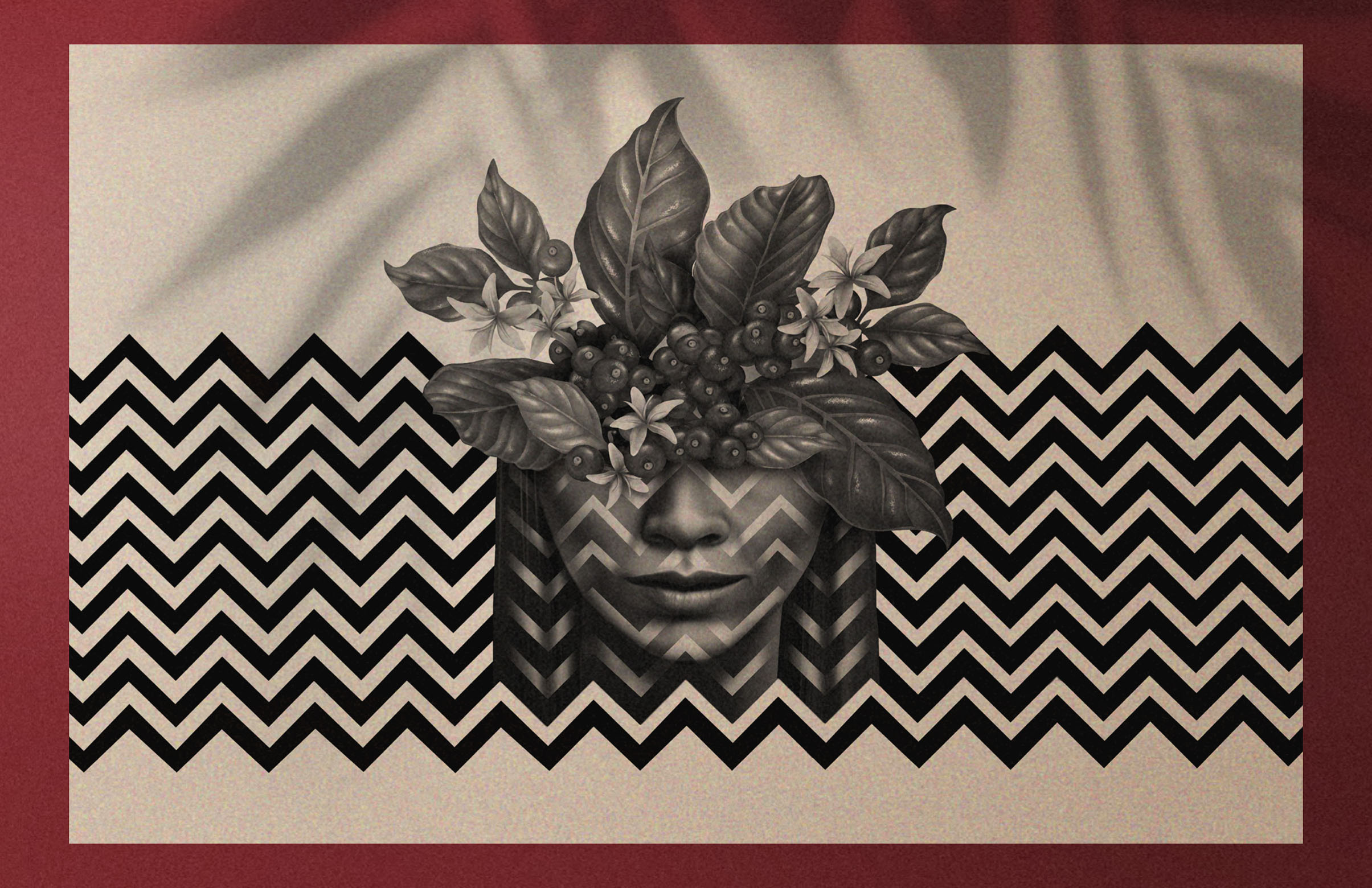
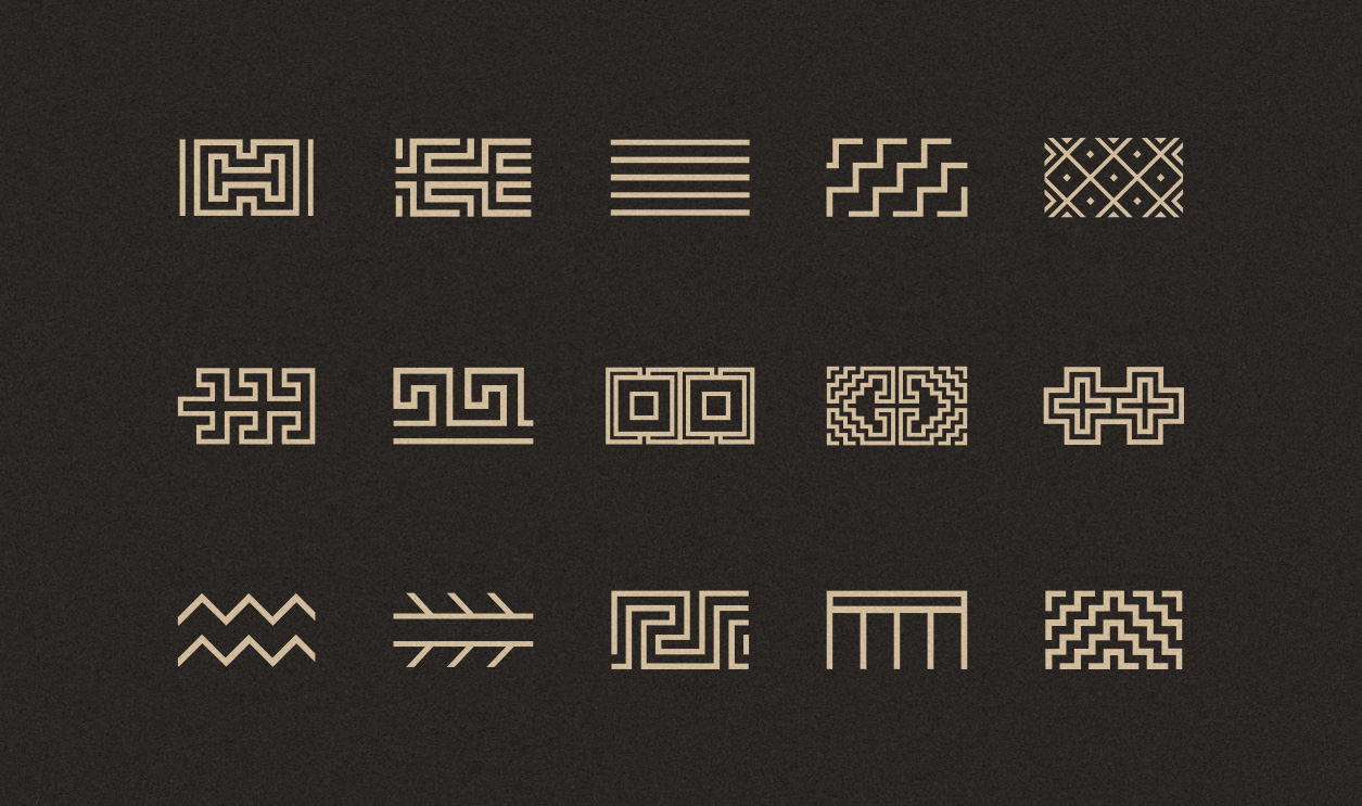
A new set of graphic patterns was created, inspired by Arhuaco iconography. The community was also taken as a reference to develop ink illustrations that conceptually represent the integration of nature with man.
To distinguish the different presentations of the product, color accents in earth tones were used, generating a color palette that blends perfectly with the concept.
Credit for this remarkable project goes to the NEV Designer agency, a freelance entity based in Callao, Peru. The project includes brand identity, graphic design, and illustration, and is now published. The agency is serving the South American market region, and the project deliverables are focused on the Food/Beverage industry.
This packaging design project truly embodies the essence of Magnagaea’s organic coffee brand identity. With its illustrative design, it’s not just a package, but a tribute to the rich coffee culture and environmental awareness that the brand represents.
The brand, Magnagaea, aims to provide its customers and local partner coffee shops with the highest quality coffee possible. They offer four types of coffees, selecting the best beans from around the world and roasting them to perfection. The coffee is available in three weight versions (80gr, 250gr, and 500 gr).
The challenge was to develop a brand that is perceived as natural, organic, direct, and memorable, using regional emblems that the public recognises as theirs.
The team designed new packaging and a comprehensive brand identity system as a tribute to Colombian coffee culture and its history. The aim was to communicate the brand’s environmental awareness and pride in their origins through the packaging.
The typography and symbol of the logo incorporated the shapes of leaves, resulting in a fully functional logo capable of adapting to any format and digital platform.
A new set of graphic patterns was created, inspired by Arhuaco iconography. The community was also taken as a reference to develop ink illustrations that conceptually represent the integration of nature with man.
To distinguish the different presentations of the product, color accents in earth tones were used, generating a color palette that blends perfectly with the concept.
Credit for this remarkable project goes to the NEV Designer agency, a freelance entity based in Callao, Peru. The project includes brand identity, graphic design, and illustration, and is now published. The agency is serving the South American market region, and the project deliverables are focused on the Food/Beverage industry.
This packaging design project truly embodies the essence of Magnagaea’s organic coffee brand identity. With its illustrative design, it’s not just a package, but a tribute to the rich coffee culture and environmental awareness that the brand represents.