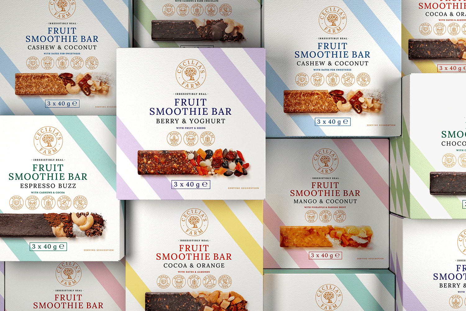
Let’s explore the packaging design of the Fruit Smoothie Bars and Boxes by Cecilia’s Farm. The brand, a six-generation family business, has a longstanding legacy of producing some of the world’s most premium dried fruit. Their reputation for unique, modernised dried fruit products has garnered a wide appeal across markets, with ongoing innovation to cater to health-conscious consumers.
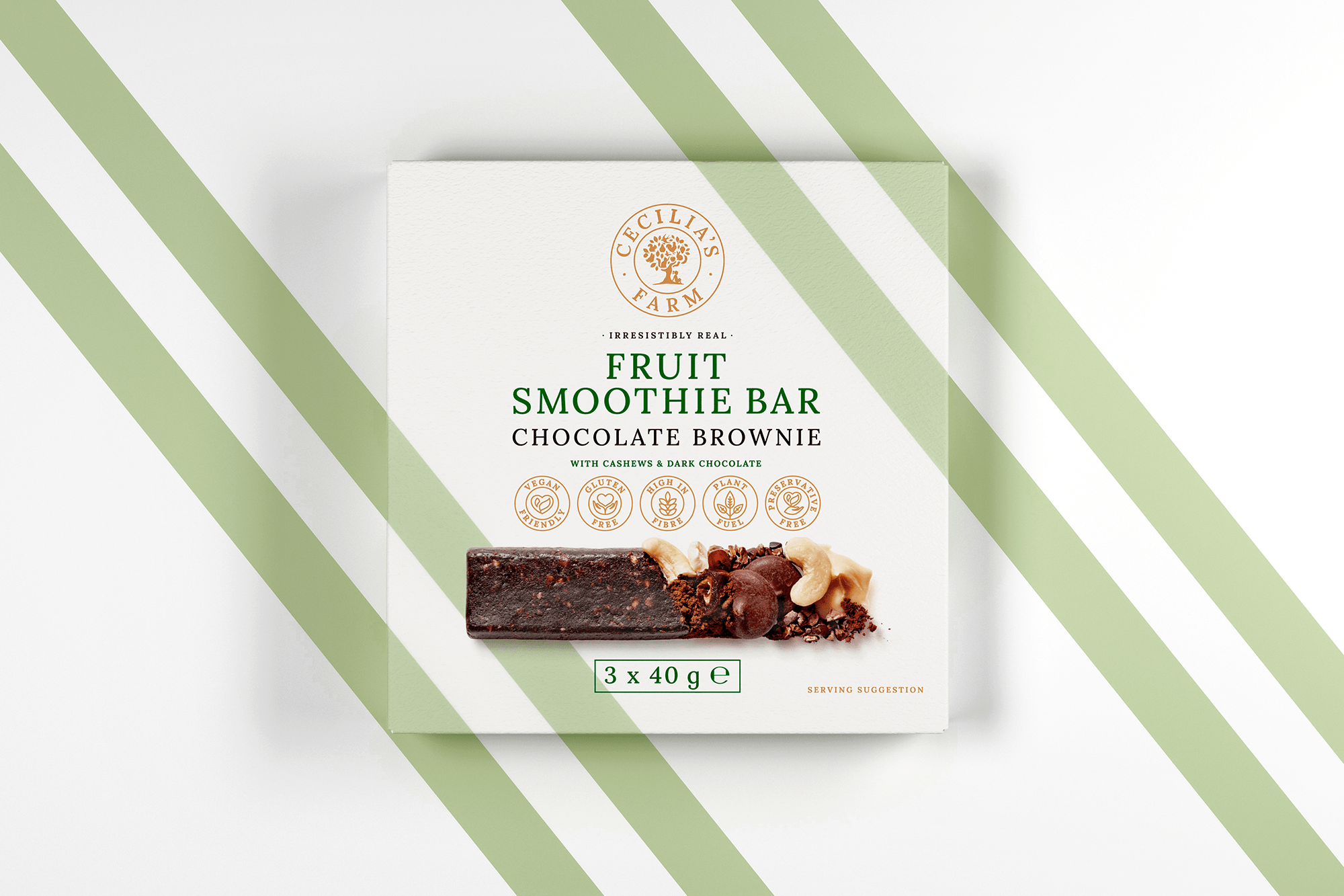
With a vision to create a contemporary and premium packaging concept, the strategic direction was to position them as a global leader in the dried fruit industry. The design has thus opted for clean lines and high-quality photography, straying away from the market trend of quirky, illustrative packaging. The intent was to set the brand apart from competitors who often resort to comical illustrations or generic looking labels.
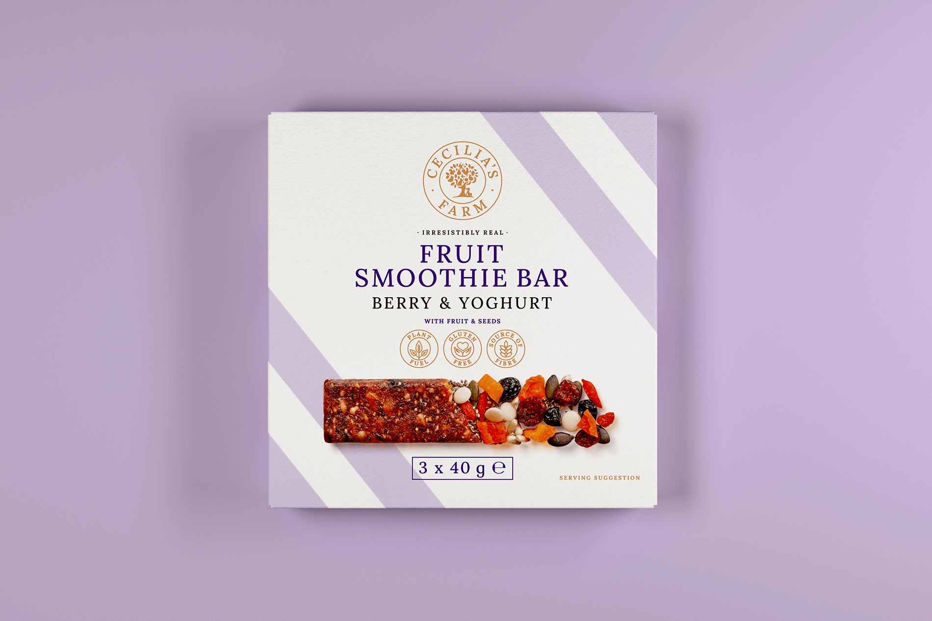
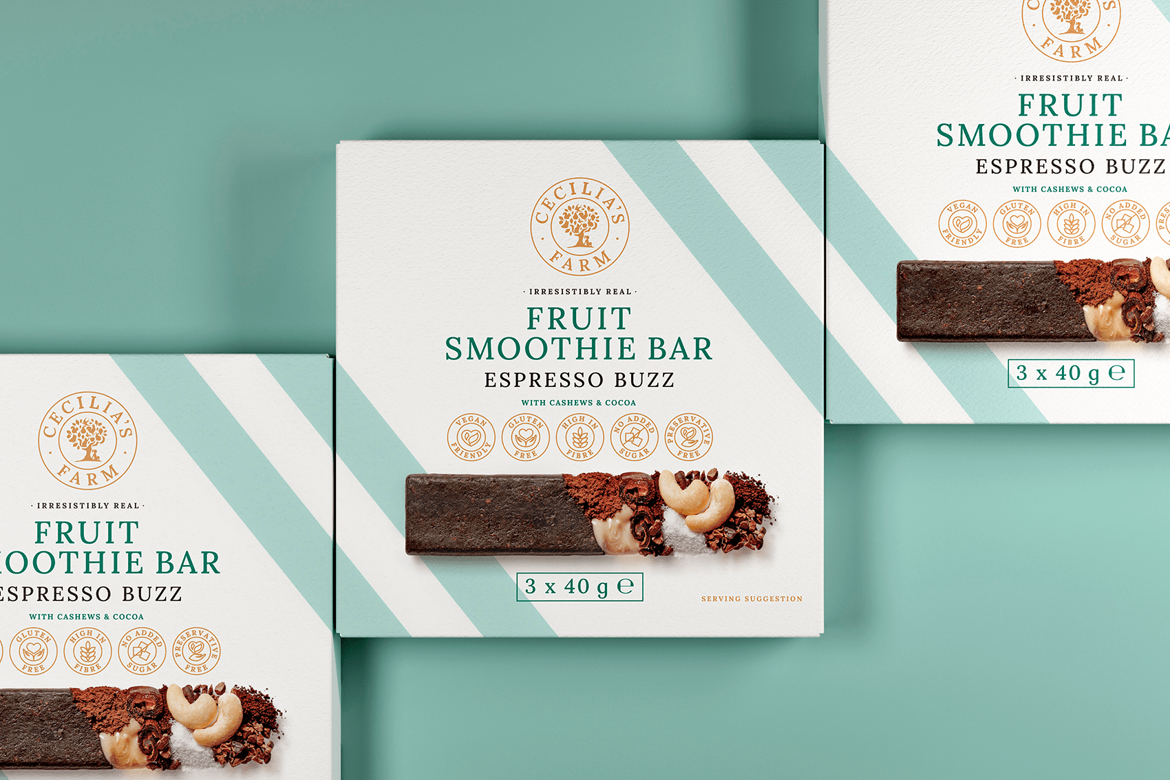
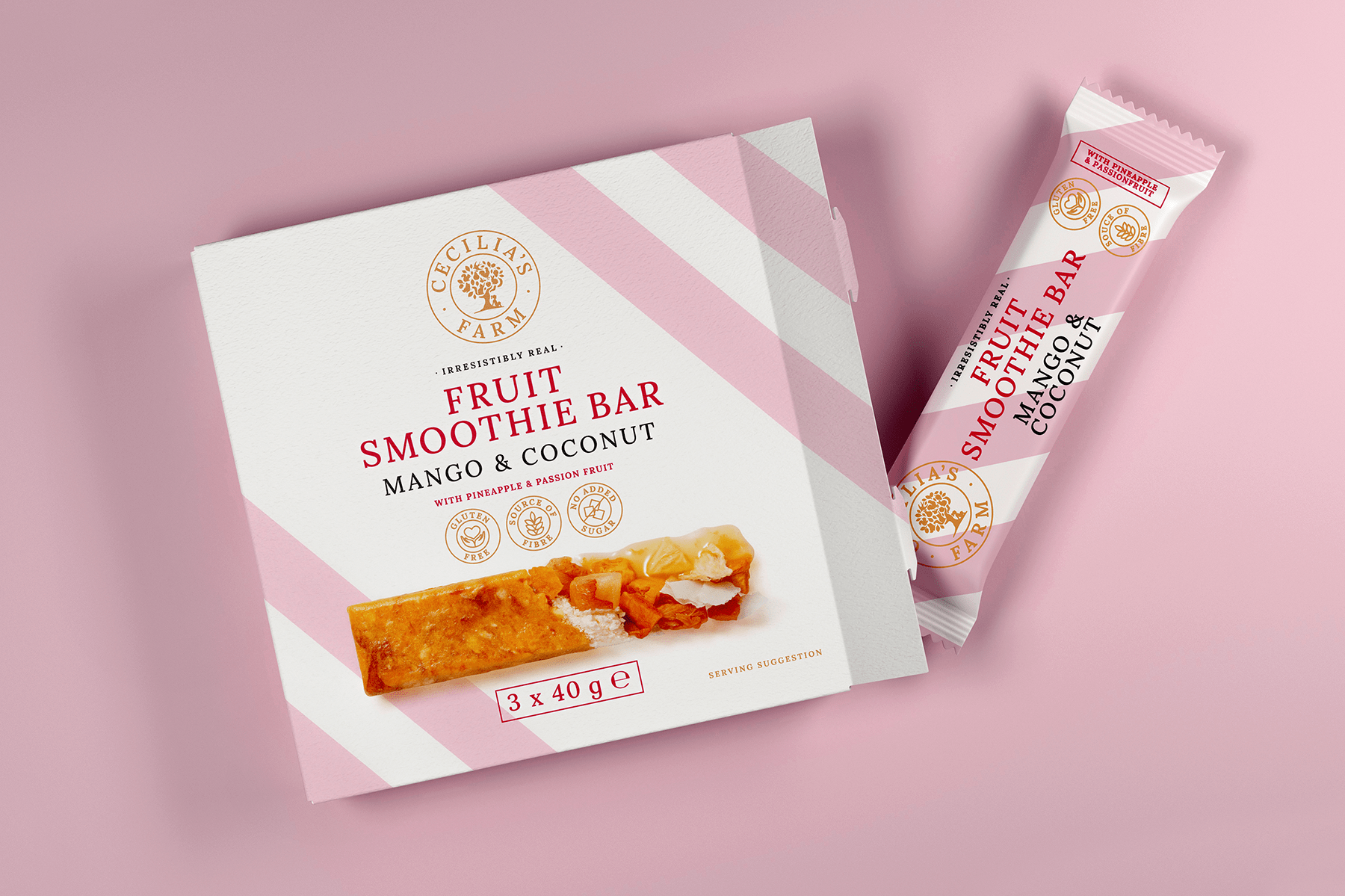
The design strategy involved a blend of elegant typography and bold colours to make the product text stand out, contrasted against a more muted brown for the company logo and ingredients. This colour symbiosis serves as an embodiment of Cecilia’s Farm’s commitment to the quality of ingredients in each bar.
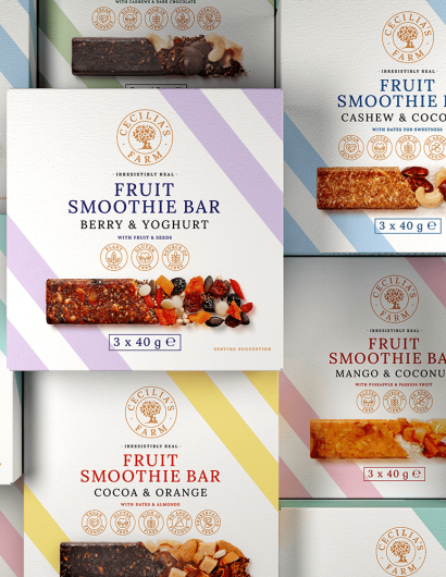
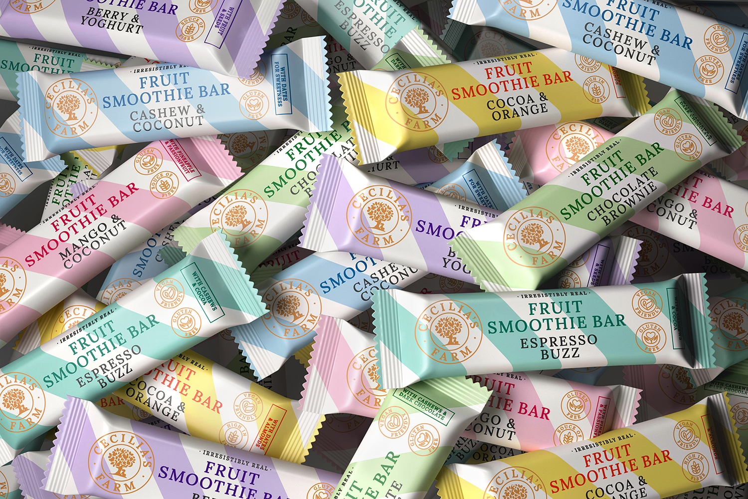
The Fruit Smoothie Bars packaging emanates a modern vibe, with its matt high quality boxes, trendy Nordic pastel shades, and striking diagonal lines. The use of world-class food photography not only informs consumers of what’s in each bar but also showcases the ingredients and the product in a visually appealing manner.
This design project is an amalgamation of the designer’s favourite elements to create the perfect packaging. Browse through the images below to get a better idea of this unique product presentation.