Designed by: PepsiCo Design & Innovation
Country: United States

Cuckoo

Cuckoo

Designed by B&B studio | Country: United Kingdom

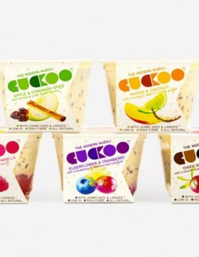
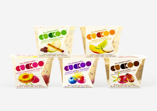
“B&B has created the name, identity and packaging for a new brand of bircher muesli. Sold in on-the-go pots, Cuckoo is a wholesome blend of jumbo oats, yoghurt and fruit inspired by the healthy Swiss lifestyle, but characterised by its range of innovative and adventurous flavours, including Mango & Coconut, Elderflower & Cranberry and Dark Chocolate & Sour Cherry.”

Cuckoo

Cuckoo

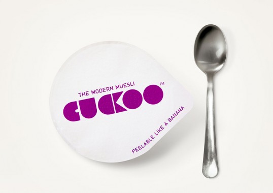
“Inspired by Swissness, but keen to avoid Alpine nostalgia, B&B worked to a Modern Swiss design essence from the start, first creating the name Cuckoo, then experimenting with graphic pack designs for a contemporary poster-style look. The final logo includes a stylised C and K to form a graphic cuckoo, while the negative space of the K is reproduced as a die-cut on pack revealing the layered product inside. The innovative nature of the product is highlighted by the strapline ‘the modern muesli’.”

Cuckoo

Cuckoo

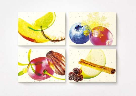
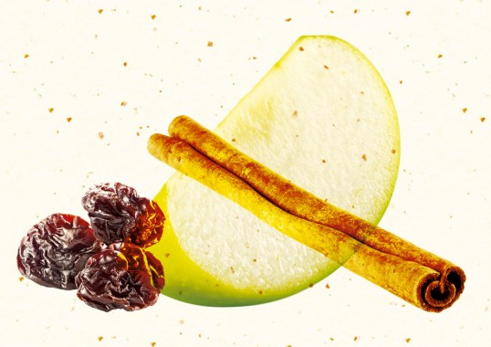
“Foodie flavours are key to the brand and we were keen to depict the ingredients in a modern and exciting way,” says B&B Creative Partner Shaun Bowen. “We used a bold and distinctive multi-layered photographic style, inspired by Swiss poster design, to really heighten the contemporary feel.”

Get the latest packaging design inspiration in your inbox:

Popular designs

Designed by: PepsiCo Design & Innovation
Country: United States

Cuckoo

lovely-package-cuckoo-muesli-1

Cuckoo

Designed by B&B studio | Country: United Kingdom

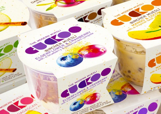
“B&B has created the name, identity and packaging for a new brand of bircher muesli. Sold in on-the-go pots, Cuckoo is a wholesome blend of jumbo oats, yoghurt and fruit inspired by the healthy Swiss lifestyle, but characterised by its range of innovative and adventurous flavours, including Mango & Coconut, Elderflower & Cranberry and Dark Chocolate & Sour Cherry.”

Cuckoo

Cuckoo

“Inspired by Swissness, but keen to avoid Alpine nostalgia, B&B worked to a Modern Swiss design essence from the start, first creating the name Cuckoo, then experimenting with graphic pack designs for a contemporary poster-style look. The final logo includes a stylised C and K to form a graphic cuckoo, while the negative space of the K is reproduced as a die-cut on pack revealing the layered product inside. The innovative nature of the product is highlighted by the strapline ‘the modern muesli’.”

Cuckoo

Cuckoo

“Foodie flavours are key to the brand and we were keen to depict the ingredients in a modern and exciting way,” says B&B Creative Partner Shaun Bowen. “We used a bold and distinctive multi-layered photographic style, inspired by Swiss poster design, to really heighten the contemporary feel.”
Explore more great package design

Get the latest on packaging design in your inbox: