Designed by Paolo Varratta Design Consultant | Country: Italy
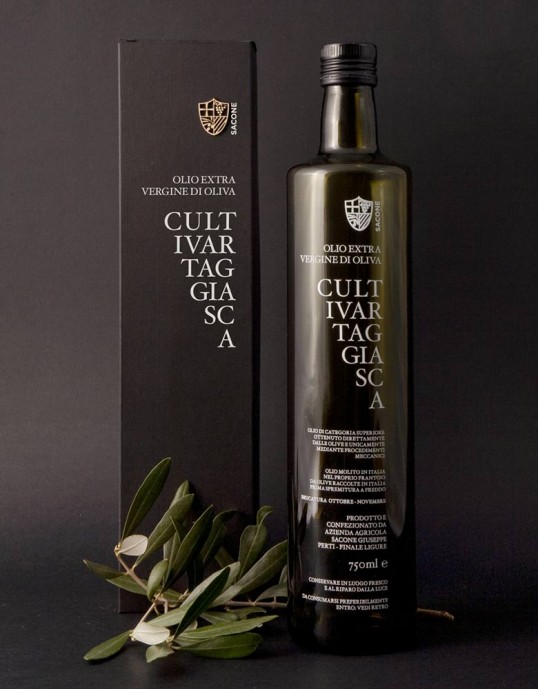
“Sacone is a small farm located in the Riviera Ligure. It’s a family company that is growing thanks to the great passion of owners and offers high quality products. The Extra Vergine Olive Oil “Cultivar Taggiasca” is probably one of the best olive oils available on the market. The request was to create a packaging that would match the content and to design a “corporate Identity” with a strong image joint to the location and the tradition. The label is made with silk-screen printing in one color and it is done directly on the bottle. This choice, has been made not only by aesthetic issues but also by functional needs. Competitors usually use a paper label that becomes greasy during use. Otherwise the box is made of black cardboard , where the graphic is printed with hot foil, while the logo, manually applied, is made of real wood realized by laser cutting.”