Designed by: PepsiCo Design & Innovation
Country: United States

Curious Potion Packaging Design

Designed by: Creative Platform | Country: Australia

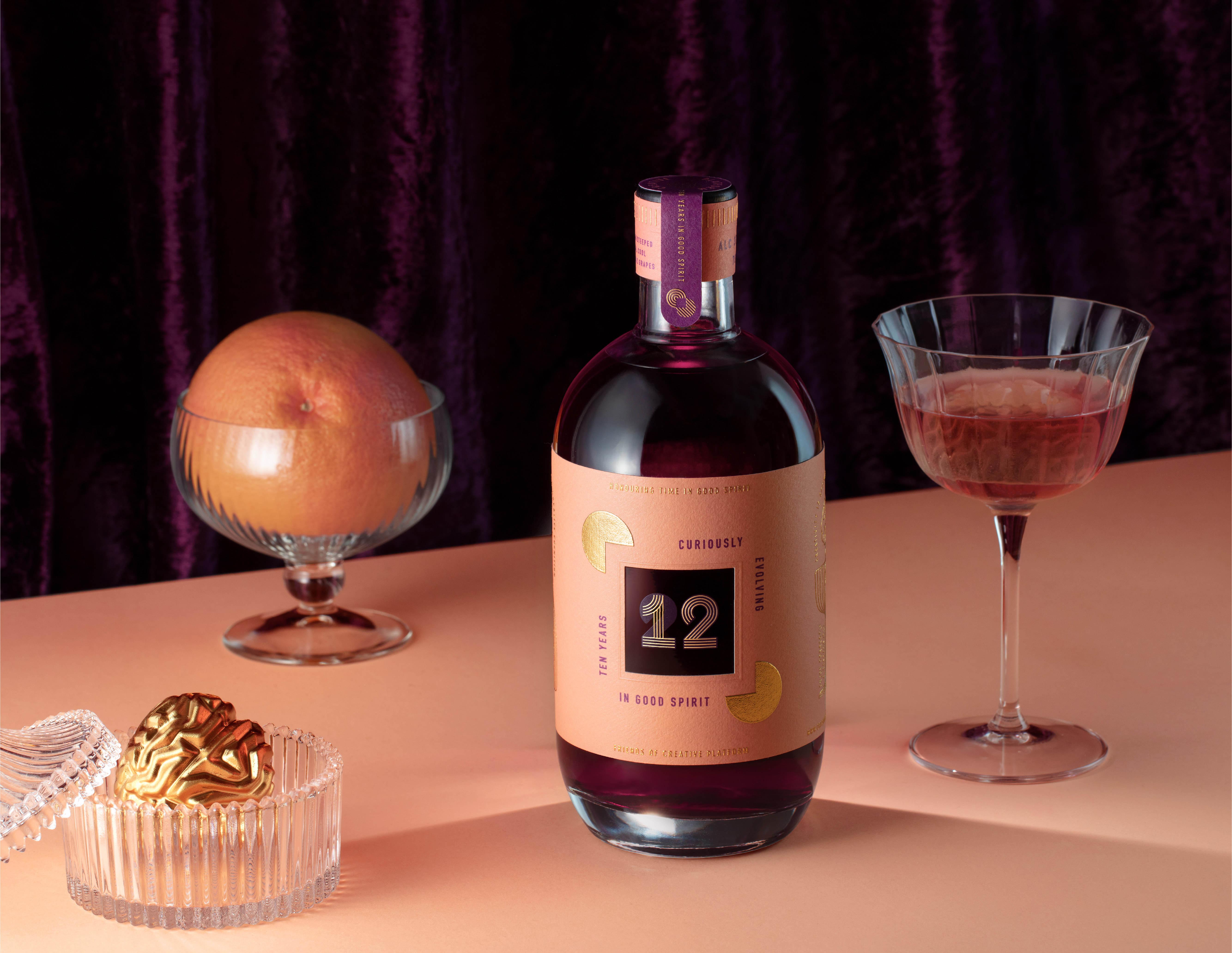
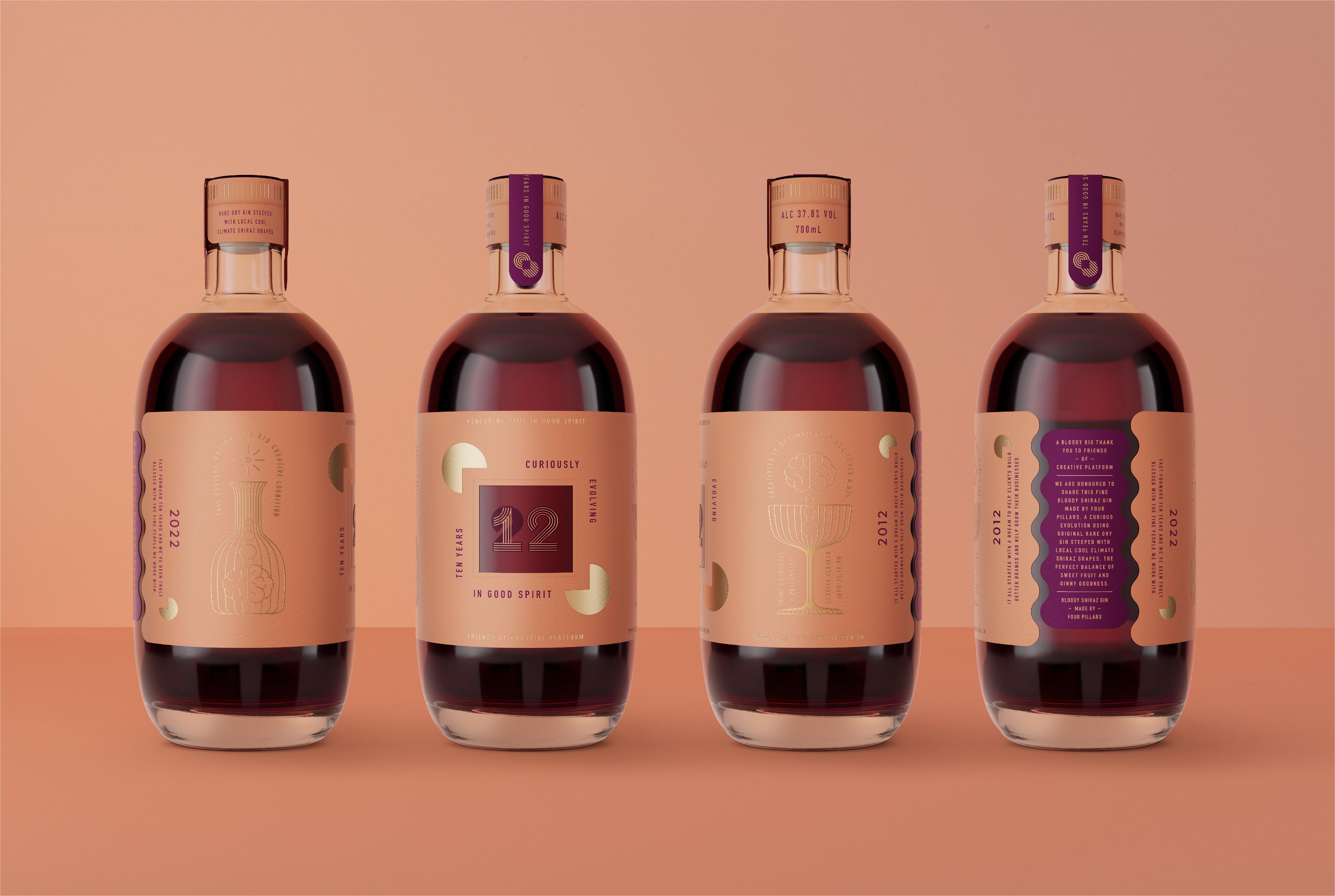
Curious Potion by Four Pillars marks the tenth year anniversary of Four Pillars. Inspired by the deep purple color of Bloody Shiraz Gin, Curious Potion, according to the company, can help increase creative cognition. The drink also honors clients and customers who have remained loyal to the brand for years.

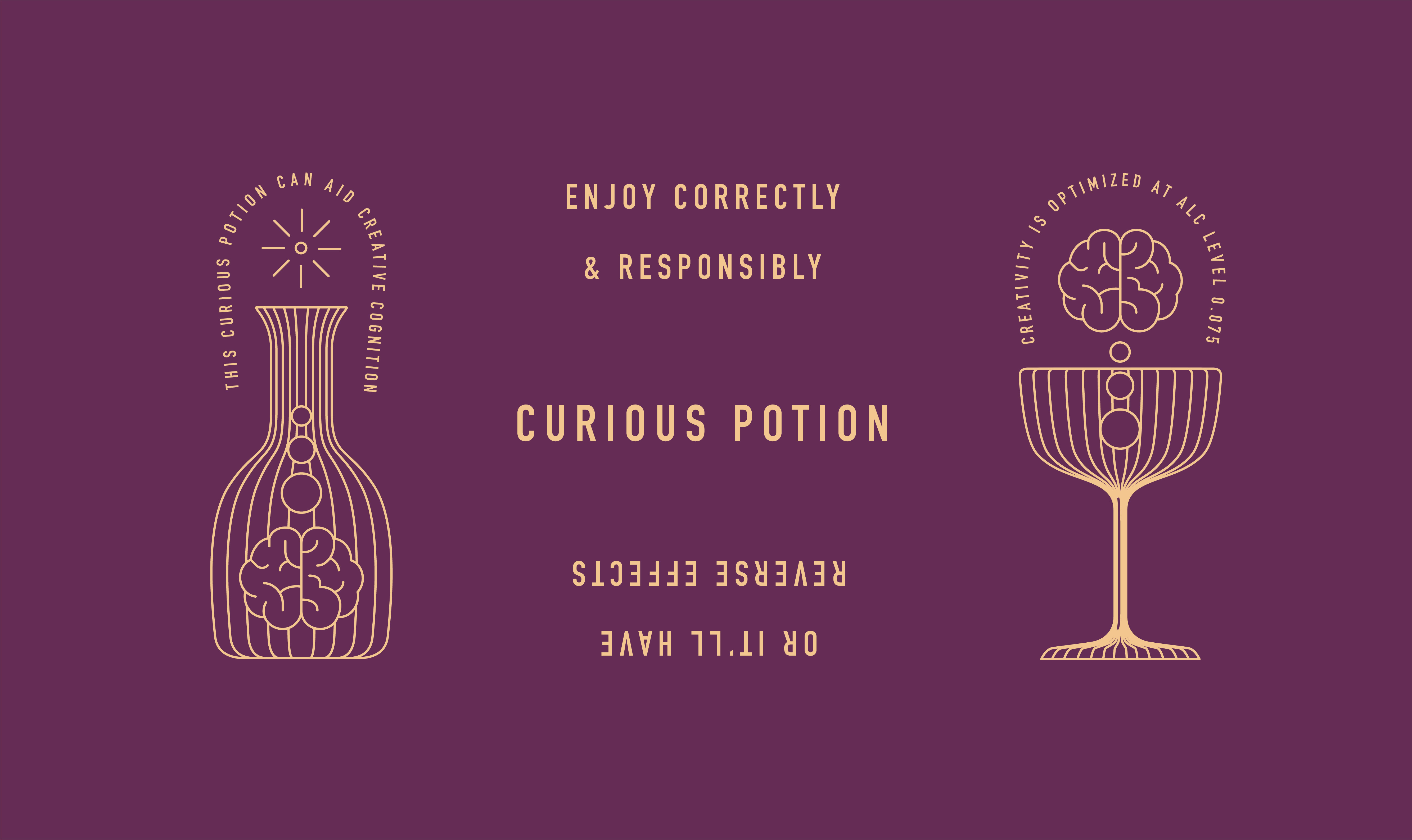
“The deep purple color in this amazing Bloody Shiraz Gin made by Four Pillars inspired the thought of a Curious Potion. There’s a theory that drinking just the right amount can aid creative cognition, which we believe is a blood alcohol level around 0.075. Any more can have the opposite effect (but at least you‘ll enjoy yourself). After all, we’re celebrating 10 years here and it’s ok to let one slide.

Curious Potion Packaging Design

The packaging

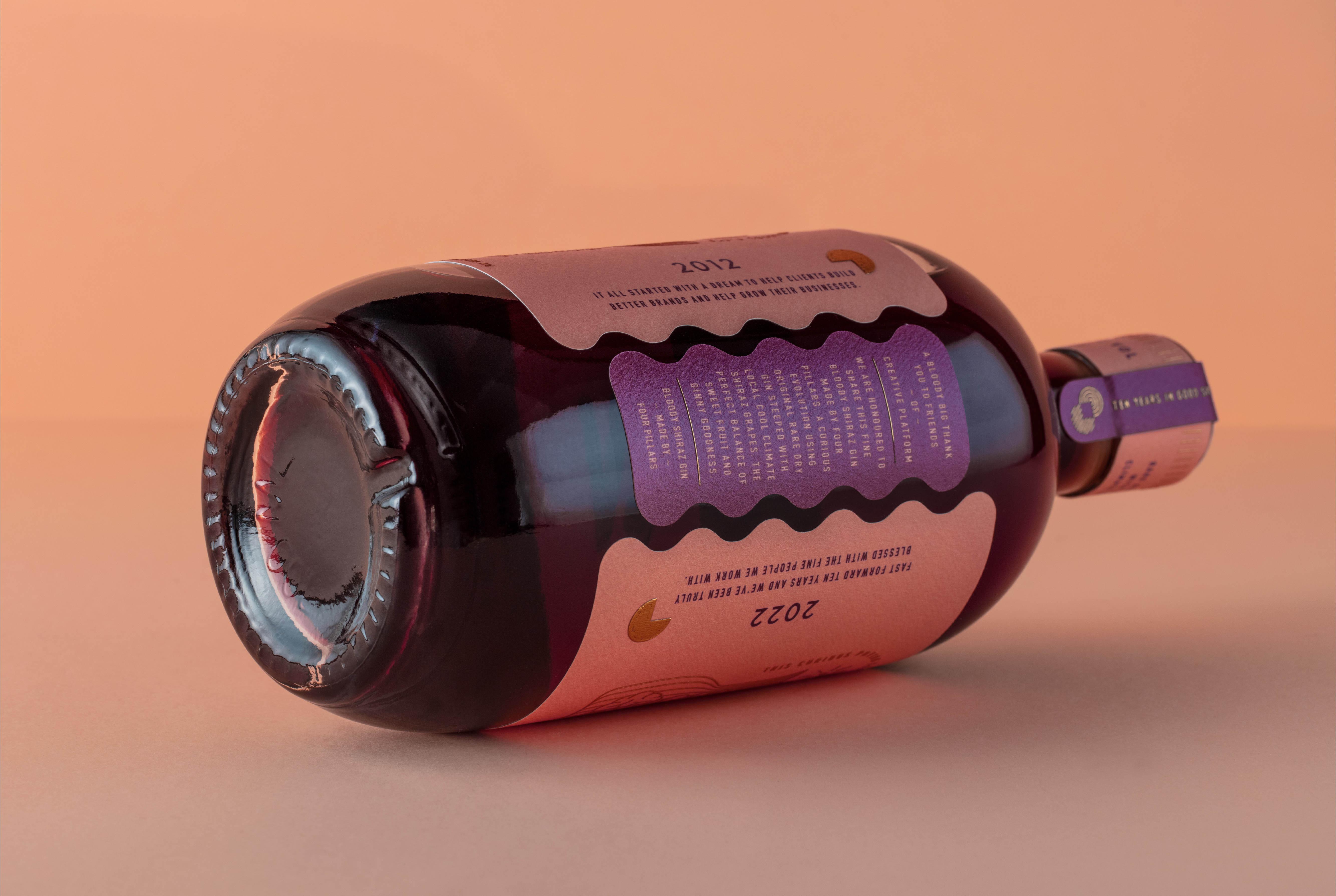
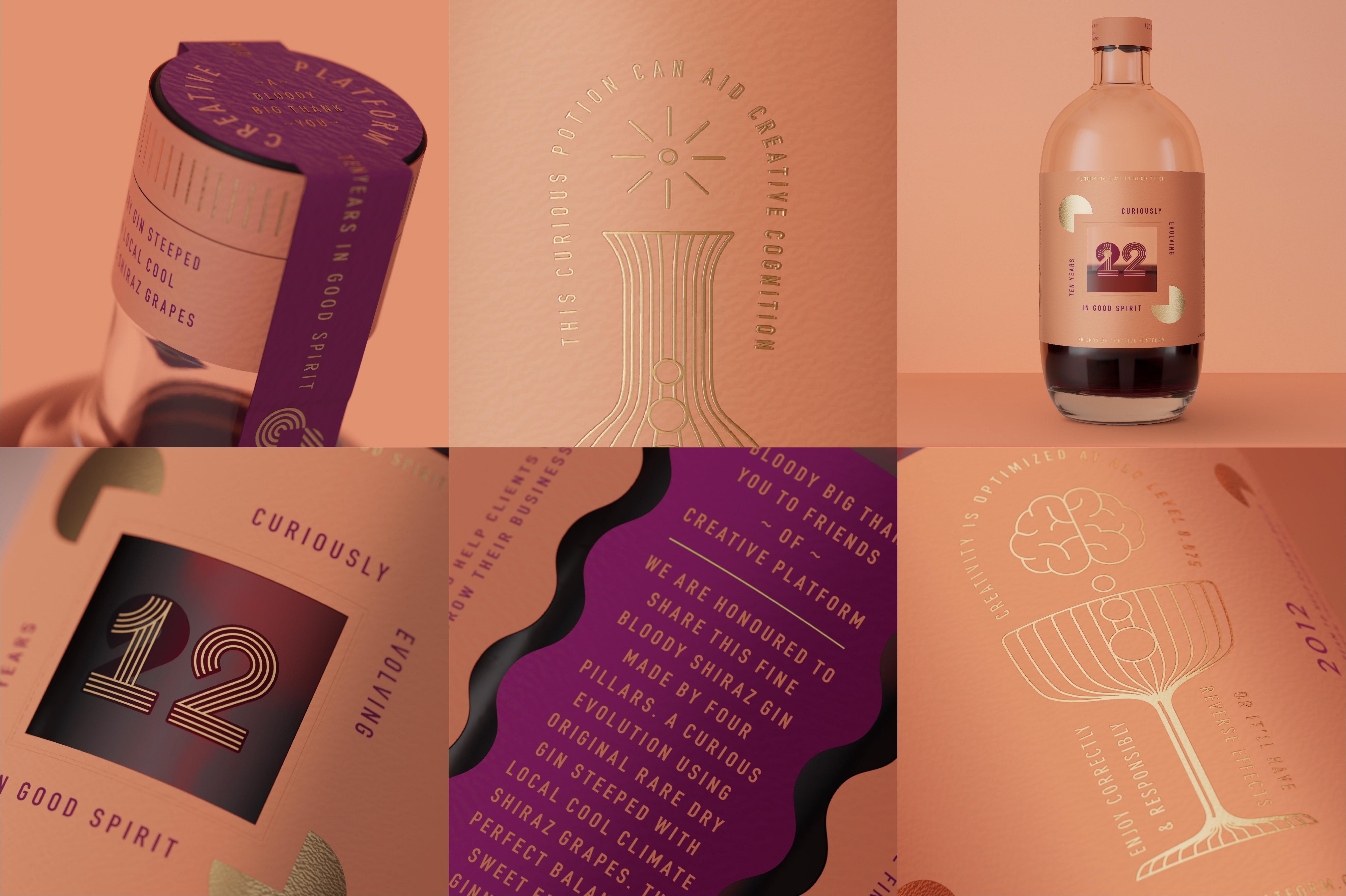
Four Pillars combined their efforts with Creative Platform, a Sydney-based branding agency, to highlight the brand’s “quality, care, and honesty.” The branding agency created simple packaging illustrations that highlight the core personality of the brand.

“Creative Platform is a specialist design studio with a talented team of diverse collaborators. Our goal is to create unique consumer brands and packaging that people love. Focusing on quality, care and honesty. We’re hands-on specialists and we keep it simple.

We partnered with CCL to print the labels on a high-end prototype machine which allowed us to experiment and test the stocks, colors, die-cuts and foil stamping. The quality and finishes are amazing!”

Get the latest packaging design inspiration in your inbox:

Popular designs

Creating a Strong Brand Identity: The Journey of Living Things Packaging Design

“Developing Living Things packaging involved multiple design stages, feedback, and refinement. With extensive market research, collaboration with brand strategist Jose Debate and design agency Studio Nari, we created a strong, recognizable brand identity appealing to health-conscious, trend-setting millennials and Gen Z.”

Tropicana’s Branding & Packaging Redesign by Sunhouse

Tropicana rejuvenates its brand with Sunhouse, blending modern iconicity and heritage. The redesign emphasizes Tropicana’s legacy, highlighting its unique story and craftsmanship, making it stand out as the original, superior orange juice.

Designed by: PepsiCo Design & Innovation
Country: United States

Curious Potion Packaging Design

CP-10-years-Website-02 (1)

Designed by: Creative Platform | Country: Australia

Curious Potion by Four Pillars marks the tenth year anniversary of Four Pillars. Inspired by the deep purple color of Bloody Shiraz Gin, Curious Potion, according to the company, can help increase creative cognition. The drink also honors clients and customers who have remained loyal to the brand for years.

“The deep purple color in this amazing Bloody Shiraz Gin made by Four Pillars inspired the thought of a Curious Potion. There’s a theory that drinking just the right amount can aid creative cognition, which we believe is a blood alcohol level around 0.075. Any more can have the opposite effect (but at least you‘ll enjoy yourself). After all, we’re celebrating 10 years here and it’s ok to let one slide.

Curious Potion Packaging Design

The packaging

Four Pillars combined their efforts with Creative Platform, a Sydney-based branding agency, to highlight the brand’s “quality, care, and honesty.” The branding agency created simple packaging illustrations that highlight the core personality of the brand.

“Creative Platform is a specialist design studio with a talented team of diverse collaborators. Our goal is to create unique consumer brands and packaging that people love. Focusing on quality, care and honesty. We’re hands-on specialists and we keep it simple.

We partnered with CCL to print the labels on a high-end prototype machine which allowed us to experiment and test the stocks, colors, die-cuts and foil stamping. The quality and finishes are amazing!”

https://vimeo.com/763625594?embedded=true&source=vimeo_logo&owner=158765616

Previous slide
Next slide
Get the latest on packaging design in your inbox: