Designed by Round | Country: Australia
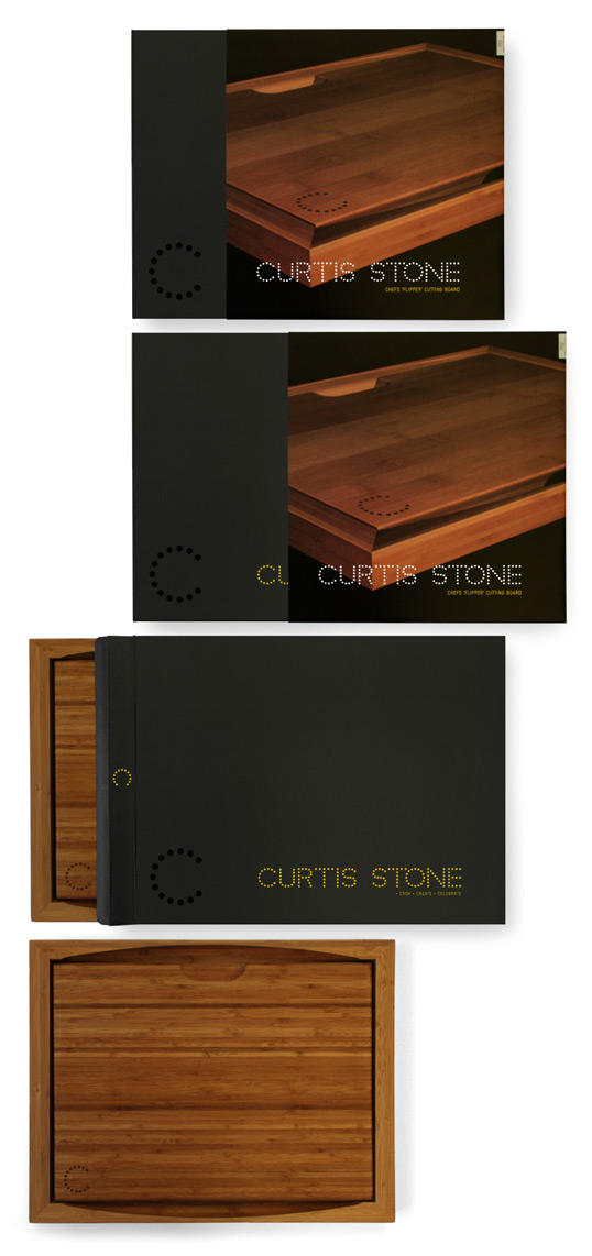
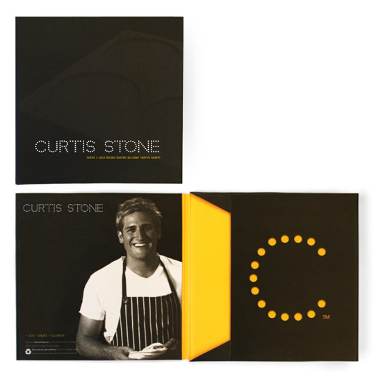
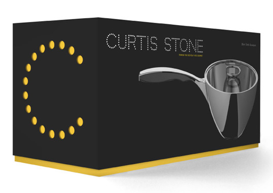
Simple and elegant packaging for Curtis Stone’s line of housewares. The diecut ‘C’ used to reveal a flood of yellow colour underneath is a nice touch.


Designed by Round | Country: Australia
Simple and elegant packaging for Curtis Stone’s line of housewares. The diecut ‘C’ used to reveal a flood of yellow colour underneath is a nice touch.


Get the latest packaging design inspiration in your inbox:
Designed by: PepsiCo Design & Innovation
Country: United States

Designed by Round | Country: Australia
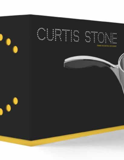
Simple and elegant packaging for Curtis Stone’s line of housewares. The diecut ‘C’ used to reveal a flood of yellow colour underneath is a nice touch.
