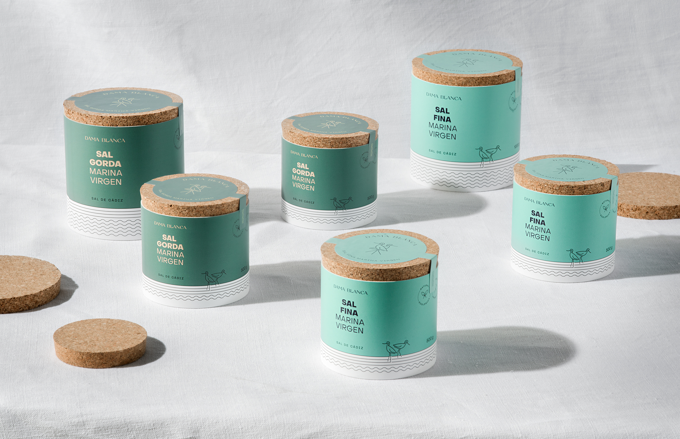
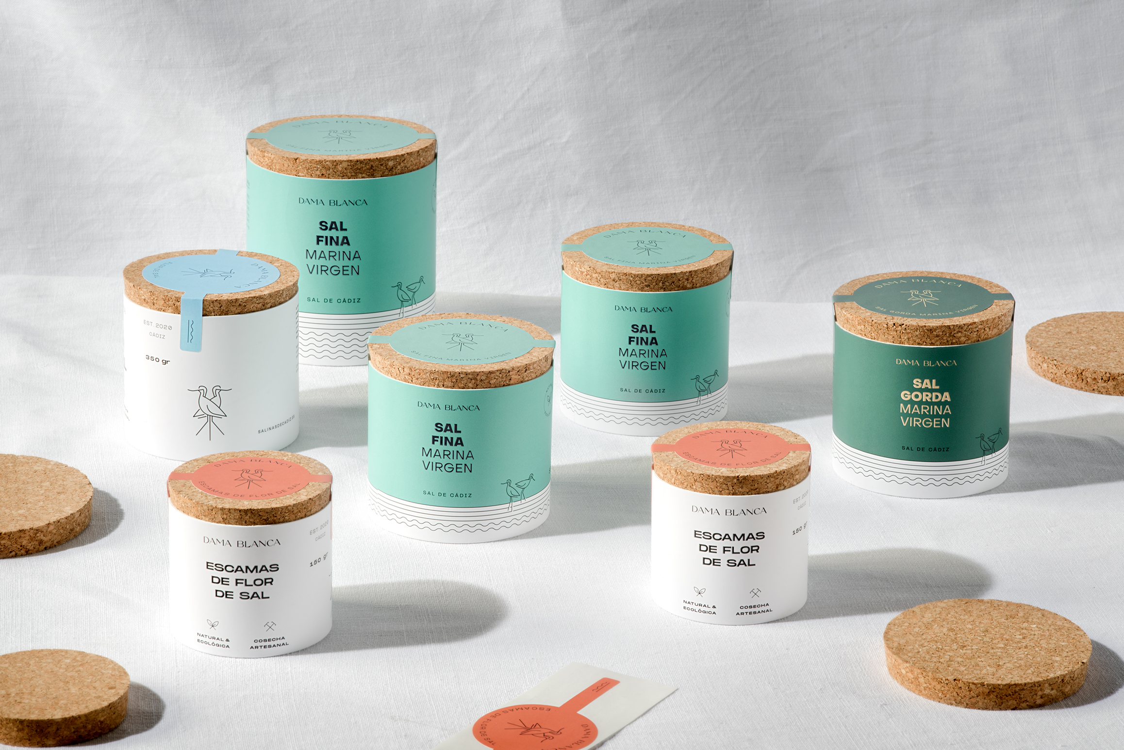
The Dama Blanca | Salt of Cádiz project is an exquisite showcase of packaging design that captures the essence of a brand’s history and authenticity. The client, Salinas of Cádiz, is a family endeavor that draws its inspiration from a deep-seated love for the sea in a region that boasts over 3,000 years of history in artisanal salt cultivation.
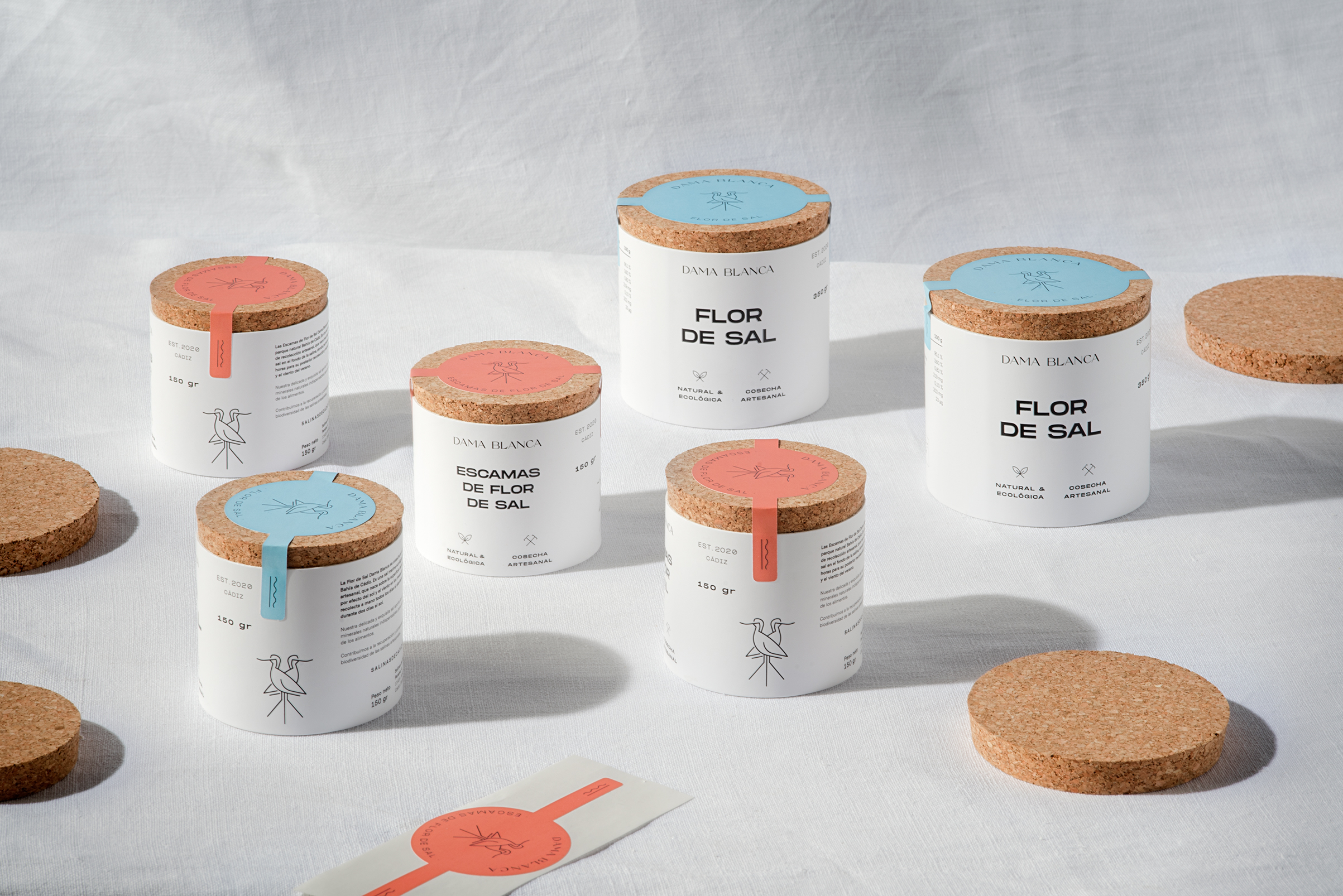
The challenge was to design packaging for its trio of SKUS products, which include fine salt, coarse salt, and fleur of salt flakes. The goal was to create a premium and elegant look that resonated with the brand’s main values of history and authenticity, which have been passed down from generation to generation since the Phoenicians by the salt masters of the Bay of Cádiz.
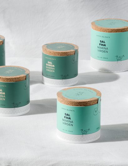
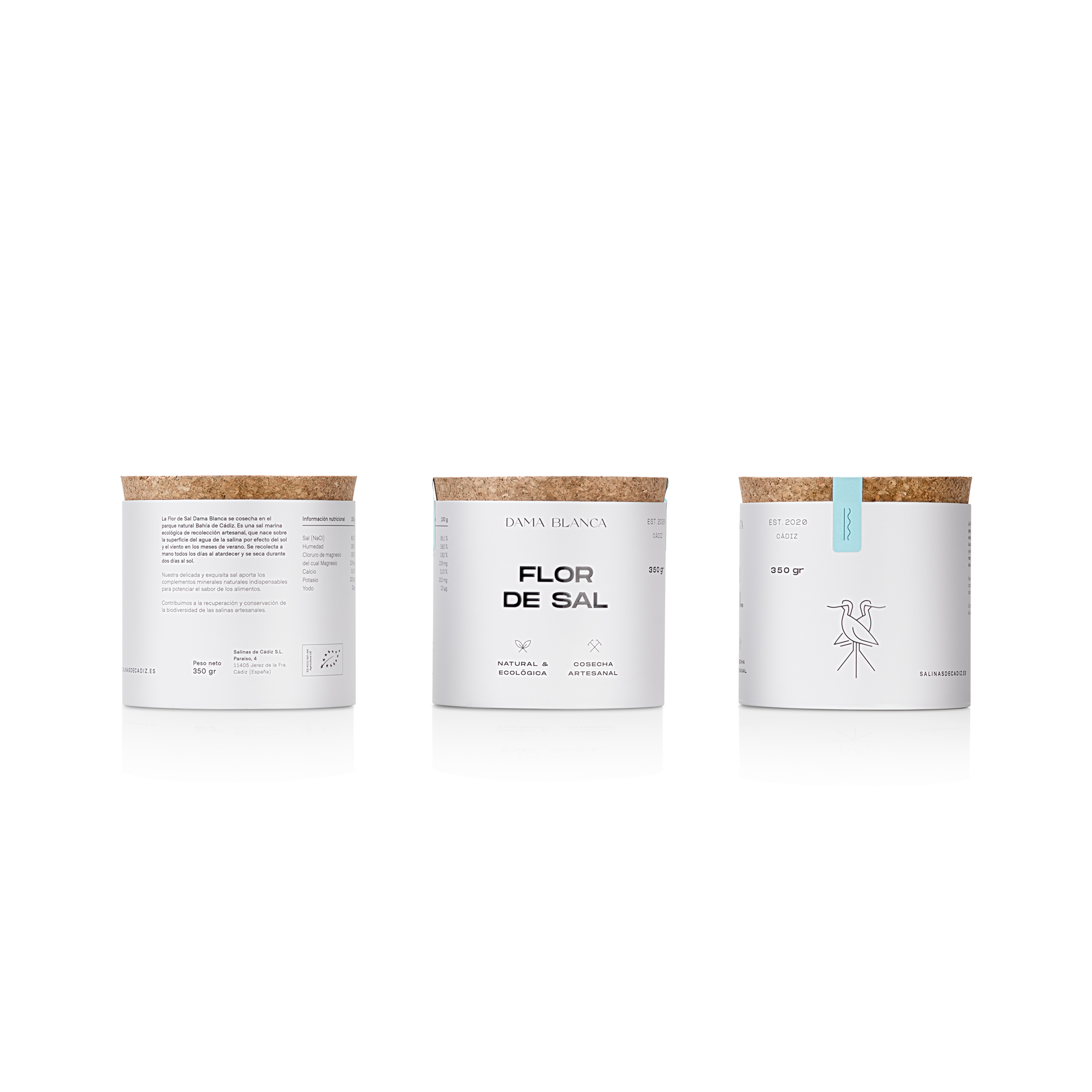
The design concept was developed by transferring these strengths of the brand to the visual language of the packaging. The team used natural raw materials like cardboard and cork, a color palette inspired by the sea and the color of the salt flats, as well as created iconography to highlight the artisanal nature of the products. The layout and composition are clean and meticulous. The logo and icons used have been exclusively created for the brand. The main illustration is an avocet, a bird that nests in the salt flats during the months of April and May, which halts salt cultivation to facilitate research work at the University of Cádiz.