Designed by: PepsiCo Design & Innovation
Country: United States

DAS KORN

DAS KORN

Designed by Kakoii | Country: Germany/Japan

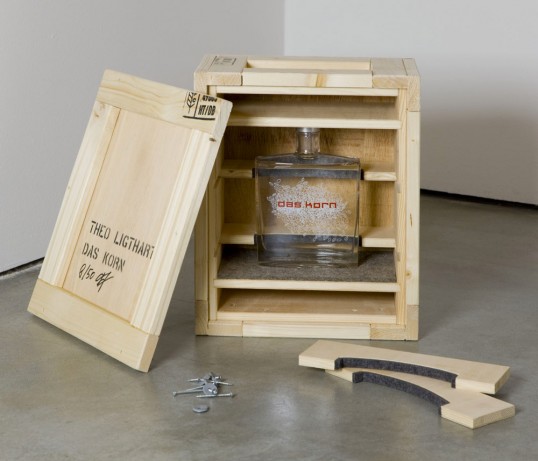
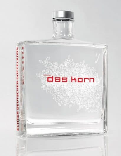
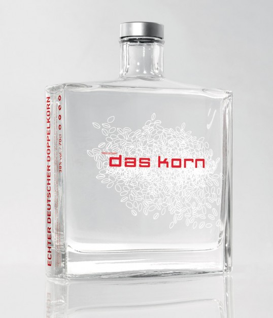
“DAS KORN (“The grain”) was designed by kakoii Berlin for the German Artist Theo Ligthart. The idea was to re-brand the typical German liquor made of wheat grain with its perception of cheap alcohol as a super premium brand. This was done by creating a packaging which uses the design language of the perfume industry. A heavy glass flacon bottle stating in a simplistic and pure way what’s inside: in typo (“Das Korn” = “The Grain”) and illustration (wheat grains). The product was introduced at one of the most important German art fairs (Artforum, Berlin) and became an acclaimed product for bars because of the combined art- and premium-image. Today DAS KORN sells as a commercial product in bars like the Soho-Club and selected retail stores as well as limited editions in art galleries.”

DAS KORN

DAS KORN

Get the latest packaging design inspiration in your inbox:

Popular designs

Burma Love Rebrand

Love at First BiteAs an extension of the Burma Superstar restaurant in San Francisco, Burma Love Foods gives diners an opportunity to

Far Out Bar

Description: Far Out Bar is a cutting-edge packaging design project created for High Life Farms’ macrodose THC chocolate bars. This project involved

Pure Persian Honey

When we look closely at honey packaging, they are almost all in the usual format, and the ultimate in creativity is that

The Port Vodka Lemon Water

Overview: In response to my client’s vision for a Cape Cod themed beverage brand, I embarked on the journey to create The Port

Designed by: PepsiCo Design & Innovation
Country: United States

DAS KORN

lovely-package-das-korn-1

DAS KORN

Designed by Kakoii | Country: Germany/Japan

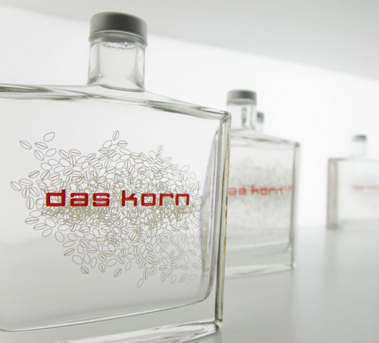
“DAS KORN (“The grain”) was designed by kakoii Berlin for the German Artist Theo Ligthart. The idea was to re-brand the typical German liquor made of wheat grain with its perception of cheap alcohol as a super premium brand. This was done by creating a packaging which uses the design language of the perfume industry. A heavy glass flacon bottle stating in a simplistic and pure way what’s inside: in typo (“Das Korn” = “The Grain”) and illustration (wheat grains). The product was introduced at one of the most important German art fairs (Artforum, Berlin) and became an acclaimed product for bars because of the combined art- and premium-image. Today DAS KORN sells as a commercial product in bars like the Soho-Club and selected retail stores as well as limited editions in art galleries.”
DAS KORN

DAS KORN

Previous slide
Next slide

Explore more great package design

Get the latest on packaging design in your inbox: