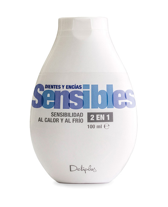
Designed by Lavernia & Cienfuegos | Country: Spain
“One of the design objectives was to comunicate the idea of an efficient, detailed dental care range thought to solve real problems, and at the same time different from the most important brands offering a similar quality. We used a typographic solution which is very functional because it can be read easily and communicates clearly the utility of the toothpaste. The overlapping of the letters and their transparencies provide the necessary graphic richness to personalize the range showing the quality of the products, and to suggest the attention to detail which they have been produced with.”


