Designed by: PepsiCo Design & Innovation
Country: United States

Doritos’ Redesign Concept Goes Viral

Designed by Michael Irwin | Country: United States 

The redesign is a “what if” concept created by designer Michael Irwin: Doritos has not changed its look.

Michael Irwin’s Doritos design concept has taken the internet by surprise. When famous brands opt for a fresh look, they get all the attention from the press and social media; however, for a design concept to go so viral is rare. Michael’s minimal packaging design concept is going very viral across various platforms.

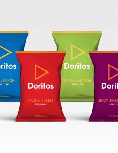
The minimal design concept imagined by Michael can be a fantastic lesson for designers and marketers. While Doritos is known for its “maximalist designs,” Michael follows a minimalist approach. 

The “what if” Doritos design concept goes very viral.
Doritos’ Redesign Concept Goes Viral
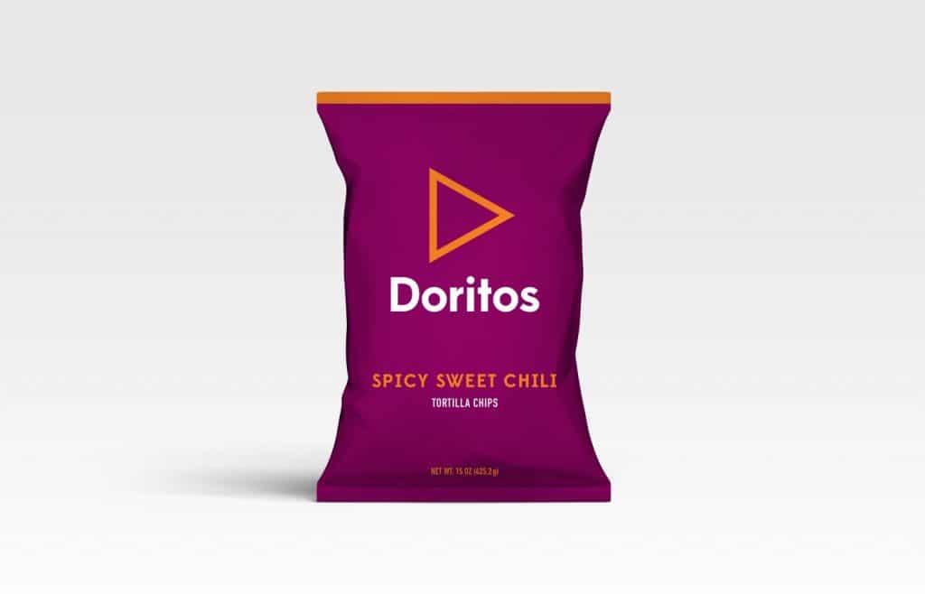
Doritos Spicy Sweet Chili imagined by Michael Irwin.

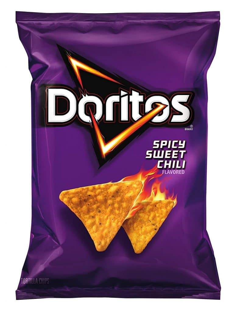
Be it advertising or packaging, Doritos is famous for taking its designs to extremes, and people love it! Take a packet of Doritos Spicy Sweet Chili for example; the original packaging features tortilla chips on fire. The famous triangular logo of the original packaging can also be seen on fire. The packaging never fails to attract customers. Now take a look at the design conceived by Michael Irwin; the package has all the qualities of the original one but in a minimal form. The logo has been redrawn; however, its trademark triangular shape has been maintained.

Designer Michael Irwin is well known for his conceptual designs and has attracted hundreds of thousands of social media users. The creative artist has over a decade of experience working with clients such as Nike, Pepsi, AT&T, ESPN, Disney, Heineken, and The NFL. According to the designer, the idea was based on the crazy thought of Doritos embracing an uber clean look.

Talking about his designs, the creative artist mentions that his Instagram handle features a mix of personal and client projects. “I am not sure exactly when I started redesigning brands for fun, but it has very much become a design exercise for me,” the designer explains.

While no one from Doritos has contacted Michael, his design concept created enough stir for the tortilla chips maker to take note of his minimal packaging design concepts. Doritos also appreciated Michael’s work. The tortilla chip makers replied to some fans saying, “Just to clear the air, this is not official, and we’re not changing the logo to this.”

The bottom line

Product packaging is crucial because it plays an important role in a customer’s purchasing decision. While Michael Irwin’s “what if” design is a personal project, Doritos essentially got a chance to gauge how customers would react if the company decided to change its packaging in the future.

The “what if” Doritos design concept goes very viral.

Get the latest packaging design inspiration in your inbox:

Popular designs

Designed by: PepsiCo Design & Innovation
Country: United States

Doritos’ Redesign Concept Goes Viral

The “what if” Doritos design concept goes very viral.

Designed by Michael Irwin | Country: United States 

The redesign is a “what if” concept created by designer Michael Irwin: Doritos has not changed its look.

Michael Irwin’s Doritos design concept has taken the internet by surprise. When famous brands opt for a fresh look, they get all the attention from the press and social media; however, for a design concept to go so viral is rare. Michael’s minimal packaging design concept is going very viral across various platforms.

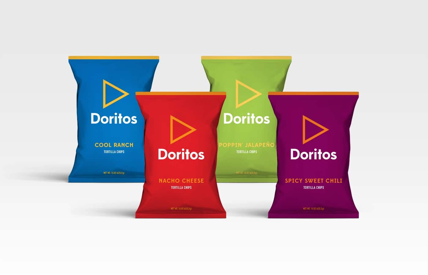
The minimal design concept imagined by Michael can be a fantastic lesson for designers and marketers. While Doritos is known for its “maximalist designs,” Michael follows a minimalist approach. 
The “what if” Doritos design concept goes very viral.
Doritos’ Redesign Concept Goes Viral
Doritos Spicy Sweet Chili imagined by Michael Irwin.

Be it advertising or packaging, Doritos is famous for taking its designs to extremes, and people love it! Take a packet of Doritos Spicy Sweet Chili for example; the original packaging features tortilla chips on fire. The famous triangular logo of the original packaging can also be seen on fire. The packaging never fails to attract customers. Now take a look at the design conceived by Michael Irwin; the package has all the qualities of the original one but in a minimal form. The logo has been redrawn; however, its trademark triangular shape has been maintained.

Designer Michael Irwin is well known for his conceptual designs and has attracted hundreds of thousands of social media users. The creative artist has over a decade of experience working with clients such as Nike, Pepsi, AT&T, ESPN, Disney, Heineken, and The NFL. According to the designer, the idea was based on the crazy thought of Doritos embracing an uber clean look.

Talking about his designs, the creative artist mentions that his Instagram handle features a mix of personal and client projects. “I am not sure exactly when I started redesigning brands for fun, but it has very much become a design exercise for me,” the designer explains.

While no one from Doritos has contacted Michael, his design concept created enough stir for the tortilla chips maker to take note of his minimal packaging design concepts. Doritos also appreciated Michael’s work. The tortilla chip makers replied to some fans saying, “Just to clear the air, this is not official, and we’re not changing the logo to this.”

The bottom line

Product packaging is crucial because it plays an important role in a customer’s purchasing decision. While Michael Irwin’s “what if” design is a personal project, Doritos essentially got a chance to gauge how customers would react if the company decided to change its packaging in the future.

Explore more great package design

Get the latest on packaging design in your inbox: