Designed by: PepsiCo Design & Innovation
Country: United States

Dr van der Hoog

Dr van der Hoog

Designed by nu:amsterdam | Country: The Netherlands

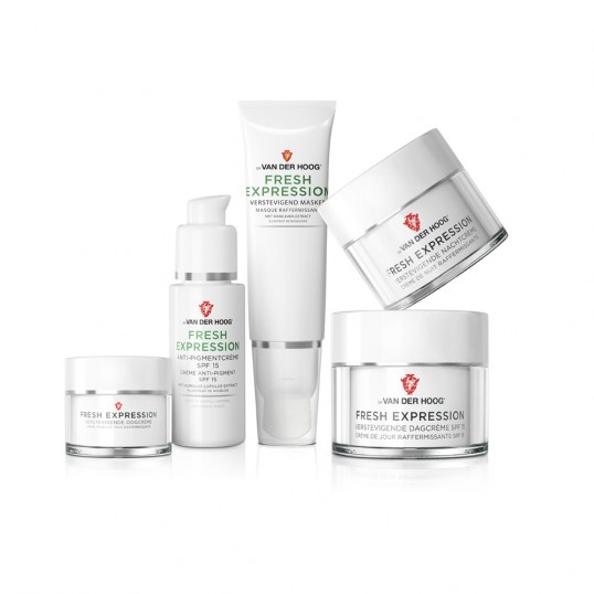
“Dr van der Hoog is a Dutch Cosmetics brand with a 75 year heritage. They decided to radically reposition their brand to a stylish statement of natural beauty. The Creative network nu:amsterdam created the new identity for the 60+ products assortment.

The designers chose an iconic centered layout, applied to simple white packaging for the moisturizers category. Colour accents in the product descriptors help consumers navigate the 6 ranges assortment. Heavy materials, refined silver lines and the logo embossing confirm the quality and authority of the brand.

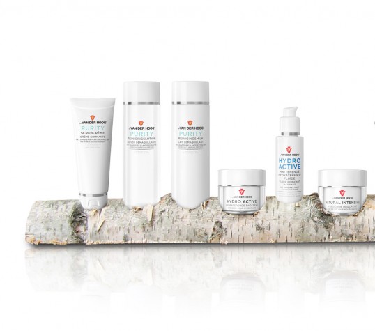
In the product presentation kit the contrast of the unfinished birch wood against the shiny packs makes a great impact, communicating natural beauty in a simple way.

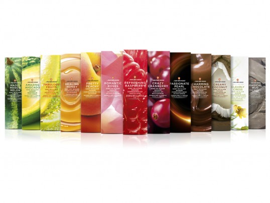
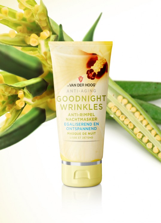
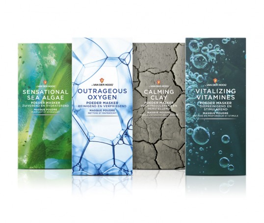
The younger face masks category requires more dynamism and power, which is what explains the abundant use of natural ingredient photographs on the packs.

The humorous product descriptors add youth and fun to the packs, that are still part of the brand identity.”

Dr van der Hoog

Dr van der Hoog

Dr van der Hoog

Dr van der Hoog

Dr van der Hoog

Get the latest packaging design inspiration in your inbox:

Popular designs

Designed by: PepsiCo Design & Innovation
Country: United States

Dr van der Hoog

lovley-package-van-der-hoog1

Dr van der Hoog

Designed by nu:amsterdam | Country: The Netherlands

“Dr van der Hoog is a Dutch Cosmetics brand with a 75 year heritage. They decided to radically reposition their brand to a stylish statement of natural beauty. The Creative network nu:amsterdam created the new identity for the 60+ products assortment.

The designers chose an iconic centered layout, applied to simple white packaging for the moisturizers category. Colour accents in the product descriptors help consumers navigate the 6 ranges assortment. Heavy materials, refined silver lines and the logo embossing confirm the quality and authority of the brand.

In the product presentation kit the contrast of the unfinished birch wood against the shiny packs makes a great impact, communicating natural beauty in a simple way.

The younger face masks category requires more dynamism and power, which is what explains the abundant use of natural ingredient photographs on the packs.

The humorous product descriptors add youth and fun to the packs, that are still part of the brand identity.”

Dr van der Hoog

Dr van der Hoog

Dr van der Hoog

Dr van der Hoog

Dr van der Hoog

Explore more great package design

Get the latest on packaging design in your inbox: