Designed by: PepsiCo Design & Innovation
Country: United States

Dragonfly Winery

dragonfly1

Designed by Hype Type Studio | Country: United Kingdom | Font: Baskerville

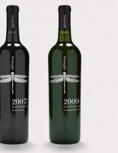
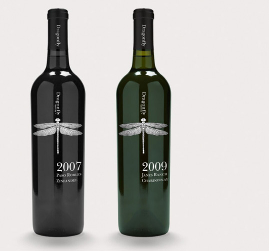
“A boutique label from California, Dragonfly Winery is focused on producing small quantities of ultra premium terrior driven wines, paired with a unique winemaking style.

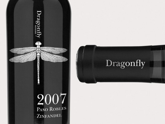
We were approached by Dragonfly to rejuvenated their wine packaging & brand identity. Our solution was a simple, clean typographic approach alongside a Dragonfly illustration creating a strong, modern visual identity.

The application takes the form of a 1 colour screen to the bottle. The logotype on the neck label is silver foiled onto black, making for easy identification when the bottle is stored amongst other wines.”
dragonfly2

Get the latest packaging design inspiration in your inbox:

Popular designs

Far Out Bar

Description: Far Out Bar is a cutting-edge packaging design project created for High Life Farms’ macrodose THC chocolate bars. This project involved

Over the wave

This Kombucha originates in Lombok, Indonesia, where its paradise beaches attract hundreds of surfers eager to ride the waves. When you surf,

The Port Vodka Lemon Water

Overview: In response to my client’s vision for a Cape Cod themed beverage brand, I embarked on the journey to create The Port

The Bra Guru

Most women are wearing the wrong size bra and that is a fact. The Bra Guru® is the first and only professional

Designed by: PepsiCo Design & Innovation
Country: United States

Dragonfly Winery

dragonfly1

dragonfly1

Designed by Hype Type Studio | Country: United Kingdom | Font: Baskerville

“A boutique label from California, Dragonfly Winery is focused on producing small quantities of ultra premium terrior driven wines, paired with a unique winemaking style.

We were approached by Dragonfly to rejuvenated their wine packaging & brand identity. Our solution was a simple, clean typographic approach alongside a Dragonfly illustration creating a strong, modern visual identity.

The application takes the form of a 1 colour screen to the bottle. The logotype on the neck label is silver foiled onto black, making for easy identification when the bottle is stored amongst other wines.”

dragonfly2

Previous slide
Next slide

Explore more great package design

Get the latest on packaging design in your inbox: