Designed by: PepsiCo Design & Innovation
Country: United States

DRY Soda Company

dry_new3

Designed by Turnstyle | Country: United States | Fonts used: Helvetica

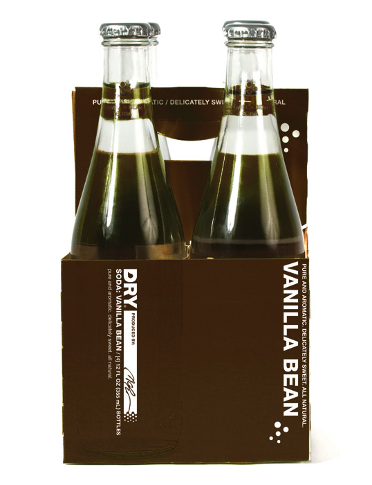
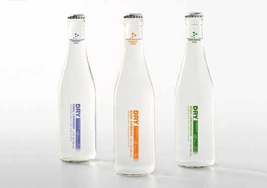
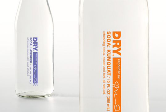
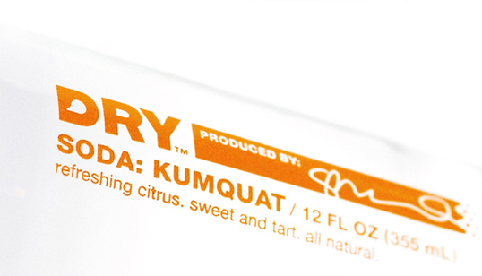
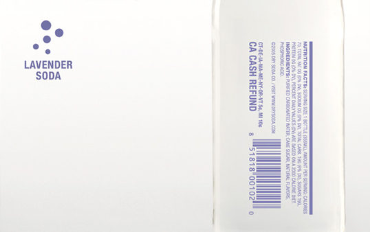
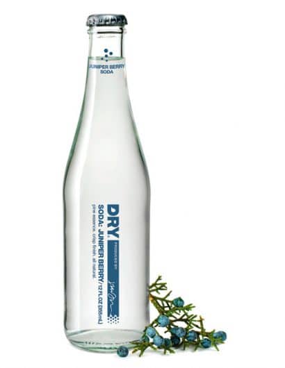
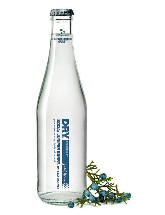
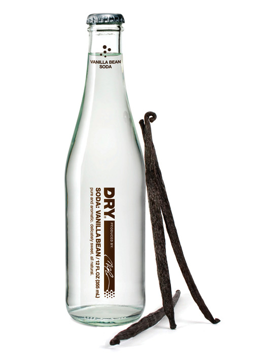
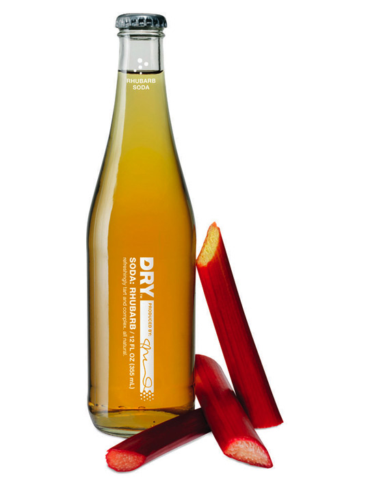
BreeAnna over at Dry Soda sent us some updated packaging. The Vanilla Bean and Juniper Berry packaging houses the signature of DRY’s first two employees, while the original four flavors showcase our Founder’s signature.

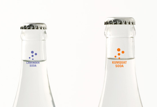
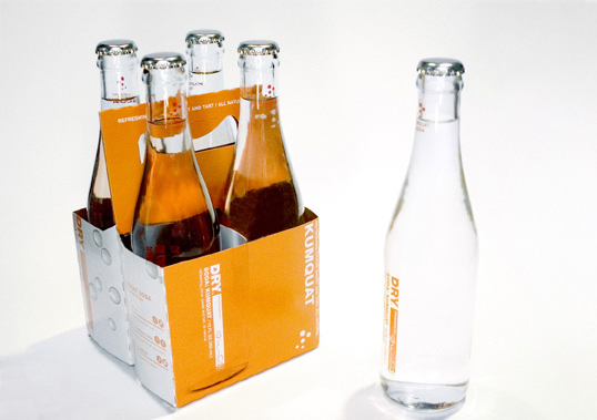
“Designed for those seeking a sophisticated, non-alcoholic beverage option, DRY Soda Co. produces lightly sweet, all-natural, culinary sodas. The sodas were developed specifically to be paired with great foods. To this end, DRY wanted the bottles to look at home in an upscale restaurant or at a five star hotel. Our design solution was intentionally minimalist. Wr endeavored to make the bottle sophisticated, but still fresh and inviting. Minimal graphics on clear bottles allow the purity of the product to show through. The owner’s signature on each bottle denotes a sense of craft behind each flavor’s recipe.”
dry_new2

dry_new1

dry_new4

dry_new5

dry1

dry2

dry3

dry4

dry5

dry6

Get the latest packaging design inspiration in your inbox:

Popular designs

The Port Vodka Lemon Water

Overview: In response to my client’s vision for a Cape Cod themed beverage brand, I embarked on the journey to create The Port

Burma Love Rebrand

Love at First BiteAs an extension of the Burma Superstar restaurant in San Francisco, Burma Love Foods gives diners an opportunity to

Pure Persian Honey

When we look closely at honey packaging, they are almost all in the usual format, and the ultimate in creativity is that

Far Out Bar

Description: Far Out Bar is a cutting-edge packaging design project created for High Life Farms’ macrodose THC chocolate bars. This project involved

Designed by: PepsiCo Design & Innovation
Country: United States

DRY Soda Company

dry_new3

dry_new3

Designed by Turnstyle | Country: United States | Fonts used: Helvetica

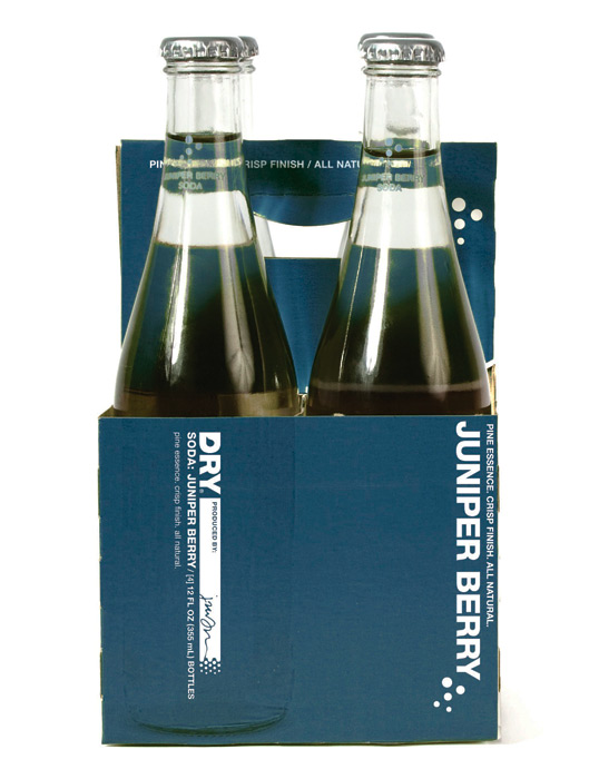
BreeAnna over at Dry Soda sent us some updated packaging. The Vanilla Bean and Juniper Berry packaging houses the signature of DRY’s first two employees, while the original four flavors showcase our Founder’s signature.

“Designed for those seeking a sophisticated, non-alcoholic beverage option, DRY Soda Co. produces lightly sweet, all-natural, culinary sodas. The sodas were developed specifically to be paired with great foods. To this end, DRY wanted the bottles to look at home in an upscale restaurant or at a five star hotel. Our design solution was intentionally minimalist. Wr endeavored to make the bottle sophisticated, but still fresh and inviting. Minimal graphics on clear bottles allow the purity of the product to show through. The owner’s signature on each bottle denotes a sense of craft behind each flavor’s recipe.”
dry_new2

dry_new1

dry_new4

dry_new5

dry1

dry2

dry3

dry4

dry5

dry6

Previous slide
Next slide

Explore more great package design

Get the latest on packaging design in your inbox: