Designed by: PepsiCo Design & Innovation
Country: United States

DUO Condoms

lovely-package-duo-condoms-1

Designed by mousegraphics | Country: Greece

“The briefing: DUO brand identity needs to be revised in order to update its worldwide look for new target audiences, better codify relevant communication and refresh its market presence.

The target consumer: Existing consumers of all ages and sexes as well as new audiences of younger people, web natives and design conscious buyers.

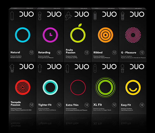
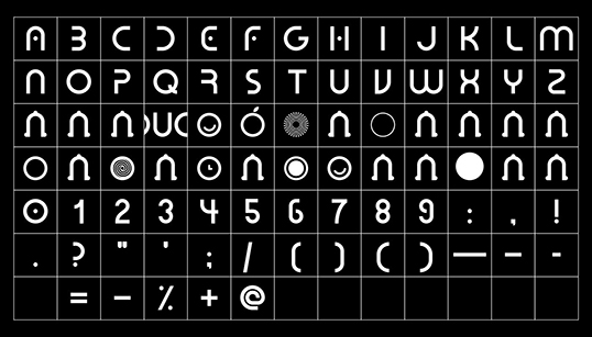
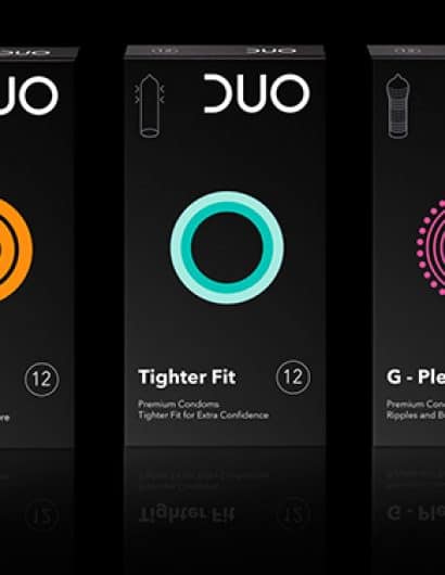
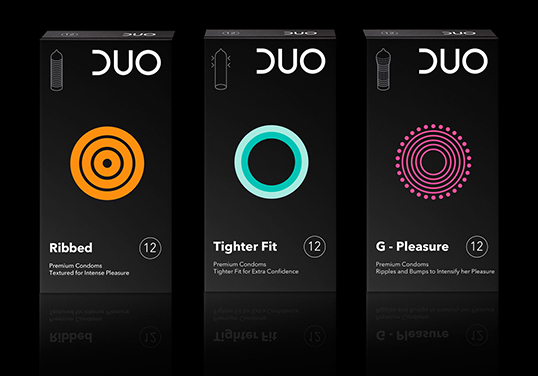
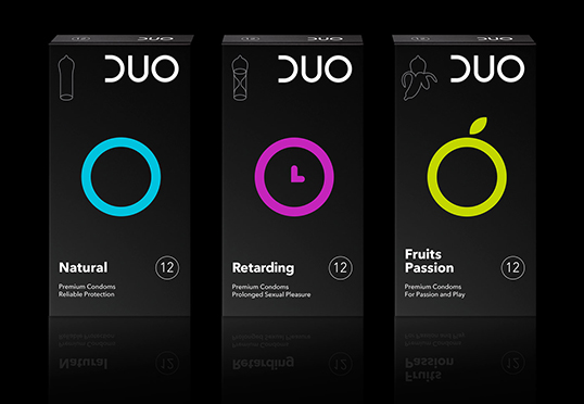
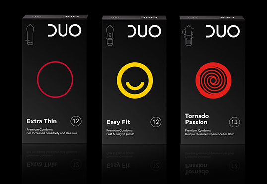
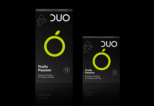
The design: To respond to our clients request we had to review the new languages of communication based on emoticons, shortcuts, symbols and condensed messages and imagine an original, codified, contemporary idiom legible by all and adaptable to all national markets, respective cultures and particular religious or social sensitivities. The DUO logo has been cleared from the oblong form around it so that the logo is better integrated within the packaging surface, and emphasis is redirected on the circle, one of the most essential, primordial forms, and also the characteristic plan – view of a condom. To address the multiple variations of DUO condoms, mousegraphics developed the playful, sensual lexicon of a “DUO – coded” language. This DUO vernacular emerges, color-coded in vibrant tones on stark black surfaces. Circle based, symbolically abstracted design and outlines reference fruits (as in the flavoured variety), languid time (as in the retarding variety), machine joints (as in G-pleasure) etc.”
lovely-package-duo-condoms-2 lovely-package-duo-condoms-3 lovely-package-duo-condoms-4 lovely-package-duo-condoms-5 lovely-package-duo-condoms-6 lovely-package-duo-condoms-7

Get the latest packaging design inspiration in your inbox:

Popular designs

Dama Blanca: Packaging Design for Salt of Cádiz

Discover the artisanal salt packaging design for Dama Blanca, a family project from Salinas of Cádiz. The design reflects the brand’s 3000-year history, authenticity and love for the sea, using natural materials and a sea-inspired palette.

Designed by: PepsiCo Design & Innovation
Country: United States

DUO Condoms

lovely-package-duo-condoms-1

lovely-package-duo-condoms-1

Designed by mousegraphics | Country: Greece

“The briefing: DUO brand identity needs to be revised in order to update its worldwide look for new target audiences, better codify relevant communication and refresh its market presence.

The target consumer: Existing consumers of all ages and sexes as well as new audiences of younger people, web natives and design conscious buyers.

The design: To respond to our clients request we had to review the new languages of communication based on emoticons, shortcuts, symbols and condensed messages and imagine an original, codified, contemporary idiom legible by all and adaptable to all national markets, respective cultures and particular religious or social sensitivities. The DUO logo has been cleared from the oblong form around it so that the logo is better integrated within the packaging surface, and emphasis is redirected on the circle, one of the most essential, primordial forms, and also the characteristic plan – view of a condom. To address the multiple variations of DUO condoms, mousegraphics developed the playful, sensual lexicon of a “DUO – coded” language. This DUO vernacular emerges, color-coded in vibrant tones on stark black surfaces. Circle based, symbolically abstracted design and outlines reference fruits (as in the flavoured variety), languid time (as in the retarding variety), machine joints (as in G-pleasure) etc.”
lovely-package-duo-condoms-2 lovely-package-duo-condoms-3 lovely-package-duo-condoms-4 lovely-package-duo-condoms-5 lovely-package-duo-condoms-6 lovely-package-duo-condoms-7

Previous slide
Next slide
Get the latest on packaging design in your inbox: