Designed by: PepsiCo Design & Innovation
Country: United States

Earthling Studio Revamps Brand Identity of Beverage Disruptor JUBEL

10
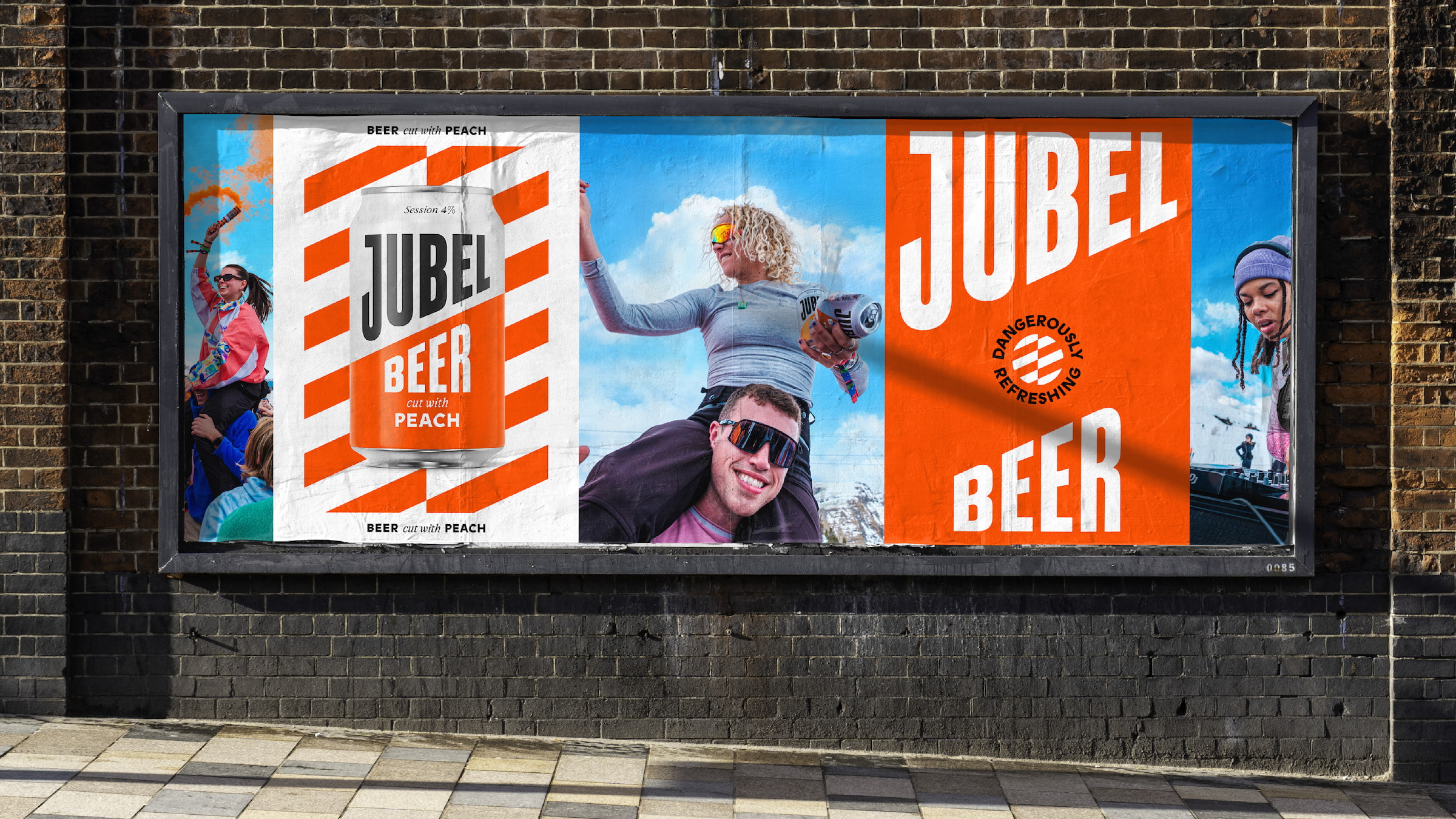
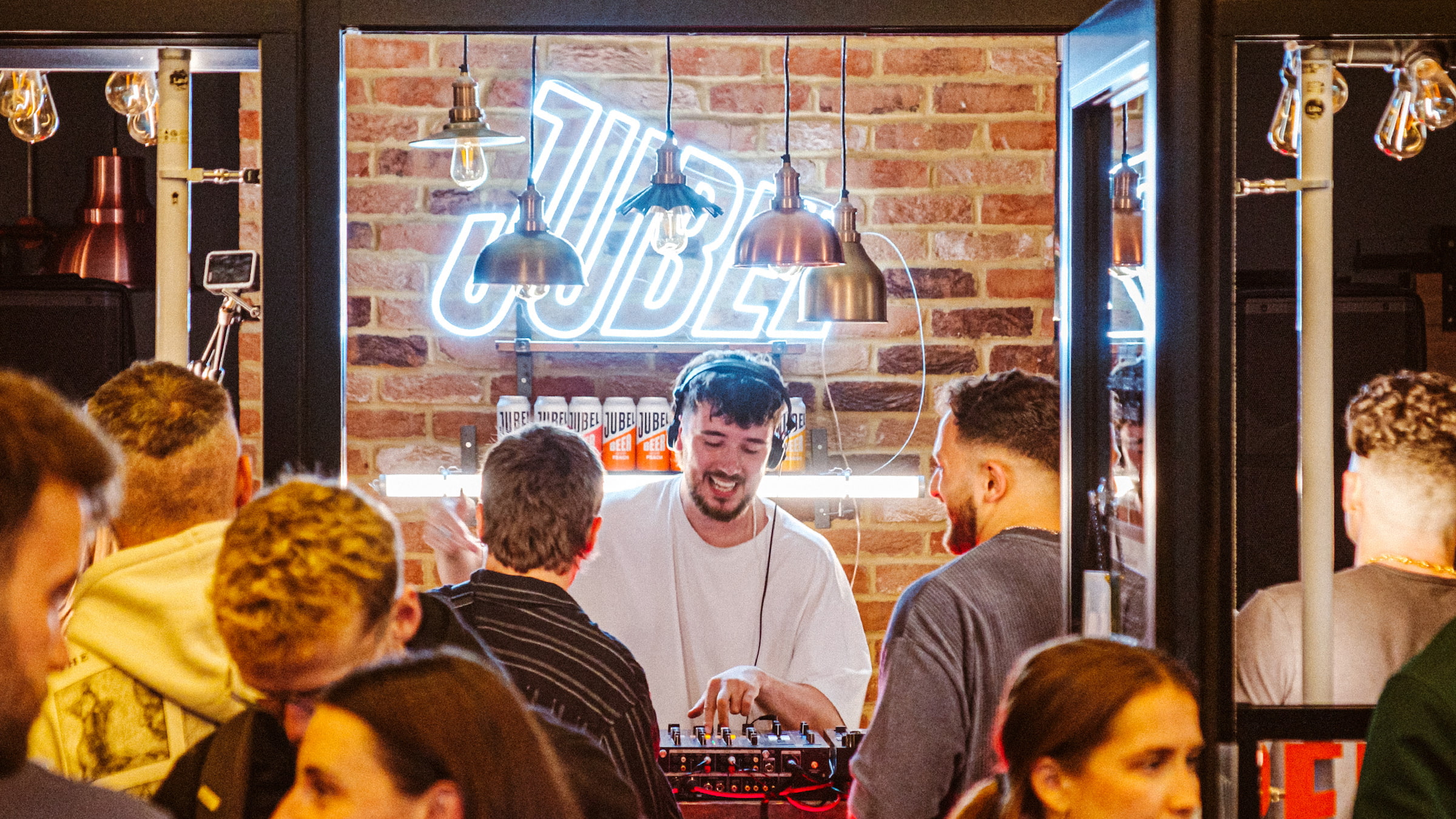
Earthling Studio has revamped the brand identity of the disruptive beverage brand, JUBEL, with a focus on distinctiveness, flexibility, and branded experiences. JUBEL’s popularity stems from its reputation as a “dangerously refreshing” beer, brewed in a unique way that combines the crisp refreshment of a cider with the sessionability of a lager. However, its existing brand identity wasn’t accurately conveying this unique selling point or providing the flexibility needed for the brand’s pop-up experiences or festival activations.

As JUBEL continues to grow, the focus has been placed on enhancing its distinctiveness by building and upgrading its existing brand assets. This ensures that the identity includes a crafted set of elements that can be seamlessly applied.

The Earthling team began by unpacking the brand’s personality and the product truths that underpin the ‘Dangerously Refreshing’ idea. JUBEL is a brand full of inspiration, with a lightness that makes it perfect for group occasions. The brand’s bold and spontaneous nature, combined with its propensity for pushing boundaries and thinking differently, is strongly reflected in the social experiences it hosts and the camaraderie within the team.

Earthling Studio Revamps Brand Identity of Beverage Disruptor JUBEL


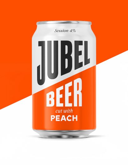
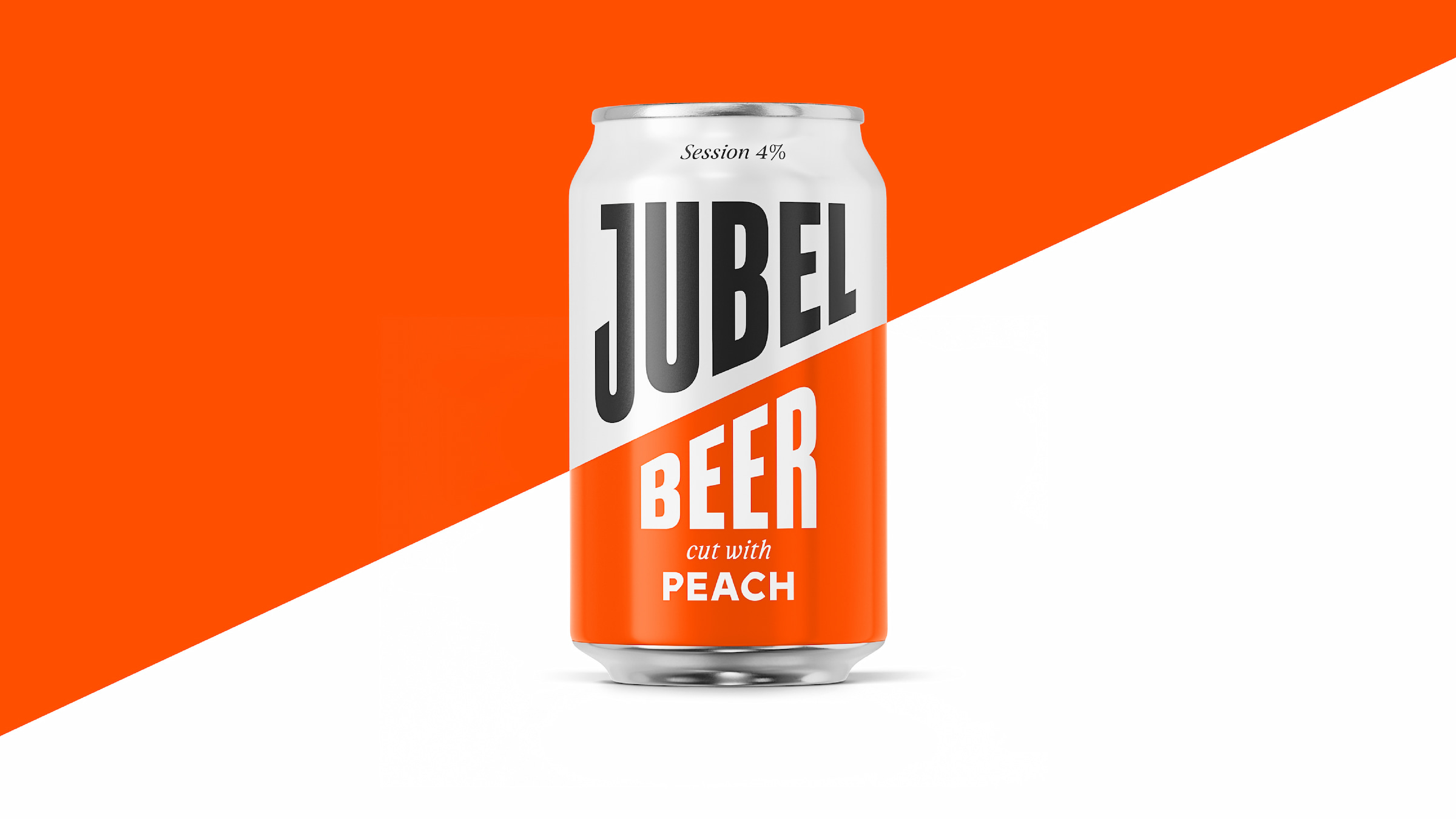
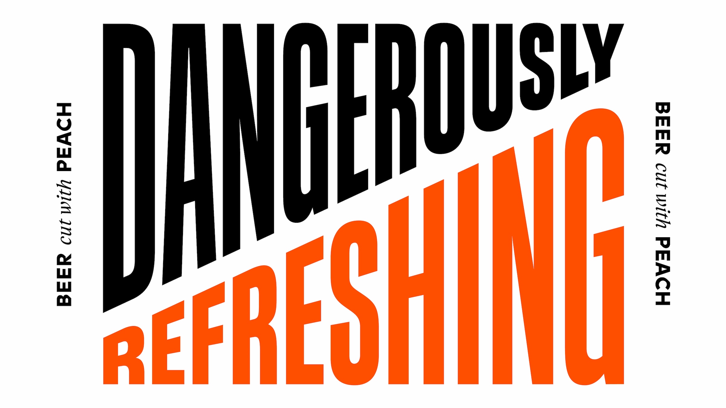
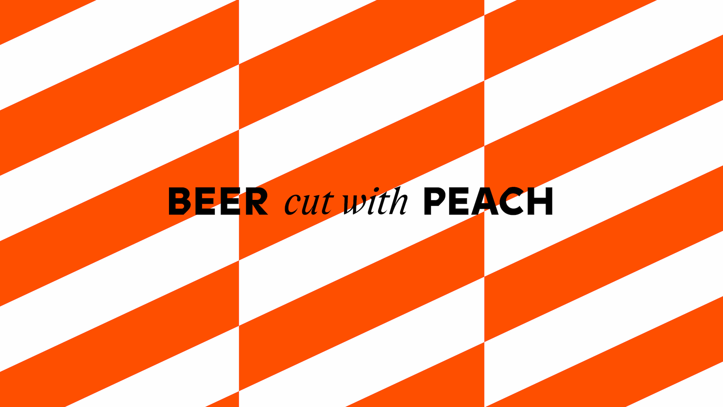
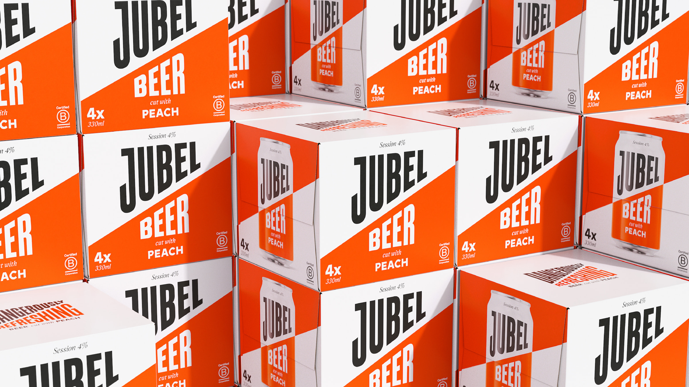
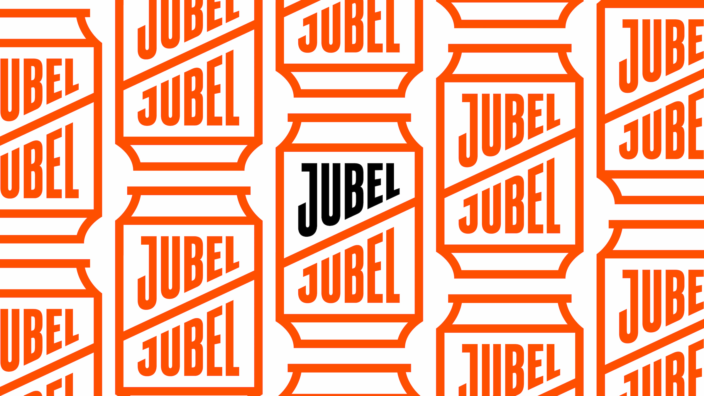
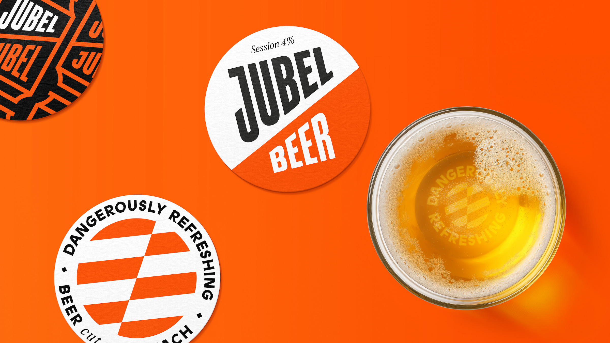
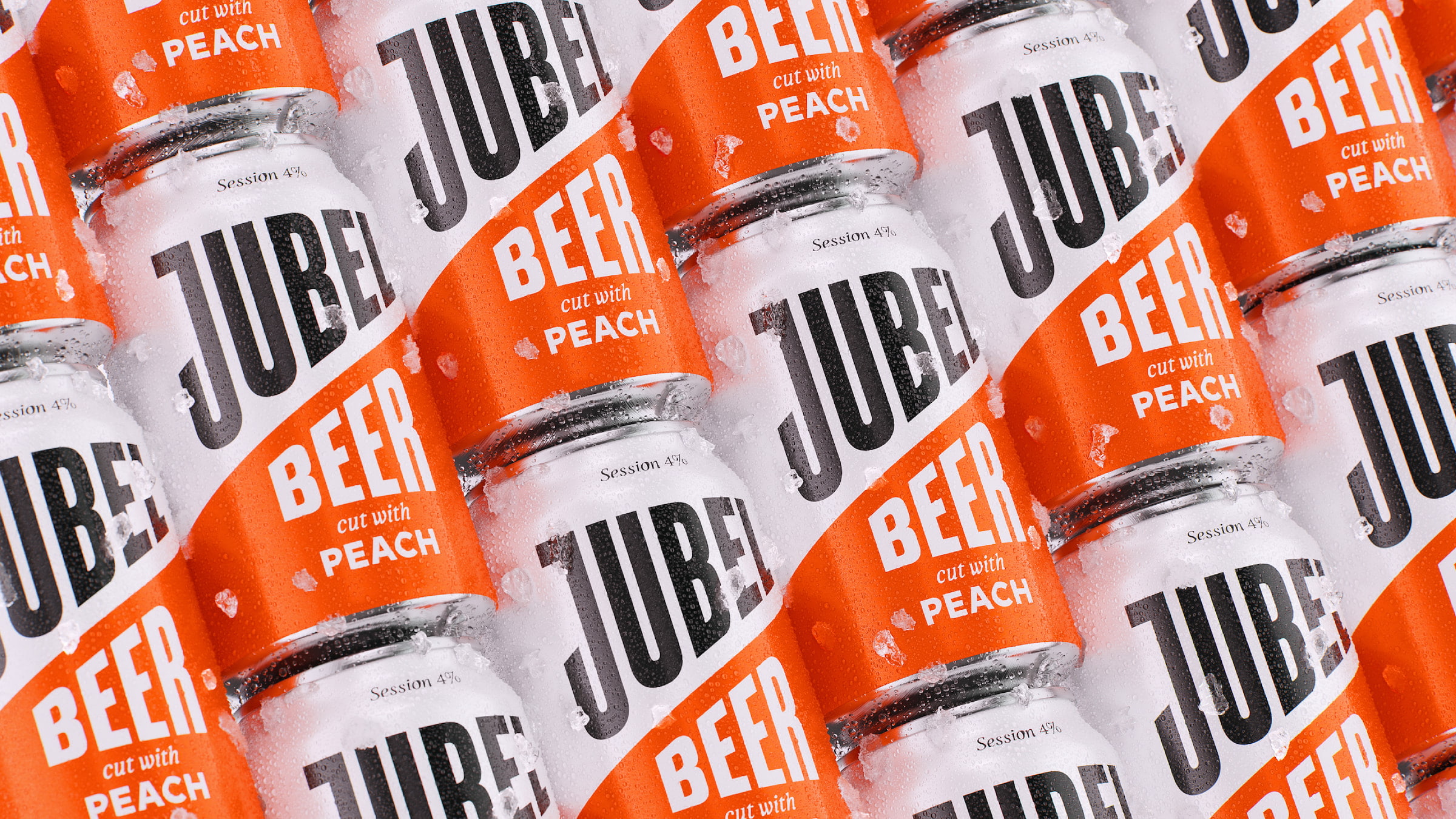
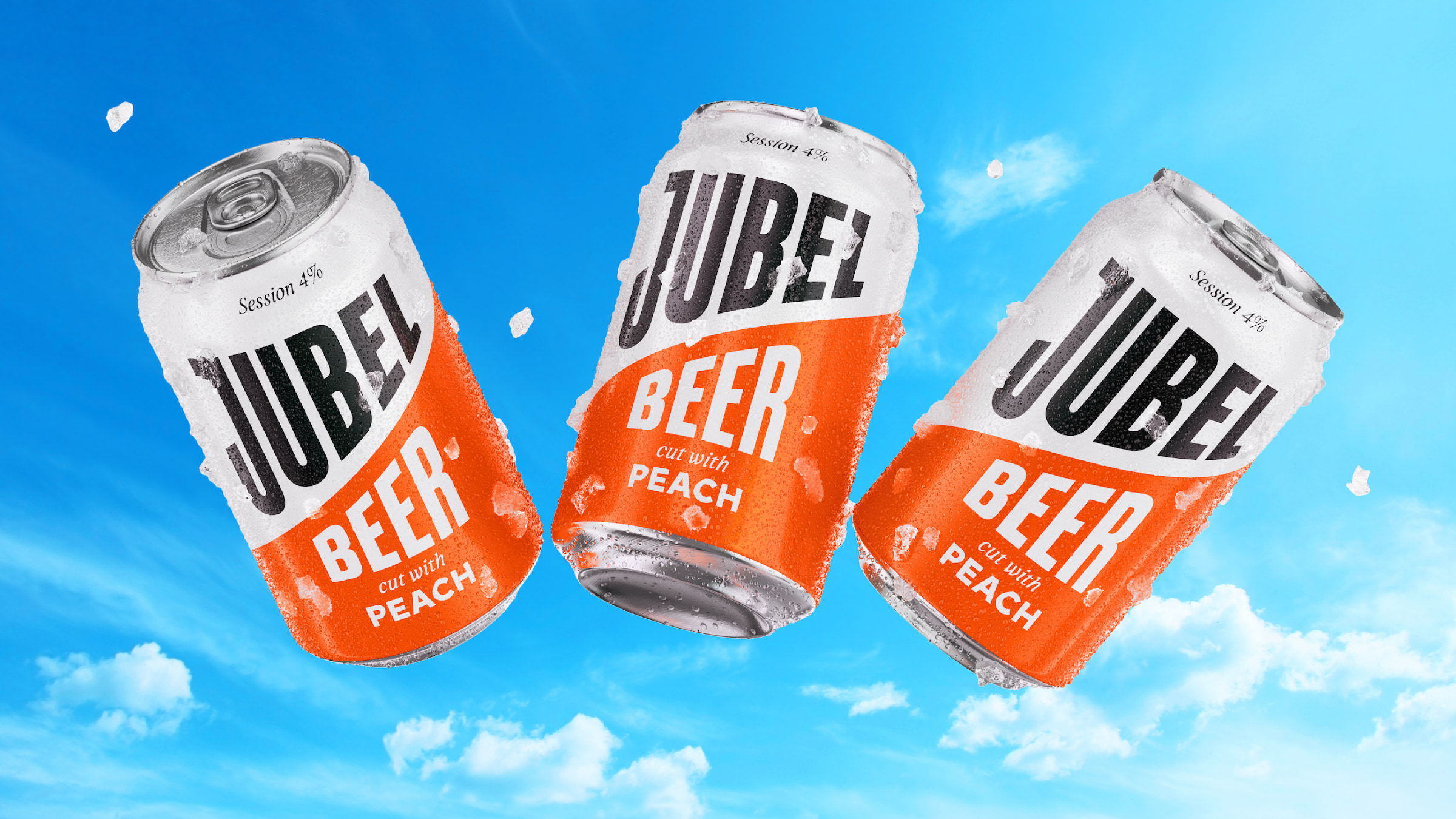
Earthling aimed to enhance the explicit expression of ‘Dangerously Refreshing’ by subverting the language of danger and subtly drawing on the codes of hazard and warning signs. This began with elevating the role of the cut, JUBEL’s most distinctive asset. The diagonal cut, paired with the impactful palette of orange, white, and black, subtly prompts the viewer to stop and take notice. The typography choices bring a mix of freshness and dynamism, importantly underpinned by touches of craft to speak to the quality of the liquid. This, combined with a simple illustration style and chevron pattern, created a flexible set of elements to inform the packaging, website, social media, merchandise, pop-up activations, on-trade collateral, campaigns, and more.

Earthling Studio Revamps Brand Identity of Beverage Disruptor JUBEL


Jesse Wilson, the founder of JUBEL, has always received positive feedback about their packaging, designed to cut through the clutter in craft. However, he felt their brand identity never flexed beyond the can and lacked a distinctive brand world. With Earthling’s help, they’ve leaned into “the cut” and created a beautiful kit of parts to maintain their distinctiveness while also building flexibility into their brand.

Earthling Studio Revamps Brand Identity of Beverage Disruptor JUBEL


Earthling Studio Revamps Brand Identity of Beverage Disruptor JUBEL


Earthling Studio Revamps Brand Identity of Beverage Disruptor JUBEL


Earthling Studio Revamps Brand Identity of Beverage Disruptor JUBEL


Earthling Studio Revamps Brand Identity of Beverage Disruptor JUBEL


Earthling Studio Revamps Brand Identity of Beverage Disruptor JUBEL


Earthling Studio Revamps Brand Identity of Beverage Disruptor JUBEL


Earthling Studio Revamps Brand Identity of Beverage Disruptor JUBEL
10

Get the latest packaging design inspiration in your inbox:

Popular designs

Far Out Bar

Description: Far Out Bar is a cutting-edge packaging design project created for High Life Farms’ macrodose THC chocolate bars. This project involved

Burma Love Rebrand

Love at First BiteAs an extension of the Burma Superstar restaurant in San Francisco, Burma Love Foods gives diners an opportunity to

The Bra Guru

Most women are wearing the wrong size bra and that is a fact. The Bra Guru® is the first and only professional

Pure Persian Honey

When we look closely at honey packaging, they are almost all in the usual format, and the ultimate in creativity is that

Designed by: PepsiCo Design & Innovation
Country: United States

Earthling Studio Revamps Brand Identity of Beverage Disruptor JUBEL

10
Earthling Studio Revamps Brand Identity of Beverage Disruptor JUBEL
Earthling Studio has revamped the brand identity of the disruptive beverage brand, JUBEL, with a focus on distinctiveness, flexibility, and branded experiences. JUBEL’s popularity stems from its reputation as a “dangerously refreshing” beer, brewed in a unique way that combines the crisp refreshment of a cider with the sessionability of a lager. However, its existing brand identity wasn’t accurately conveying this unique selling point or providing the flexibility needed for the brand’s pop-up experiences or festival activations.

As JUBEL continues to grow, the focus has been placed on enhancing its distinctiveness by building and upgrading its existing brand assets. This ensures that the identity includes a crafted set of elements that can be seamlessly applied.

The Earthling team began by unpacking the brand’s personality and the product truths that underpin the ‘Dangerously Refreshing’ idea. JUBEL is a brand full of inspiration, with a lightness that makes it perfect for group occasions. The brand’s bold and spontaneous nature, combined with its propensity for pushing boundaries and thinking differently, is strongly reflected in the social experiences it hosts and the camaraderie within the team.

Earthling Studio Revamps Brand Identity of Beverage Disruptor JUBEL


Earthling aimed to enhance the explicit expression of ‘Dangerously Refreshing’ by subverting the language of danger and subtly drawing on the codes of hazard and warning signs. This began with elevating the role of the cut, JUBEL’s most distinctive asset. The diagonal cut, paired with the impactful palette of orange, white, and black, subtly prompts the viewer to stop and take notice. The typography choices bring a mix of freshness and dynamism, importantly underpinned by touches of craft to speak to the quality of the liquid. This, combined with a simple illustration style and chevron pattern, created a flexible set of elements to inform the packaging, website, social media, merchandise, pop-up activations, on-trade collateral, campaigns, and more.

Earthling Studio Revamps Brand Identity of Beverage Disruptor JUBEL


Jesse Wilson, the founder of JUBEL, has always received positive feedback about their packaging, designed to cut through the clutter in craft. However, he felt their brand identity never flexed beyond the can and lacked a distinctive brand world. With Earthling’s help, they’ve leaned into “the cut” and created a beautiful kit of parts to maintain their distinctiveness while also building flexibility into their brand.

Earthling Studio Revamps Brand Identity of Beverage Disruptor JUBEL


Earthling Studio Revamps Brand Identity of Beverage Disruptor JUBEL


Earthling Studio Revamps Brand Identity of Beverage Disruptor JUBEL


Earthling Studio Revamps Brand Identity of Beverage Disruptor JUBEL


Earthling Studio Revamps Brand Identity of Beverage Disruptor JUBEL


Earthling Studio Revamps Brand Identity of Beverage Disruptor JUBEL


Earthling Studio Revamps Brand Identity of Beverage Disruptor JUBEL


Earthling Studio Revamps Brand Identity of Beverage Disruptor JUBEL
10
Previous slide
Next slide

Explore more great package design

Get the latest on packaging design in your inbox: