Designed by: PepsiCo Design & Innovation
Country: United States

EAT.

EAT.

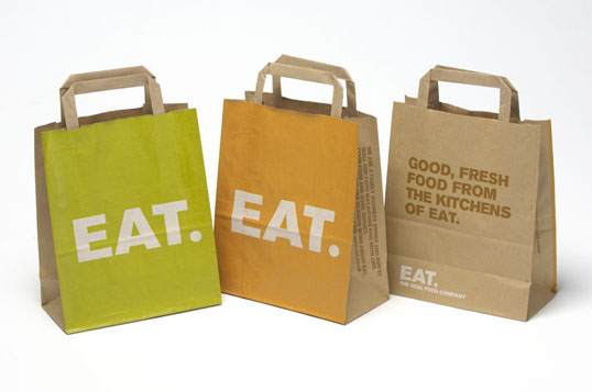
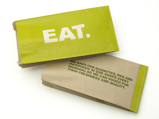
“In 2006 EAT came back to Pentagram to ask us to undertake an evolution of their brand communication, in order to bring the company’s identity in-line with the way the marketplace had developed since the creation of their brand.

Pentagram produced a communications review, which recommended adding value to the brand by refocusing EAT’s tone of communication, emphasising their existing good business practices and adding a degree of flexibility to the core brand elements in order to keep the EAT identity fresh and vibrant on an ongoing basis.”
EAT.

EAT.

EAT.

EAT.

EAT.

EAT.

Get the latest packaging design inspiration in your inbox:

Popular designs

The Bra Guru

Most women are wearing the wrong size bra and that is a fact. The Bra Guru® is the first and only professional

The Port Vodka Lemon Water

Overview: In response to my client’s vision for a Cape Cod themed beverage brand, I embarked on the journey to create The Port

Pure Persian Honey

When we look closely at honey packaging, they are almost all in the usual format, and the ultimate in creativity is that

Designed by: PepsiCo Design & Innovation
Country: United States

EAT.

eat1

EAT.

“In 2006 EAT came back to Pentagram to ask us to undertake an evolution of their brand communication, in order to bring the company’s identity in-line with the way the marketplace had developed since the creation of their brand.

Pentagram produced a communications review, which recommended adding value to the brand by refocusing EAT’s tone of communication, emphasising their existing good business practices and adding a degree of flexibility to the core brand elements in order to keep the EAT identity fresh and vibrant on an ongoing basis.”

EAT.

EAT.

EAT.

EAT.

EAT.

EAT.

Previous slide
Next slide

Explore more great package design

Get the latest on packaging design in your inbox: