Designed by: PepsiCo Design & Innovation
Country: United States

Ego

Ego

Designed by Lavernia & Cienfuegos | Country: Spain

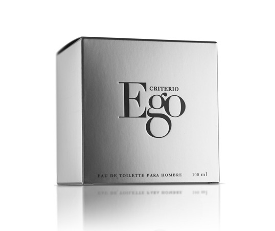
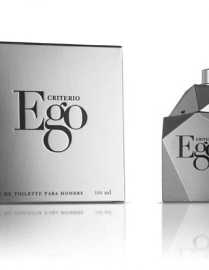
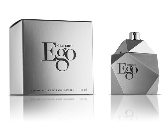
“Ego aims to connect with a modern audience concerned about their appearance. The faceted glass pack has been painted in matte silver so that the volume of the piece is solid and clearly defined. Ego uses a visual language which is direct and at the same time refined. The logo was created with equal strength in mind. Didot typeface was used in which the characteristics of the letter g was enlarged so that in context, three letters together form a single entity with more personality.”

Ego

Ego

Get the latest packaging design inspiration in your inbox:

Popular designs

The Bra Guru

Most women are wearing the wrong size bra and that is a fact. The Bra Guru® is the first and only professional

The Port Vodka Lemon Water

Overview: In response to my client’s vision for a Cape Cod themed beverage brand, I embarked on the journey to create The Port

Pure Persian Honey

When we look closely at honey packaging, they are almost all in the usual format, and the ultimate in creativity is that

Designed by: PepsiCo Design & Innovation
Country: United States

Ego

ego1

Ego

Designed by Lavernia & Cienfuegos | Country: Spain

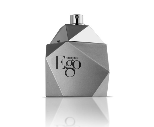
“Ego aims to connect with a modern audience concerned about their appearance. The faceted glass pack has been painted in matte silver so that the volume of the piece is solid and clearly defined. Ego uses a visual language which is direct and at the same time refined. The logo was created with equal strength in mind. Didot typeface was used in which the characteristics of the letter g was enlarged so that in context, three letters together form a single entity with more personality.”
Ego

Ego

Previous slide
Next slide

Explore more great package design

Get the latest on packaging design in your inbox: