


Designed by: Episode Two | Country: UK
Headquartered in Jalisco, Mexico, Cielito Lindo is one of the most popular breweries in South America. With the launch of its barrel-aged program, the Mexican brewery has ventured into the “collectors beer market.”
Toro Pinto, a Mexico-based design agency, was approached to create the packaging design for the barrel-aged collection. According to the design brief, Cielito Lindo wanted the designs to connect with the customers at an emotional level, along with having some Mexican elements.
“We were commissioned to create the artwork system and packaging output for the first barrel-aged collection. Requirements were simple: emotion, and Mexicanity. The master brand had to be kept intact but present as a signature in order to create a blank canvas for the artwork and design to unveil. The collection had to resonate with the consumer who commonly acquires these 600 ml presentations in the autumn-winter season as a gift, hence the experience had to convey that warm sense of a special occasion gift.”


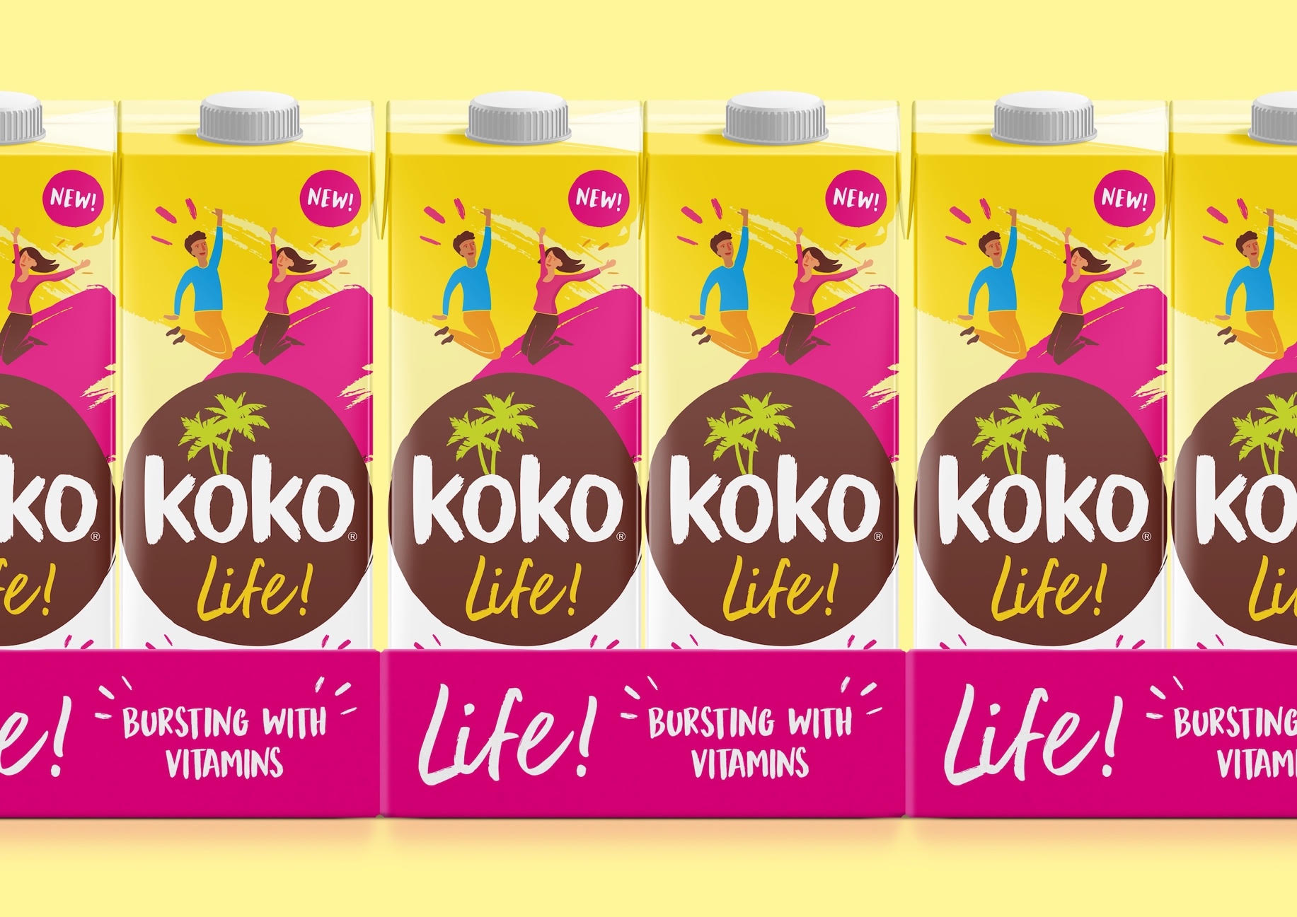
“We wanted the packaging design to really champion the unique ‘natural goodness’ proposition” says Creative Director Mark Stubbington “and help elevate the Koko brand credentials.”
“While it was also important to stay true to the core range look and feel” adds Creative Strategist Rikki Payne.
The striking visuals created by Episode Two compliment the product. Yellow in the packaging evokes positive energy, sunshine and warmth, whereas pink portrays love. The fun typeface adds to the overall fun vibe of the packaging.
“This was a tricky brief. We needed our new product to fit with the existing Koko range, but demonstrate the additional nutritional benefits and energy delivered by a product fortified with vitamins. The outcome speaks for itself, with a striking visual identity that perfectly balances the Koko brand with an elevated lifestyle proposition,” Heather Lewis. Senior Marketing Manager


