Once labeled a Schedule I substance by the United States Controlled Substances Act in 1970, psilocybin is now showing promising results in recent clinical trials for treating addiction, depression, and end-of-life mood disorders. Furthermore, there is preclinical evidence highlighting its benefits for pain relief. This, coupled with the growing popularity of microdosing and eased restrictions on psilocybin use in states like Oregon and Colorado, has paved the way for companies like Cy Biopharma to explore its therapeutic potential.
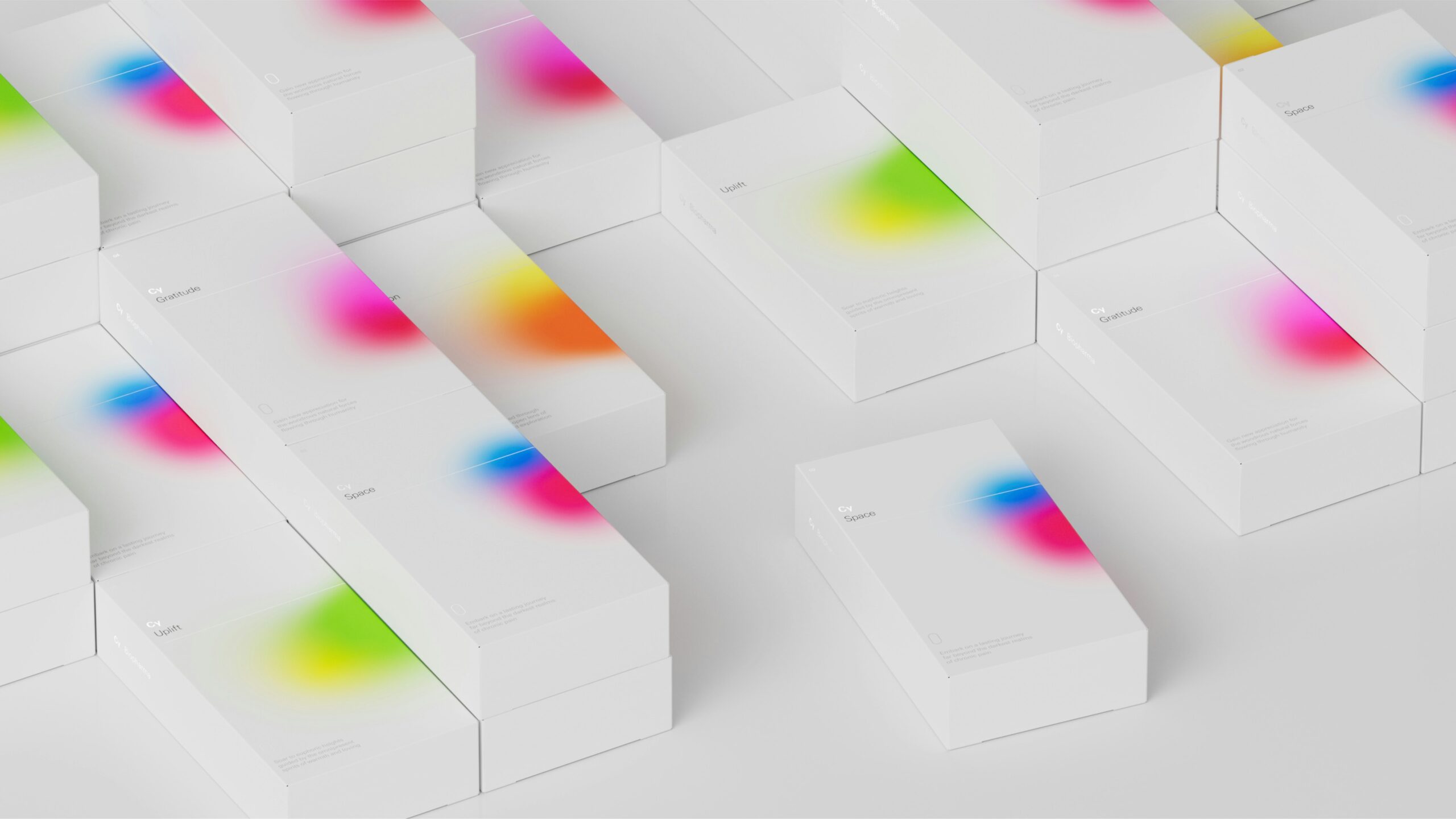
To escape the stereotypical image of magic mushrooms and psychedelic imagery, Cy Biopharma turned to the San Francisco-based studio Play for a design and identity that emphasizes the scientific benefits of psilocybin. They aimed for a design that would blend seamlessly into the pharmaceutical world while embracing psilocybin’s psychedelic properties.

The result is a brand that looks unlike any other painkiller out there. The design incorporates colors inspired by nature and the environments where the raw ingredients are found. The packaging features brightly colored, amorphous clusters of mist against a clean white backdrop, a visual metaphor for the psychedelic experience.

Cy Biopharma is a shining example of how thoughtful design can help to position a product in a new light, making it more approachable and appealing for a wider audience. As the world opens up to the potential therapeutic applications of substances like psilocybin, it’s exciting to see how design will continue to play a role in shaping perceptions and breaking down stigmas.