The Art of Creating Emotion through Design
Emotion, nature, and artistry are cleverly intertwined in the design of this gin label. The aesthetic is inspired by various elements of nature, including the botanical ingredients and spices found within the gin itself. The abstract painting that is formed adopts the codes of Japanese art, appealing to the senses of the viewer.
Similar to the construction lines in da Vinci’s Vitruvian Man, the label reinterprets the three organic forms of the graphic identity, highlighting the values associated with each:
- Left part: art & nature
- Central part: spirit & texture
- Right part: emotion & poetry
The Subtle Order of Elements in Design
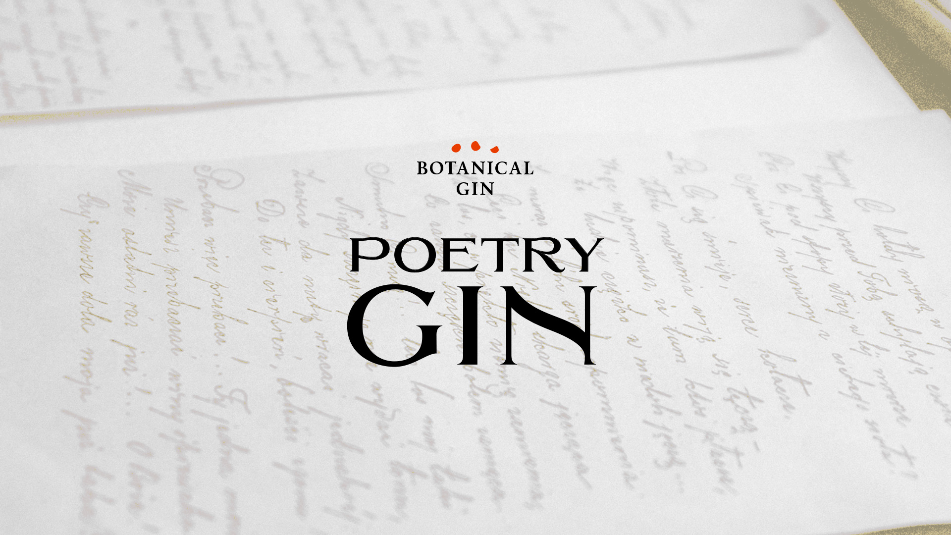
The branding concept was crafted into three unique icons, representing the juniper berries and peppers – the main ingredients of Poetry Gin. These icons also symbolize the three major areas of expression on the label.
The left side of the label showcases the various ingredients of Poetry Gin, maintaining an element of mystery about the distiller’s work. The right side is devoted to the world of poetry and the emotion it evokes in us.
The use of red hot stamping, transparent varnish, and embossing techniques highlight the precious details of the label. At first glance, the white of the label gives a pure appearance, but upon closer inspection, the consumer discovers each element present in the tableau.
Like the three stages of tasting wine or spirits, the viewer’s vision follows the revelation of Poetry Gin’s flavors. The composition, conceived by Studio Boam, is a meeting between a Cartesian approach and dreamy spirit, creating a structured and balanced whole. Each element finds its place in the overall structure and adheres to a precise artistic logic.