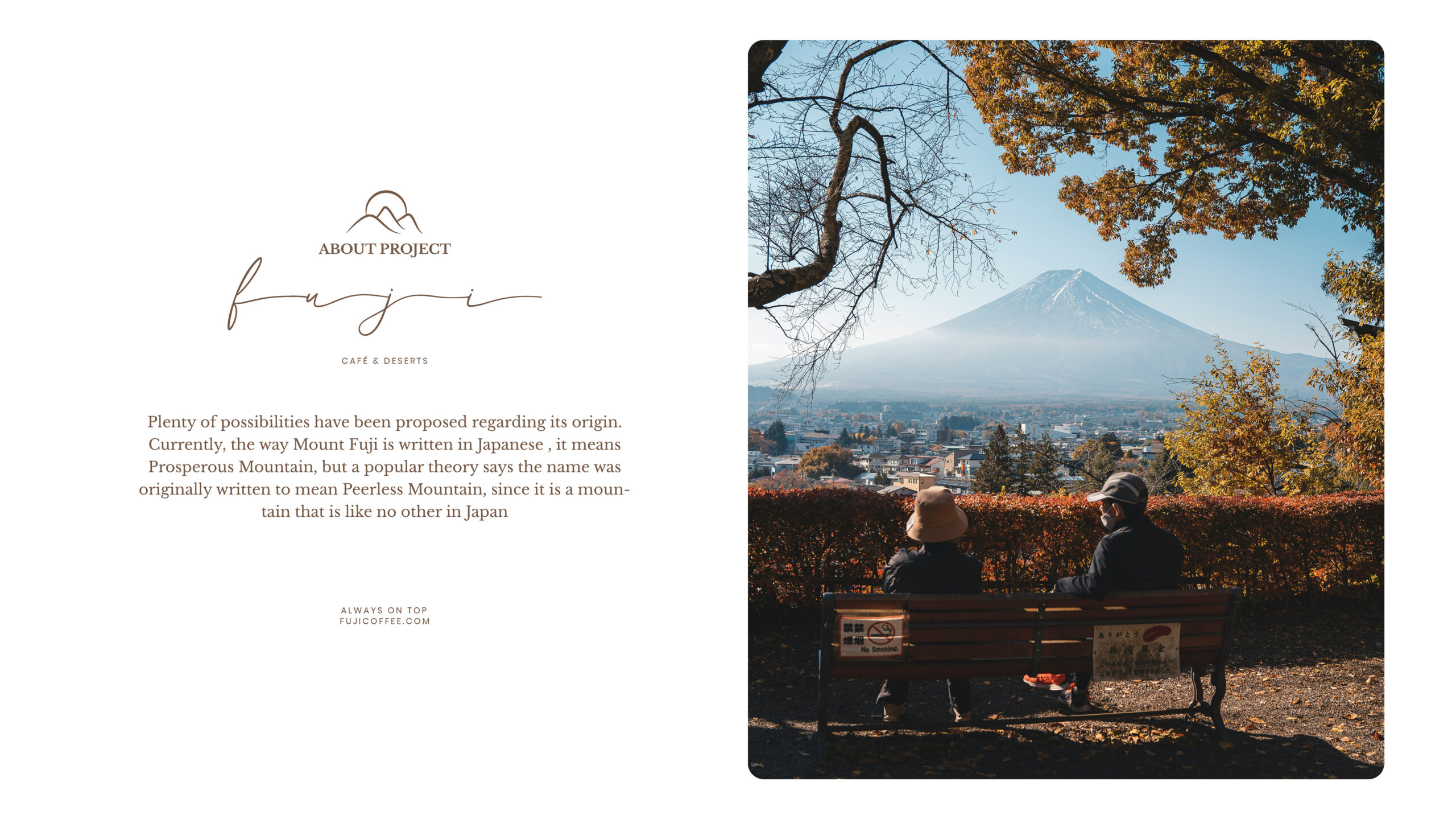


Fuji is a unique cafe located in Egypt, inspired by the majestic Mount Fuji in Japan. The name ‘Fuji’ translates to Prosperous Mountain, but is also believed to signify a Peerless Mountain, reflecting its distinctive stature in Japan.
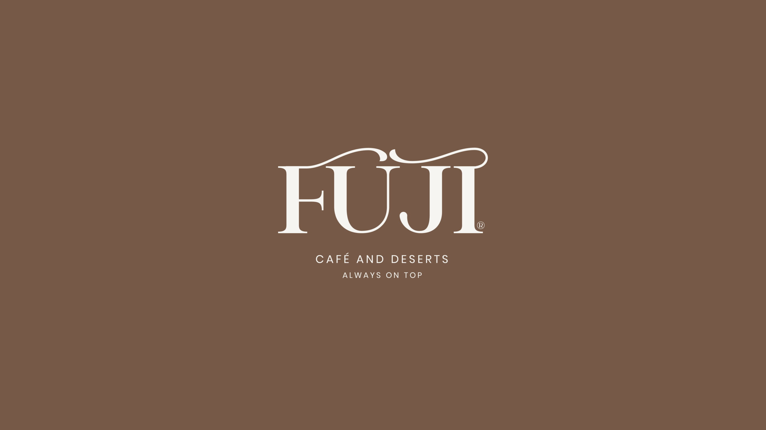
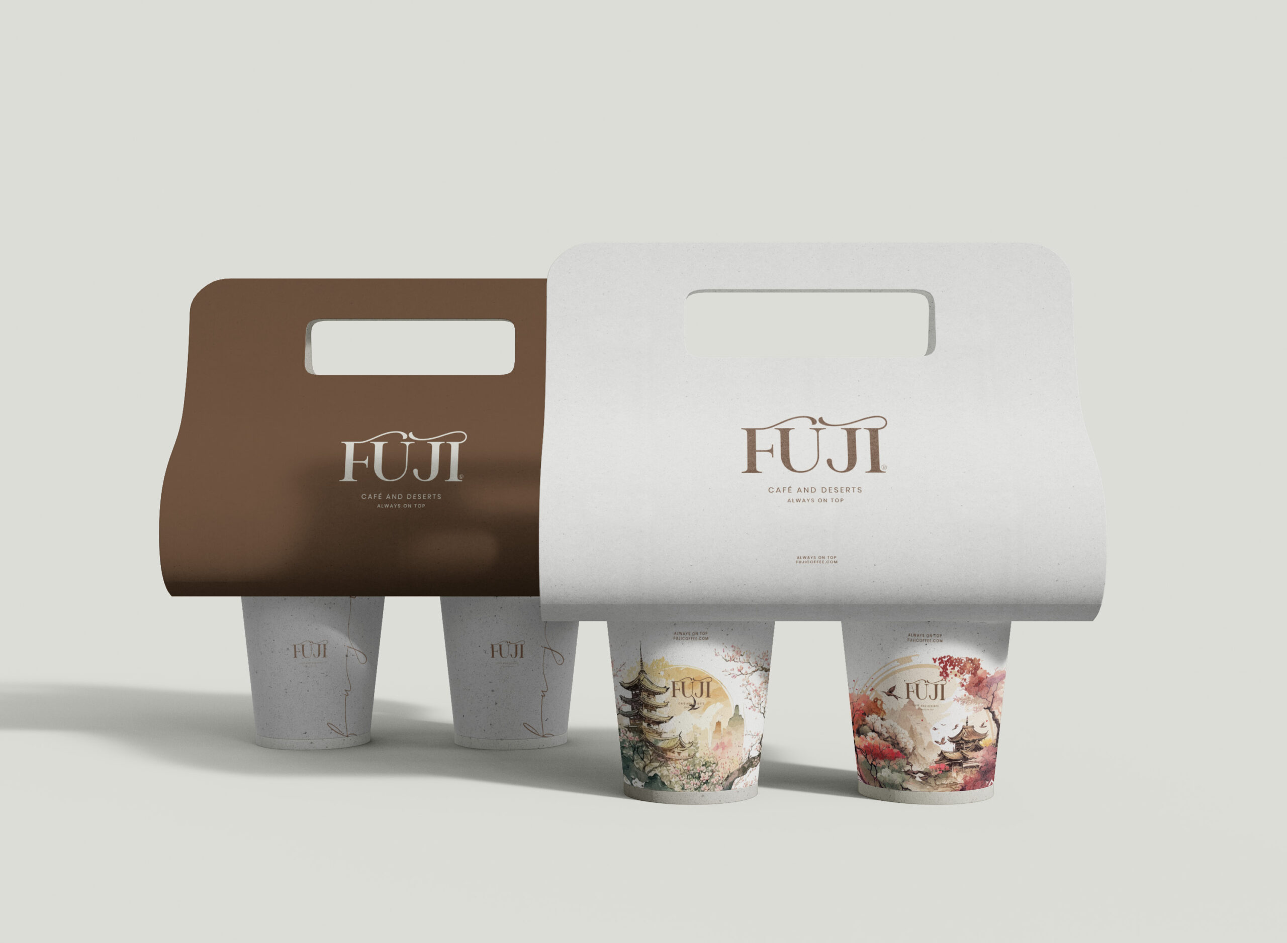
The cafe’s brand identity is beautifully crafted, featuring a typeface that embodies curving, cloudy waves, evoking the image of a mountain’s summit. An icon symbol further enriches the brand’s aesthetics, symbolizing a luxurious experience at the mountain’s peak.
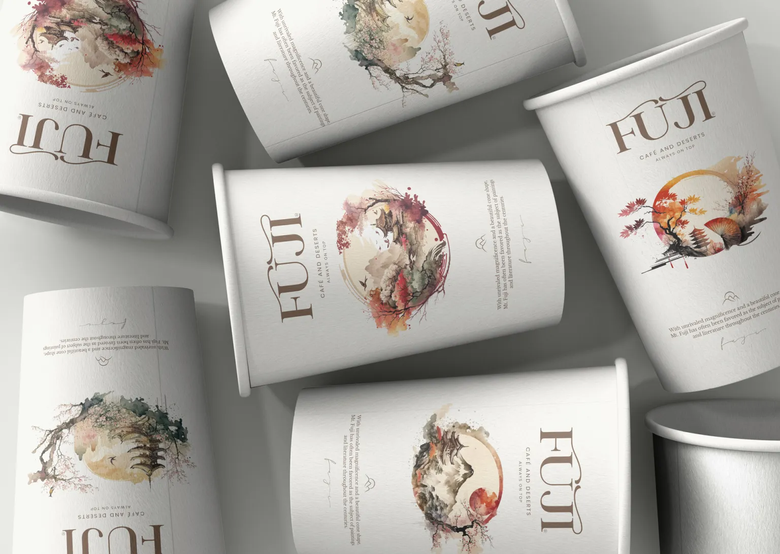
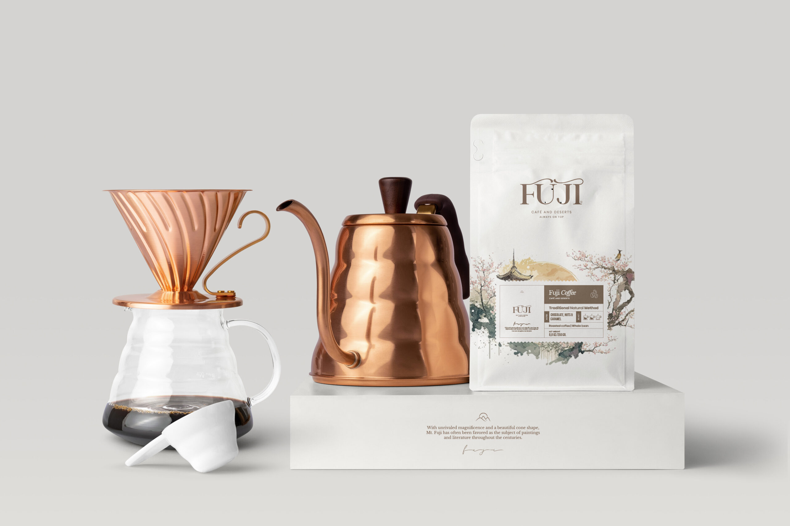
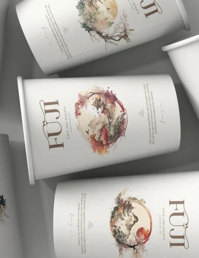
The packaging designs for Fuji cafe are an artistic representation of this concept. The swirling patterns and monochromatic color palette give a sense of calm and serenity, much like the peaceful summit of Mount Fuji. The packaging is both elegant and modern, reflecting the cafe’s commitment to providing a luxurious and unique experience for its customers.
Please take a moment to appreciate the intricate details and thoughtfulness that went into creating these designs: 