Designed by lg2boutique | Country: Canada
“The Farnham Ale & Lager Brewery is a new company that has just made a splash in the world of Quebec Beers. The brewer, located in the village of the same name, called on lg2boutique to design a brand platform that reflected its product, develop a graphic identity, design packaging and the total identity of the platform.
The branding of Farnham Ale & Lager positions this new Quebec brewer as an innovative brand that stands out in its category because of its taste and because of its look.
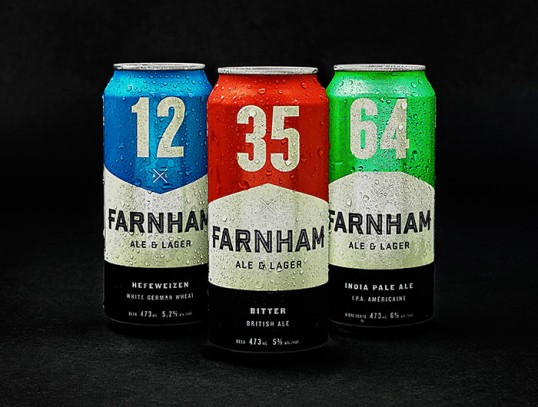
All of the graphic elements were chosen to highlight the beer’s origin, which was this Eastern Townships railway town. The four flavours stand out with their strong colour codes, their degrees of bitterness are indicated by 12, 27, 33 and 64, highlighted numbers, and the diagonal cross symbolizes a railway crossing.
The platform contains packaging, promotional clothing, caps, glasses and coasters.”