Designed by: PepsiCo Design & Innovation
Country: United States

Farrier

Farrier

Designed by Duncan/Channon | Country: United States

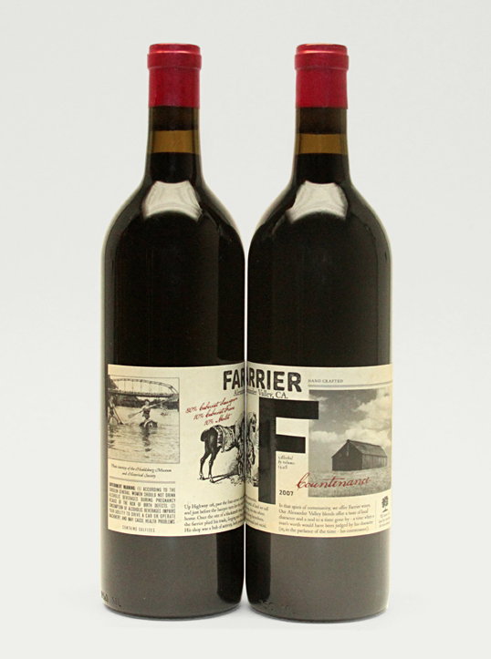
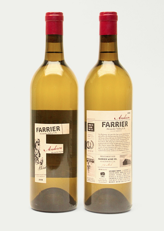
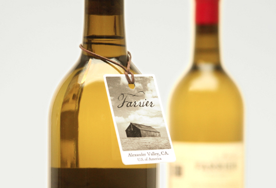
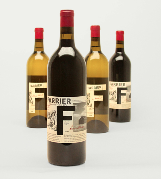
“Created for Jackson Family Wines (of Kendall-Jackson fame), Farrier is a brand that Duncan/Channon helped build from the ground up. The client came with a plot of land in Sonoma’s Alexander Valley and a challenge – create a wine brand that embodies the heritage of that singular place.

The overall concept taps into the sense of community that has historically played such an important role in rural life. Jackson Family Wines has always been guided by a strong appreciation for the land. And, as a family business, it is deeply rooted in the community. It seemed natural for Farrier to pay tribute to these things.

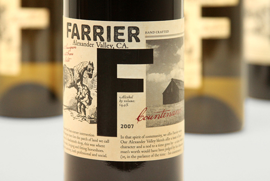
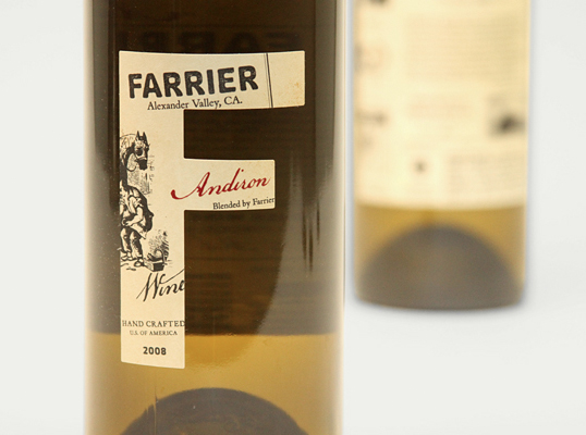
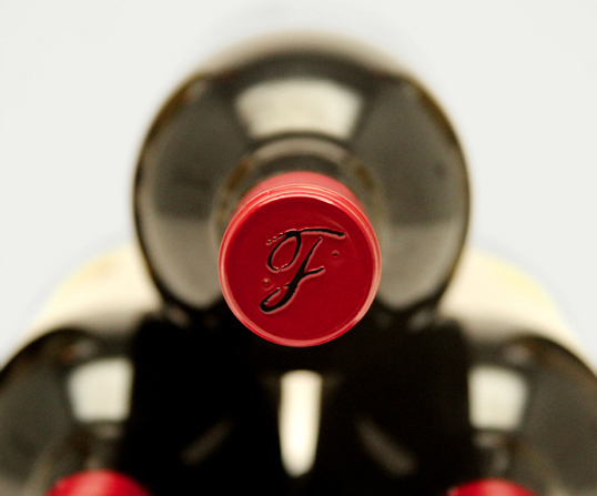
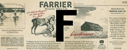
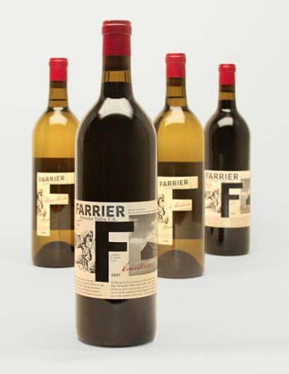
The design tells the story of a blacksmith shop that had been on the property in the 1800s. It was a place where the local farrier (or horseshoe fitter, for those of you not familiar with equine parlance) plied his trade and the townsfolk gathered to socialize. Reinforcing the handcrafted quality of the wine, the packaging mirrors the look of an old newspaper and the language adopts an endearingly olde-school colloquial tone. The red wine uses a more traditional wrap label, while the whites are adorned with a die-cut “F.”

Farrier

Farrier

Farrier

Farrier

Farrier

Farrier

Farrier

Farrier

Get the latest packaging design inspiration in your inbox:

Popular designs

Designed by: PepsiCo Design & Innovation
Country: United States

Farrier

farrier1

Farrier

Designed by Duncan/Channon | Country: United States

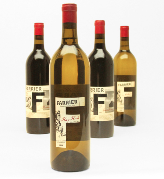
“Created for Jackson Family Wines (of Kendall-Jackson fame), Farrier is a brand that Duncan/Channon helped build from the ground up. The client came with a plot of land in Sonoma’s Alexander Valley and a challenge – create a wine brand that embodies the heritage of that singular place.

The overall concept taps into the sense of community that has historically played such an important role in rural life. Jackson Family Wines has always been guided by a strong appreciation for the land. And, as a family business, it is deeply rooted in the community. It seemed natural for Farrier to pay tribute to these things.

The design tells the story of a blacksmith shop that had been on the property in the 1800s. It was a place where the local farrier (or horseshoe fitter, for those of you not familiar with equine parlance) plied his trade and the townsfolk gathered to socialize. Reinforcing the handcrafted quality of the wine, the packaging mirrors the look of an old newspaper and the language adopts an endearingly olde-school colloquial tone. The red wine uses a more traditional wrap label, while the whites are adorned with a die-cut “F.”
Farrier

Farrier

Farrier

Farrier

Farrier

Farrier

Farrier

Farrier

Explore more great package design

Get the latest on packaging design in your inbox: