Designed by: PepsiCo Design & Innovation
Country: United States

Fatso Peanut Butter Packaging Design

2

Designed by: Crew | Country: Canada

While most peanut butter contains harmful preservatives and chemicals, Fatso’s products come packed with healthy fats and nutrients. The name ‘Fatso’ signifies the healthy fats the product comes packed with.

“We all grew up on it. We all love it. But did you know that most peanut butters are filled with crap? Ya, hate to break it to you. But that PB&J your mom used to pack you for lunch…no bueno.

Enter Fatso! A peanut butter loaded with healthy fats and nutrients. Founded in 2016; Jill Van Gyn launched the brand with hopes of getting the world off junk-filled nut butters and onto something better. The name ‘Fatso’ speaks to the healthy fats that it’s loaded with. Which is fitting for a playful and unconventional brand like Fatso. So, what was the problem? Well, the brand look and feel just didn’t live up to the bold energy of Jill and the brand. The name is striking, but the visuals didn’t bring that same kind of vibe. That’s where we come in.”
Fatso Peanut Butter Packaging Design

The packaging

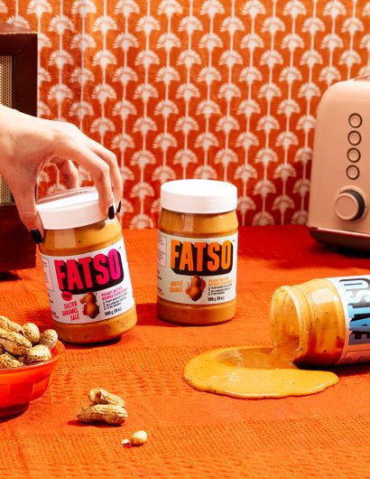
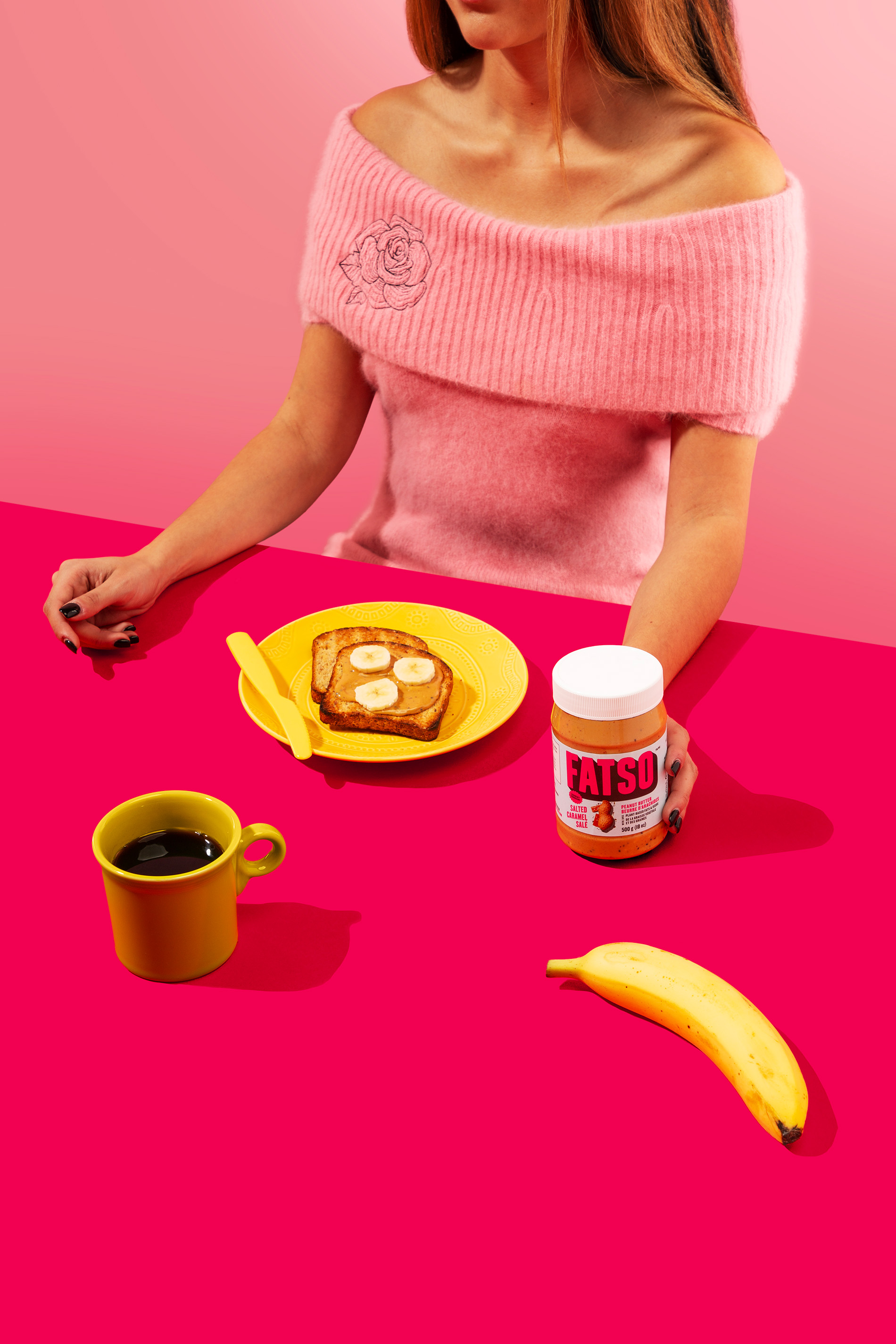
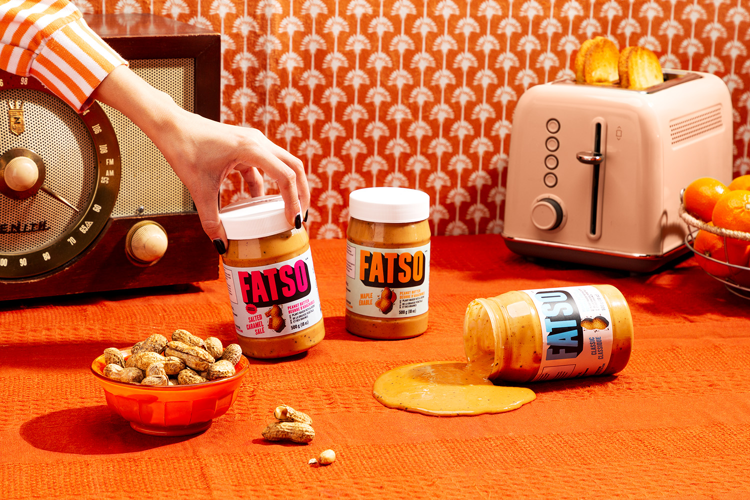
Fatso teamed up with Crew, a Vancouver-based branding agency, to create packaging illustrations that would attract customers immediately. The branding agency used pastel colors and fonts that give the brand a retro vibe.

“Packed with plant-based superfats and carving out a category of its own within the peanut butter landscape, the design needed to stand out from the rest. We took the design from ma n’ pa to pow! Using a bold condensed custom typeface and a deep drop shadow, we created a wordmark that’s in-your-face and impossible to miss. Flavour? You can’t miss it either. We give our hero nuts and seeds the spotlight right front and center on the pack.

Colour played a huge role too. We paired vibrant colors with pastels to elicit big taste and confidence as well as to distinguish between the three mouthwatering flavors. The visual combination of the logo and colors also nod to the nostalgic and retro personality that is Jill and the Fatso brand. Fatso finally feels like Fatso. And it’s finally getting the attention it deserves.

2

Get the latest packaging design inspiration in your inbox:

Popular designs

Designed by: PepsiCo Design & Innovation
Country: United States

Fatso Peanut Butter Packaging Design

2
1-fatso-world-brand-design

Designed by: Crew | Country: Canada

While most peanut butter contains harmful preservatives and chemicals, Fatso’s products come packed with healthy fats and nutrients. The name ‘Fatso’ signifies the healthy fats the product comes packed with.

“We all grew up on it. We all love it. But did you know that most peanut butters are filled with crap? Ya, hate to break it to you. But that PB&J your mom used to pack you for lunch…no bueno.

Enter Fatso! A peanut butter loaded with healthy fats and nutrients. Founded in 2016; Jill Van Gyn launched the brand with hopes of getting the world off junk-filled nut butters and onto something better. The name ‘Fatso’ speaks to the healthy fats that it’s loaded with. Which is fitting for a playful and unconventional brand like Fatso. So, what was the problem? Well, the brand look and feel just didn’t live up to the bold energy of Jill and the brand. The name is striking, but the visuals didn’t bring that same kind of vibe. That’s where we come in.”
Fatso Peanut Butter Packaging Design

The packaging

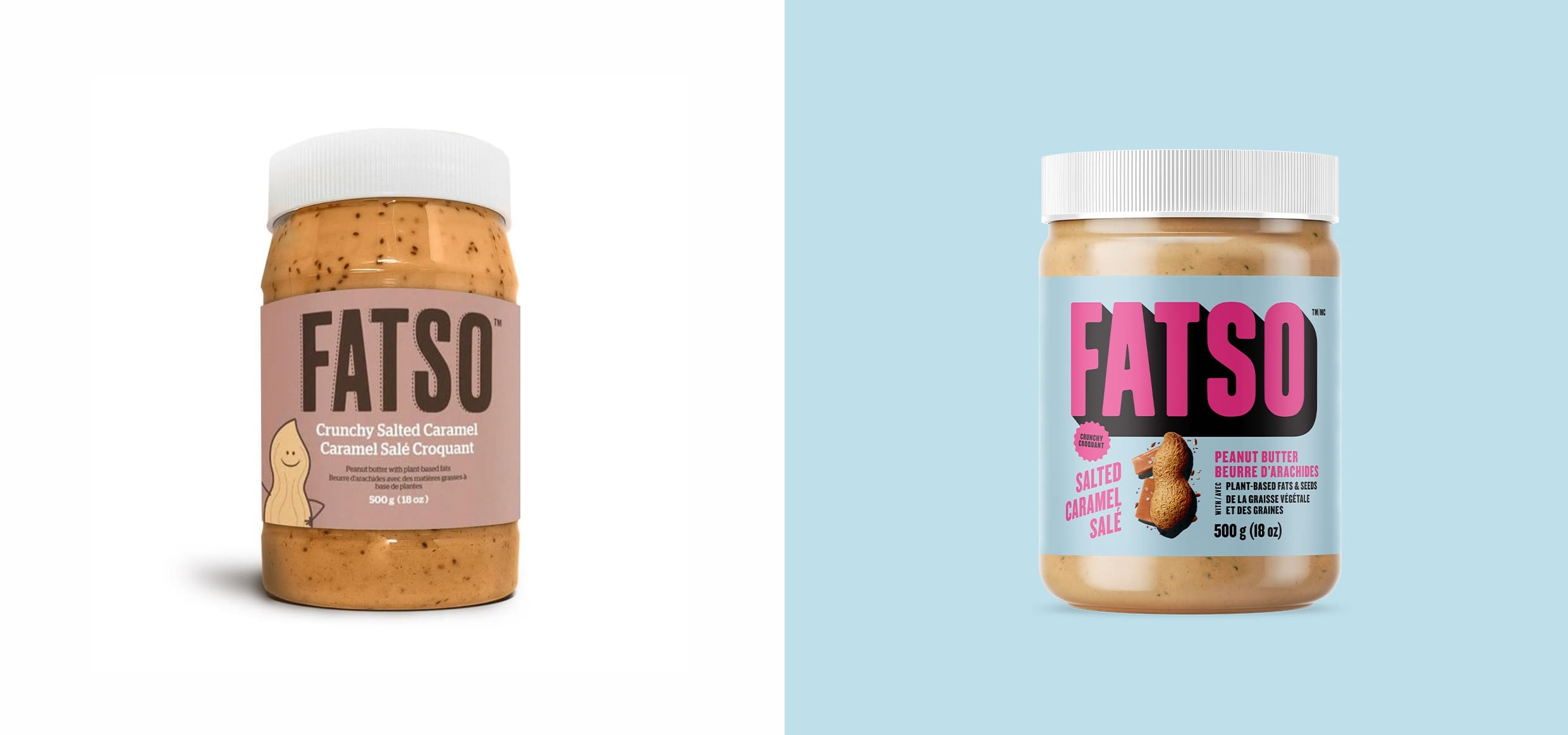
Fatso teamed up with Crew, a Vancouver-based branding agency, to create packaging illustrations that would attract customers immediately. The branding agency used pastel colors and fonts that give the brand a retro vibe.

“Packed with plant-based superfats and carving out a category of its own within the peanut butter landscape, the design needed to stand out from the rest. We took the design from ma n’ pa to pow! Using a bold condensed custom typeface and a deep drop shadow, we created a wordmark that’s in-your-face and impossible to miss. Flavour? You can’t miss it either. We give our hero nuts and seeds the spotlight right front and center on the pack.

Colour played a huge role too. We paired vibrant colors with pastels to elicit big taste and confidence as well as to distinguish between the three mouthwatering flavors. The visual combination of the logo and colors also nod to the nostalgic and retro personality that is Jill and the Fatso brand. Fatso finally feels like Fatso. And it’s finally getting the attention it deserves.

2
Previous slide
Next slide
Get the latest on packaging design in your inbox: