


Design by: Beto Nunes | Country: Brazil
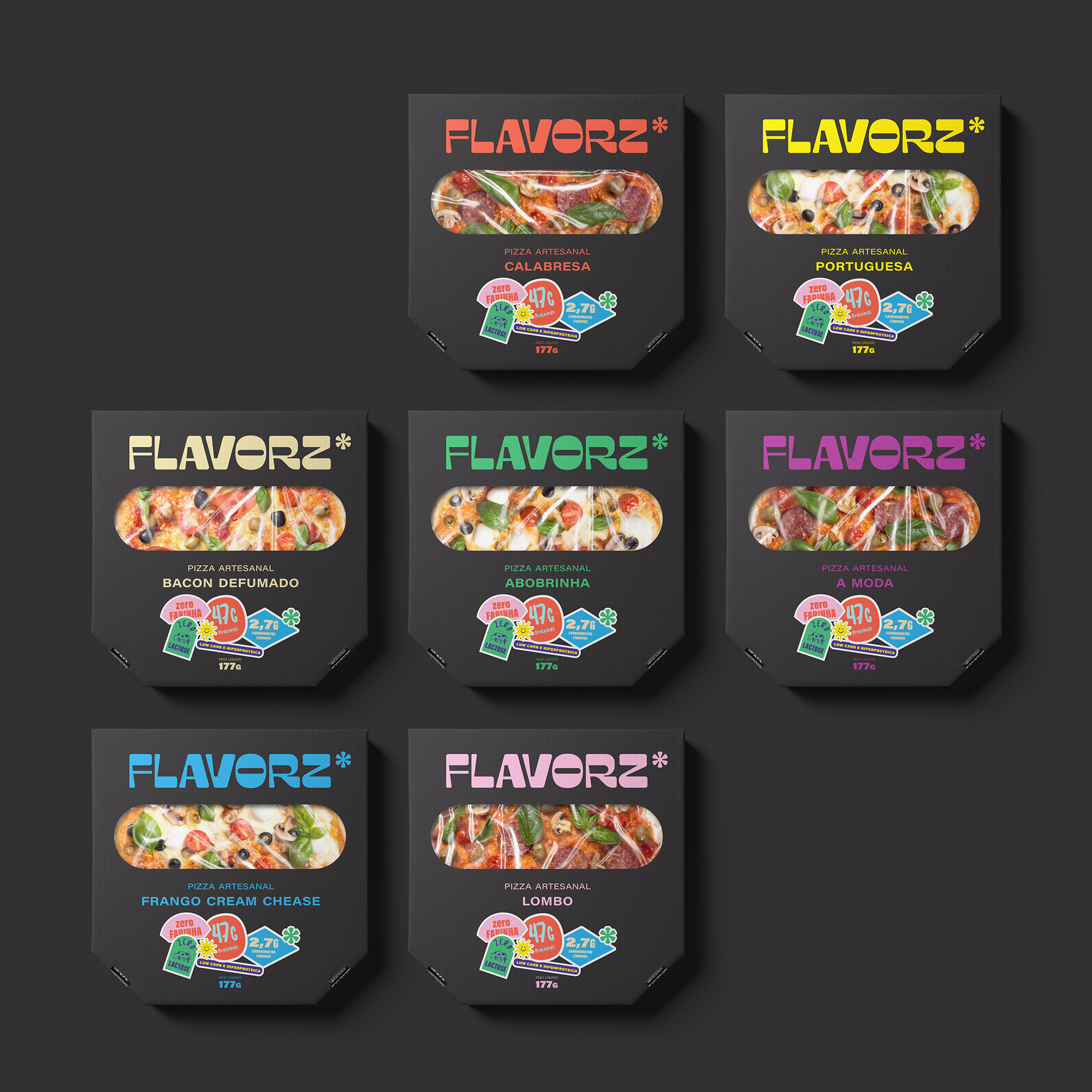
Flavorz* is a brand created by Flávia and Otávio as a healthy alternative to conventional pizzas that can spike blood sugar levels, increase weight, and give rise to various heart-related diseases. One of the most interesting aspects of these exclusive handmade pizzas is that they do not use flour. These chicken-based pizzas can be consumed by all without the fear of health hazards.
Healthy food is considered to be tasteless, which is why only a small percentage of the population, such as athletes or people with medical conditions, opt for these types of meals. With Flavorz*, Flávia and Otávio wanted to change that notion by adding an array of flavors to these protein-based healthy substitutes.


Branding agency Beto Nunes designed the brand and the packaging with the focus on highlighting the distinct flavors visually.
The design agency mentions:
“…one of the first steps was to work directly with the flavor attribute. We named the brand Flavorz* to create this relationship between brand, product and experience. The asterisk that accompanies the name is the graphic symbol that carries the other attributes that are inserted in the brand DNA and a way to say that Flavorz* is flavor and much more.”
While the designs are vibrant and attractive, they follow a simple design aesthetic.
“The packaging and communication use an apartment and simplistic aesthetic, but super vibrant and fun due to its vibrant color palette. The information highlighted on the packaging were worked as stickers, a more irreverent way to highlight important points to the consumer. The result is an identity full of personality, which through its aesthetics and language manages to distance itself from competitors, both in the fit and traditional market, placing itself as a healthy alternative, but also extremely tasty. Flavorz*. Taste and much more!”


